We are pleased to announce the release of the new version Stimulsoft Reports and Stimulsoft Dashboards 2020.4.1, which is now available for download. This major release comes with the release of Stimulsoft Reports.Angular, support for NET Core 3.1 in WinForms, Sparklines, and other functionality.
Stimulsoft Reports.Angular
In the 2020.4.1 release, we are pleased to present you with a cross-platform, full-featured set of tools for developing, viewing, and converting reports for the Angular platform version 9 and higher. Stimulsoft Reports.Angular uses client-server technology to work. Fast Angular components work on the client-side, while on the server-side, there is a full-featured reporting engine running .NET Framework 4.5 and higher or .NET Core 2.0 and higher. Stimulsoft Reports.Angular is a part of Stimulsoft Reports.Web product, and it is presented in separate packages for NuGet (server-side) and NPM (client-side).

Support for.NET Core 3.1 in WinForms
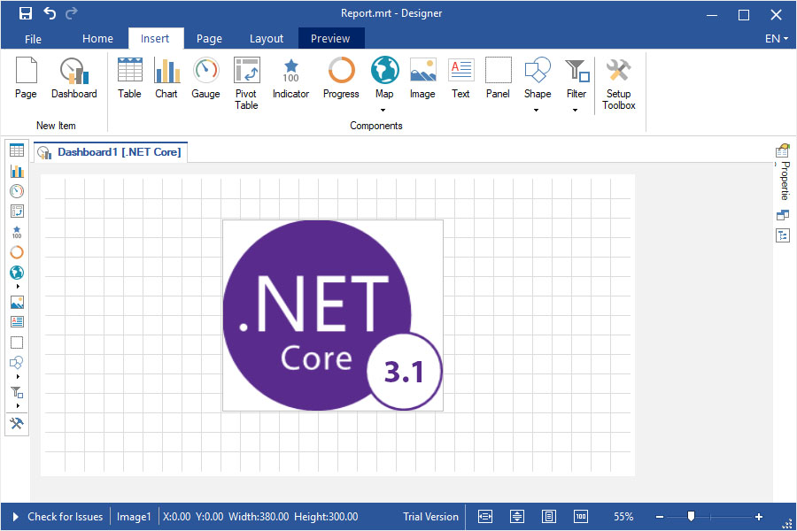
In the current release, we have added support for .NET Core 3.1 in WinForms components. Now you can use these components to create, edit and view reports and dashboards in .NET Core applications. All components are included in the Stimulsoft Reports.Net product, usage examples are also available on GitHub.
Sparklines in reports
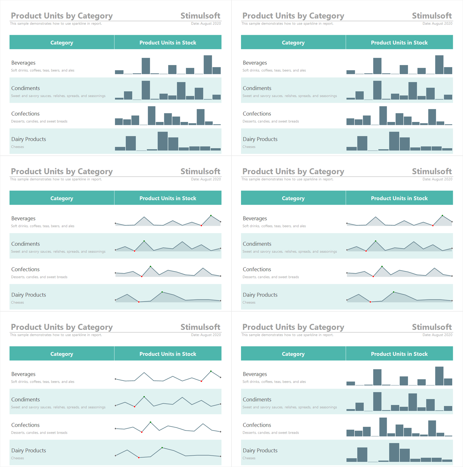
In the release 2020.4.1, we added Sparkline as a data visualization component in reports. Add a component to a report page or a Data band, specify a data column, and select a type. Data values can be displayed as Line, Area, Column, or Win/Loss. Also, you can mark the extreme and maximum values with dots.
Viewing data for elements
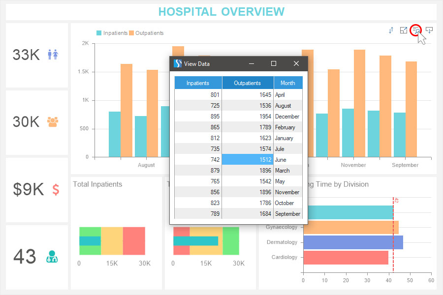
Now you can view the data of the current dashboard element directly from the viewer. To do this, click the View Data button of the required element, and all the values of the data columns of this element will be displayed in a separate menu. If necessary, the View Data button can be disabled in the Interaction menu of the current item.
Viewing a dashboard query
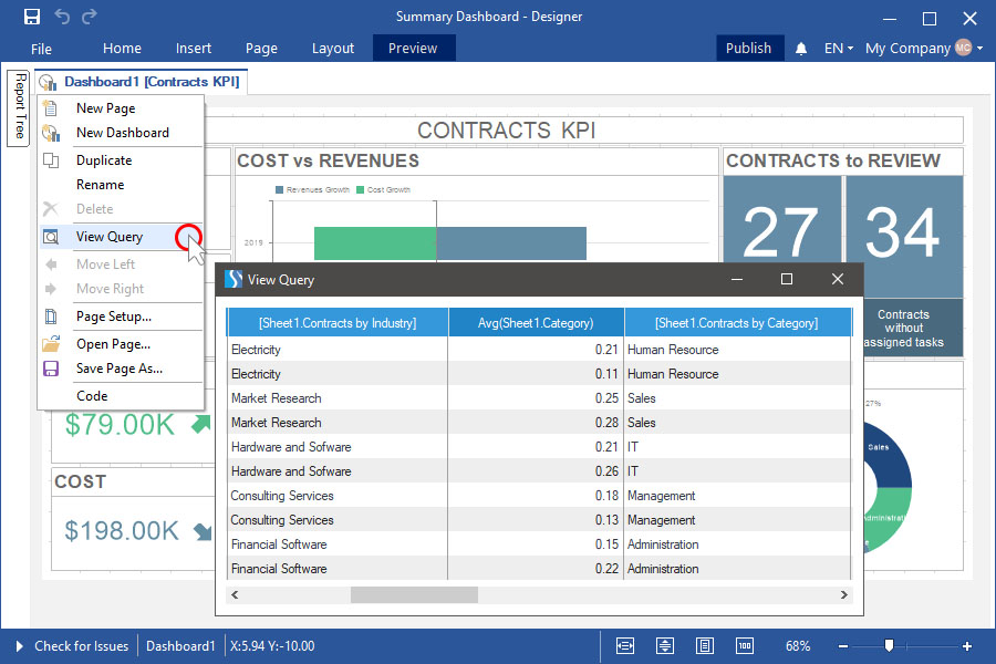
When designing a dashboard using multiple data sources, you can view a virtual data table of the current dashboard. A virtual dashboard data table is a joined table formed from the dashboard data sources. To view it, select the View Query command from the context menu of the dashboard header.
Support for GIS
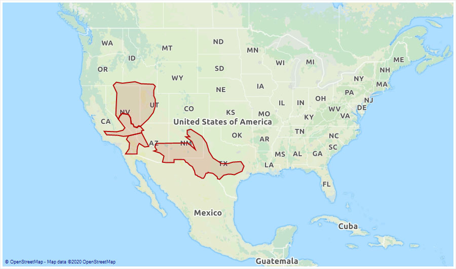
In the 2020.4.1 release, we added the ability to display geometric primitives according to SQL standards on the Online Map element. Add an online map to the dashboard and drag the GIS data column to the appropriate field. You can also change the background of the map.
Gauge settings
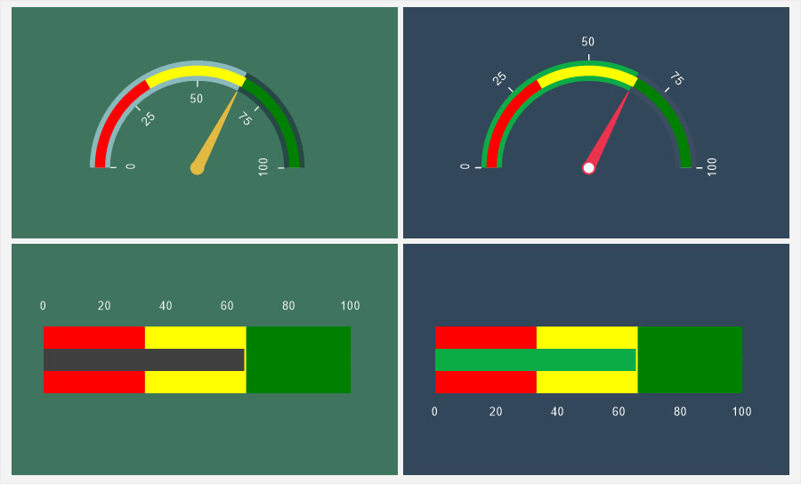
Now value labels in the Gauge element can be positioned both outside the value scale and inside. Also, value labels can be disabled. Customization of labels is carried out on the property panel, in the Labels group. In addition, we have optimized the algorithm for calculating the number of signatures for an element depending on its size.
Updated Interaction editor
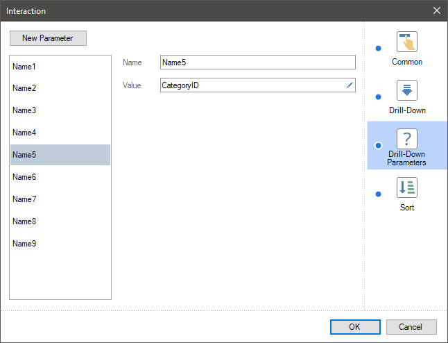
In the 2020.4.1 release, we have improved the Interaction editor used for designing reports. As a result of optimization, we have kept all the previous functionality and doubled the number of detail parameters.
Show Blanks
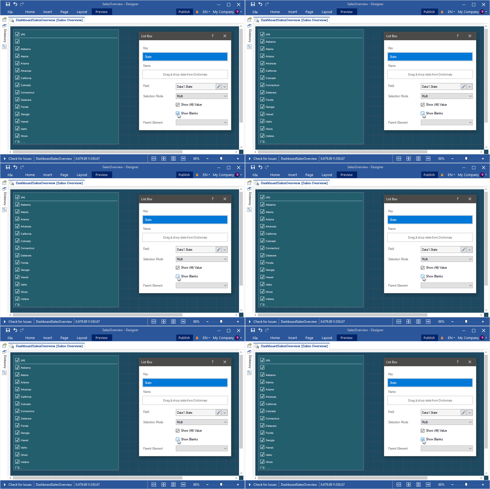
When using filtering elements on the dashboard, the data can contain empty values. In the list of values for filtering items, it will be represented as an empty value. In the new release, we added the ability to show or hide empty values in the list of values of the current filtering element. To do this, select or clear the Show Blanks checkbox.
Sort by variation
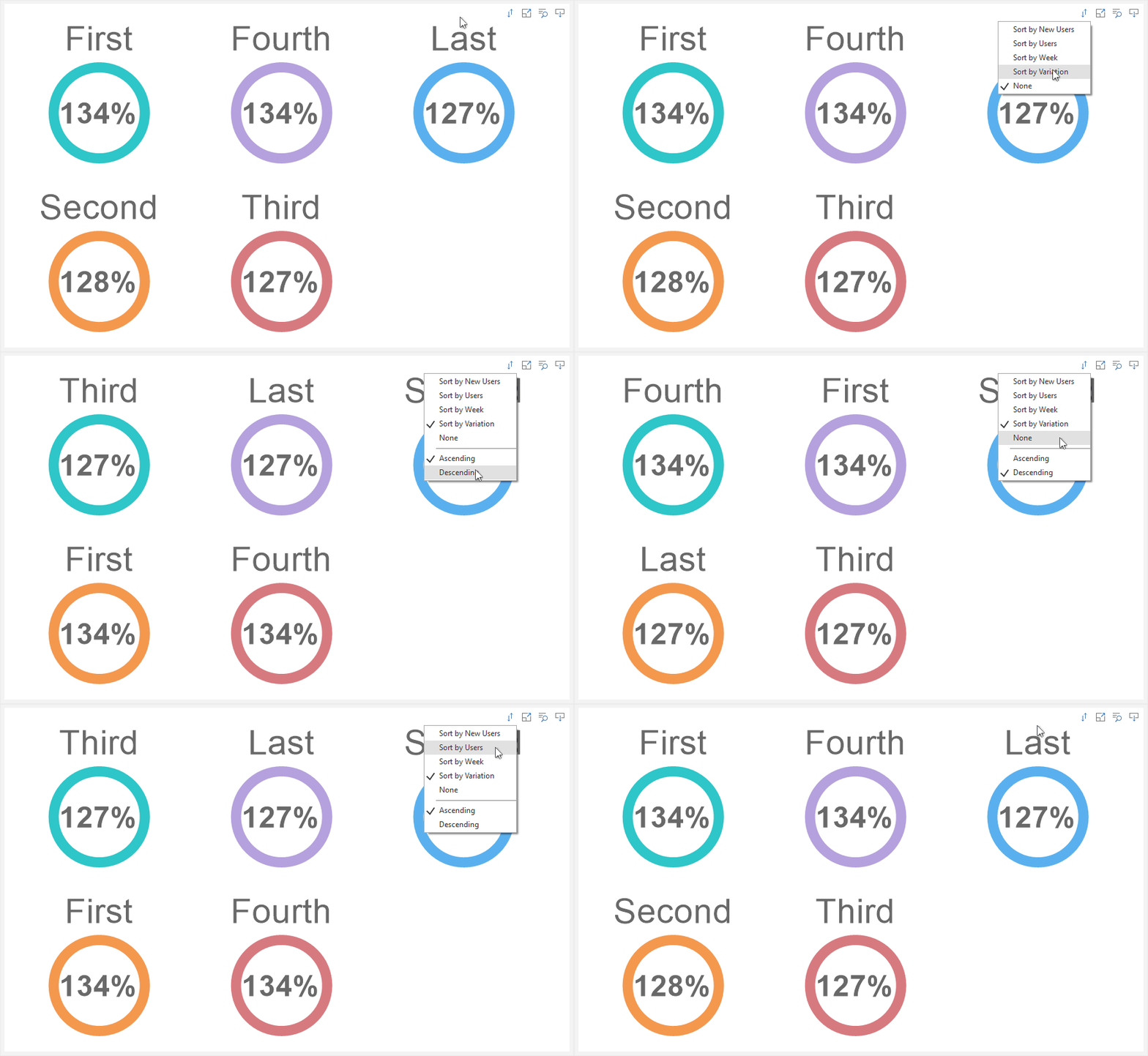
In release 2020.4.1, you can sort the indicator and progress values by the deviation value. The deviation value is calculated by the report generator when analyzing dashboard data and is the ratio of the indicator values to the target values in percent. This sorting is relevant only if the elements are set to Series.
Icons in charts
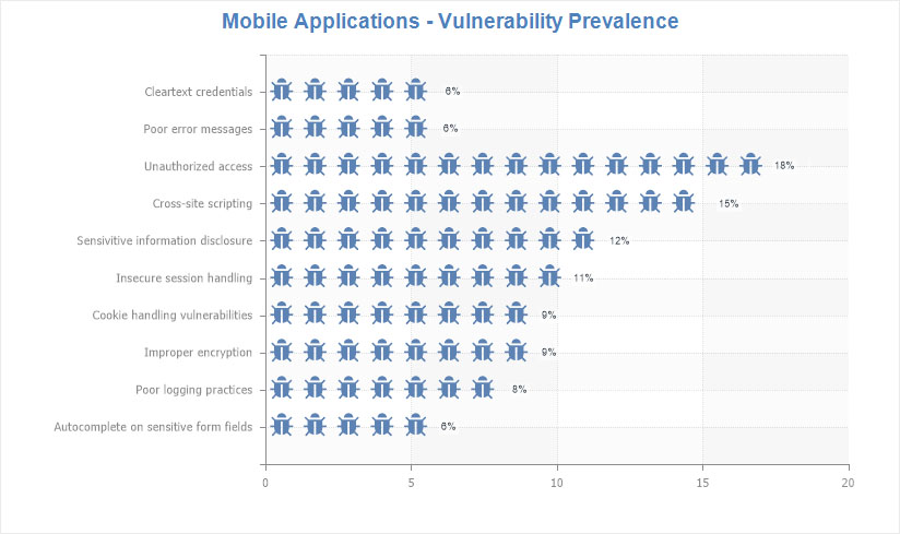
You can now use icons in report charts - to display the graphical objects of the chart, in the label, and the chart legend. To do this, select a specific row of the chart and set the required icon as the Icons property's value.
Stimulsoft Reports.Angular
In the 2020.4.1 release, we are pleased to present you with a cross-platform, full-featured set of tools for developing, viewing, and converting reports for the Angular platform version 9 and higher. Stimulsoft Reports.Angular uses client-server technology to work. Fast Angular components work on the client-side, while on the server-side, there is a full-featured reporting engine running .NET Framework 4.5 and higher or .NET Core 2.0 and higher. Stimulsoft Reports.Angular is a part of Stimulsoft Reports.Web product, and it is presented in separate packages for NuGet (server-side) and NPM (client-side).

Support for.NET Core 3.1 in WinForms
In the current release, we have added support for .NET Core 3.1 in WinForms components. Now you can use these components to create, edit and view reports and dashboards in .NET Core applications. All components are included in the Stimulsoft Reports.Net product, usage examples are also available on GitHub.

Sparklines in reports
In the release 2020.4.1, we added Sparkline as a data visualization component in reports. Add a component to a report page or a Data band, specify a data column, and select a type. Data values can be displayed as Line, Area, Column, or Win/Loss. Also, you can mark the extreme and maximum values with dots.

Viewing data for elements
Now you can view the data of the current dashboard element directly from the viewer. To do this, click the View Data button of the required element, and all the values of the data columns of this element will be displayed in a separate menu. If necessary, the View Data button can be disabled in the Interaction menu of the current item.

Viewing a dashboard query
When designing a dashboard using multiple data sources, you can view a virtual data table of the current dashboard. A virtual dashboard data table is a joined table formed from the dashboard data sources. To view it, select the View Query command from the context menu of the dashboard header.

Support for GIS
In the 2020.4.1 release, we added the ability to display geometric primitives according to SQL standards on the Online Map element. Add an online map to the dashboard and drag the GIS data column to the appropriate field. You can also change the background of the map.

Gauge settings
Now value labels in the Gauge element can be positioned both outside the value scale and inside. Also, value labels can be disabled. Customization of labels is carried out on the property panel, in the Labels group. In addition, we have optimized the algorithm for calculating the number of signatures for an element depending on its size.

Updated Interaction editor
In the 2020.4.1 release, we have improved the Interaction editor used for designing reports. As a result of optimization, we have kept all the previous functionality and doubled the number of detail parameters.

Show Blanks
When using filtering elements on the dashboard, the data can contain empty values. In the list of values for filtering items, it will be represented as an empty value. In the new release, we added the ability to show or hide empty values in the list of values of the current filtering element. To do this, select or clear the Show Blanks checkbox.

Sort by variation
In release 2020.4.1, you can sort the indicator and progress values by the deviation value. The deviation value is calculated by the report generator when analyzing dashboard data and is the ratio of the indicator values to the target values in percent. This sorting is relevant only if the elements are set to Series.

Icons in charts
You can now use icons in report charts - to display the graphical objects of the chart, in the label, and the chart legend. To do this, select a specific row of the chart and set the required icon as the Icons property's value.