Today, we temporarily omit the topic of reports and talk only about dashboards. Our report designer is a powerful tool for designing dashboards, which you can save, convert into a document, or make available via a link, using Stimulsoft Cloud after creation.
It's quite easy to share and publish a dashboard on social networks, for example, Twitter and Facebook, on our website or in an application.
This time, we will talk about a more subtle thing for dashboard developers. But before we get to the point, we want to remind you of one important thing. A dashboard, when previewing it, can be stretched over the entire area of the viewer, stretched only in width with the aspect ratio intact or not stretched. The Content Alignment parameter value defines this behavior in dashboard settings. All components will change in sizes proportionally with any stretch option, too. And here lies the main point - you have created a great dashboard that looks perfectly on your large 4K monitor.We shared a link to the published dashboard with our partners, which they will open on a mobile device. The viewer will be stretched across the width and height of the device display, and the dashboard will be displayed in it. It is unlikely to cause delight, especially if more than 5 components are on the dashboard.
But don't hurry to redo the dashboard trying to please everyone. A great solution is to add a bit of tuning to an existing template: a mobile version of the dashboard design. In other words, a particular version of the dashboard will be displayed on a mobile device.
It's pretty easy to make. Create or open a dashboard in the designer. Go to the Page tab. You will find two buttons of the current dashboard design version control – Desktop or Mobile. You should select the mode for which you want to create a design version. Suppose that the Desktop version is already developed, and we are talking about adding a version for mobile devices accordingly, you should select the Mobile mode.
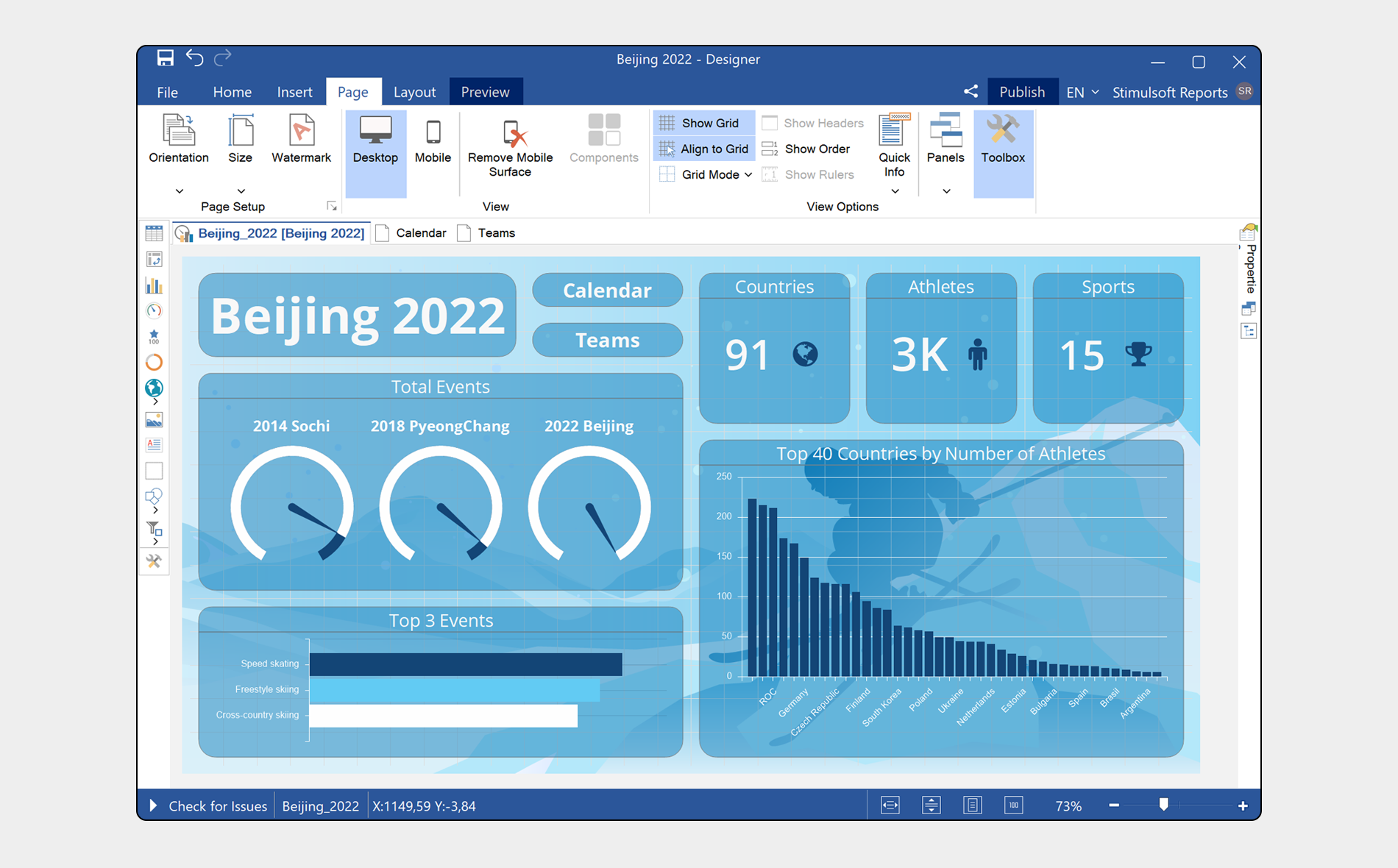
If your template does not contain the Mobile version, an empty dashboard and menu with dashboard components from the Desktop version will be displayed. The dashboard design version may include all components of the Desktop version or not include some of them.
It's quite easy to share and publish a dashboard on social networks, for example, Twitter and Facebook, on our website or in an application.
This time, we will talk about a more subtle thing for dashboard developers. But before we get to the point, we want to remind you of one important thing. A dashboard, when previewing it, can be stretched over the entire area of the viewer, stretched only in width with the aspect ratio intact or not stretched. The Content Alignment parameter value defines this behavior in dashboard settings. All components will change in sizes proportionally with any stretch option, too. And here lies the main point - you have created a great dashboard that looks perfectly on your large 4K monitor.We shared a link to the published dashboard with our partners, which they will open on a mobile device. The viewer will be stretched across the width and height of the device display, and the dashboard will be displayed in it. It is unlikely to cause delight, especially if more than 5 components are on the dashboard.
But don't hurry to redo the dashboard trying to please everyone. A great solution is to add a bit of tuning to an existing template: a mobile version of the dashboard design. In other words, a particular version of the dashboard will be displayed on a mobile device.
It's pretty easy to make. Create or open a dashboard in the designer. Go to the Page tab. You will find two buttons of the current dashboard design version control – Desktop or Mobile. You should select the mode for which you want to create a design version. Suppose that the Desktop version is already developed, and we are talking about adding a version for mobile devices accordingly, you should select the Mobile mode.
If your template does not contain the Mobile version, an empty dashboard and menu with dashboard components from the Desktop version will be displayed. The dashboard design version may include all components of the Desktop version or not include some of them.
What you can and can't do in the Mobile dashboard design version is the main thing.
- You can add only some dashboard components, change their position and sizes. Enable or disable headers of these components. Define options for enabling the display of the mobile version of the design on your device (more information about that you can find below);
- You can't add new components to your dashboard, having not added them to the Desktop version, override data, completely change component design settings such as style, etc.
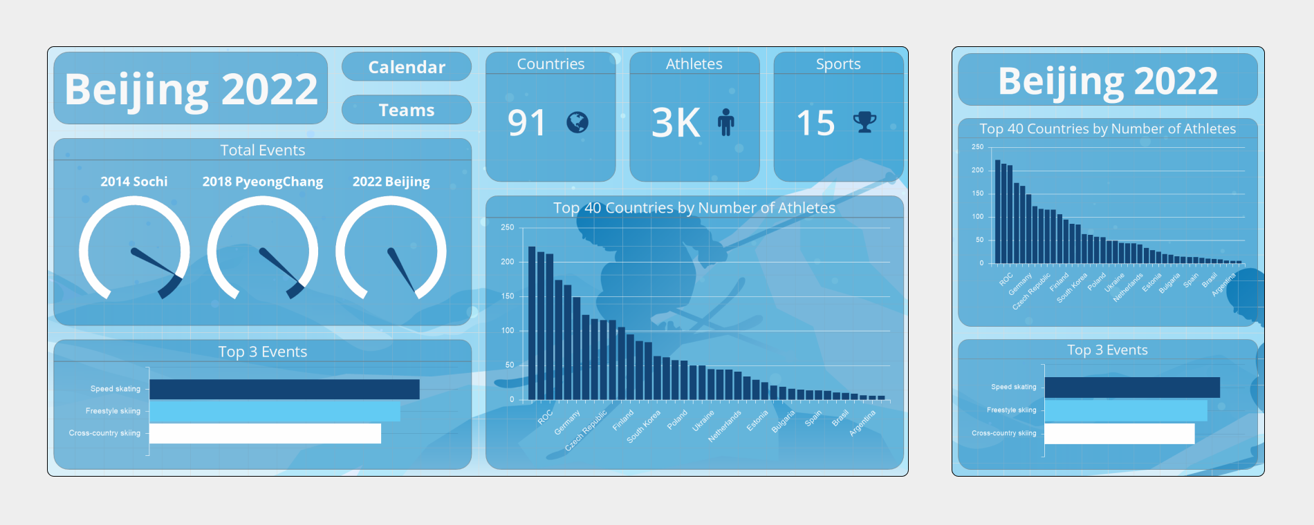
The Mobile dashboard design version can display the current dashboard on mobile devices but not change it conceptually.
And now a crucial question - when exactly, when displayed in the viewer, will the mobile dashboard mode be enabled, and when will it be the desktop mode?
Everything is easy here – when creating the Mobile design, a dashboard contains the Device Width property. The value of this property is defined in pixels, and it is a boundary property. As soon as the device screen width, where the viewer is deployed, is less than a specified value, the Mobile version will be displayed. In all other cases – the Desktop version. You can define when to display the Mobile version of the dashboard design. To do that, you should change the width limit of the device. By default, the mobile version will be displayed at a width of up to 480 pixels. The mobile dashboard design version can be deleted, if you need it. To do that, you should use the Delete Mobile Surface command. Another important thing, design view – Desktop or Mobile, where the dashboard template was saved will be used during the next opening of this template in the report designer. So, don`t be afraid if suddenly you open a template and the Mobile design version is displayed. You should go to the Page tab, enable the Desktop and save changes if you need to use the Desktop mode by default.
Thus, the dashboard template may contain two design versions, each of them will be used under certain conditions (it depends on the value of the Device width property). It allows you to create a universal dashboard, which can be viewed on various devices.
A video with a detailed description of dashboard design creation for mobile devices.
If you have any questions – contact us.