In today’s article, we’ll talk about responsive dashboard design. Responsive design refers to a layout where dashboard elements can change their position and appearance depending on the device used to view the report. In other words, when viewing a dashboard on a mobile device, components may appear in a different layout, at a different size, or be omitted altogether compared to how they appear on a computer, laptop, or projector screen.
Why responsive design matters
By default, dashboards are stretched to fill the entire viewport, and their elements are proportionally scaled. This works both when the screen size increases and when it decreases. However, a dashboard designed on a computer may be extremely inconvenient to view on a mobile device: elements may become small and hard to read, and charts, for example, can be compressed beyond recognition. This reduces the clarity of the information and can lead to misinterpretation of data.
That’s why a responsive (or “mobile”) mode is essential, it ensures that dashboards remain user-friendly, clear, and readable across different devices. Please note!
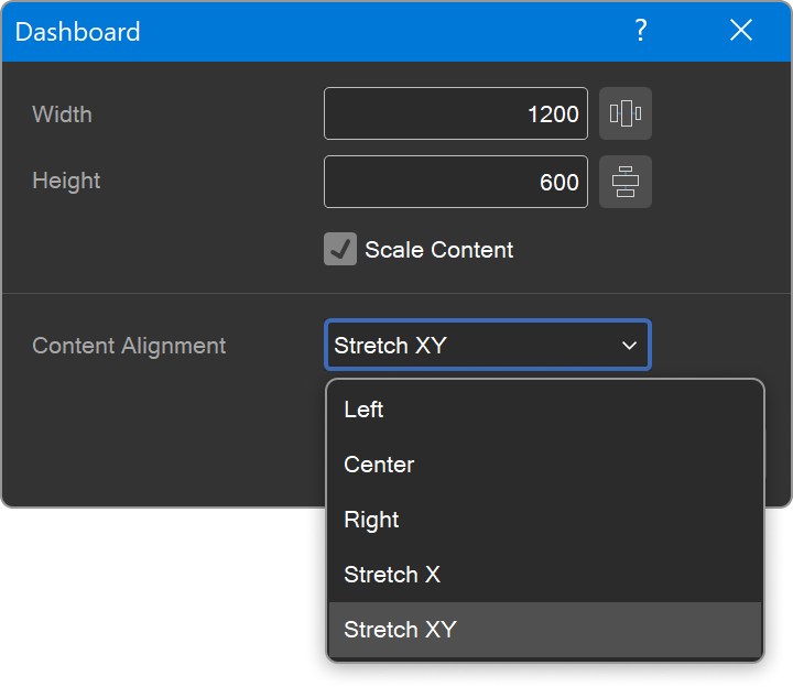
The responsive mode only works if the Content Alignment parameter is set to Stretch X or Stretch XY. If it's set to Center, Left, or Right, responsiveness will not apply, as the content remains fixed in size and doesn’t scale, similar to the design mode.
That’s why a responsive (or “mobile”) mode is essential, it ensures that dashboards remain user-friendly, clear, and readable across different devices. Please note!
The responsive mode only works if the Content Alignment parameter is set to Stretch X or Stretch XY. If it's set to Center, Left, or Right, responsiveness will not apply, as the content remains fixed in size and doesn’t scale, similar to the design mode.
How to add a mobile version of a dashboard
- Open an existing dashboard or create a new one in the report designer.
- Go to the Page tab and activate mobile mode by clicking the corresponding button.
- The mobile version of the dashboard will appear, and in the Components menu, you will see all elements from the desktop version.
Before configuring the mobile version, it’s important to understand what can and can’t be changed:
You can:
- Change the size of the mobile dashboard;
- Add only the necessary components;
- Adjust the size and order of elements;
- Enable or disable component titles.
You can’t:
- Change component settings (e.g., data fields or visualization types), as these changes will affect the desktop version as well;
- Change component styles, style changes apply to all versions.
Creating a mobile version involves dragging the necessary components onto the mobile dashboard, adjusting their sizes, and organizing their layout.
How responsiveness works?
After setting up and saving the mobile version, a common question arises: When will it actually be displayed?The answer is simple: This is controlled by the Device Width property, which is available only in mobile mode.
- If the screen width is less than or equal to the specified value, the mobile version will be shown.
- If the screen width is greater, the desktop version will be displayed instead.
The Device Width value is set in pixels. This allows you to tailor the dashboard display for specific types of devices, such as smartphones or tablets.
Multiple mobile versions of a dashboard
Sometimes you may need to create different mobile versions, one for a phone, and another for a tablet.
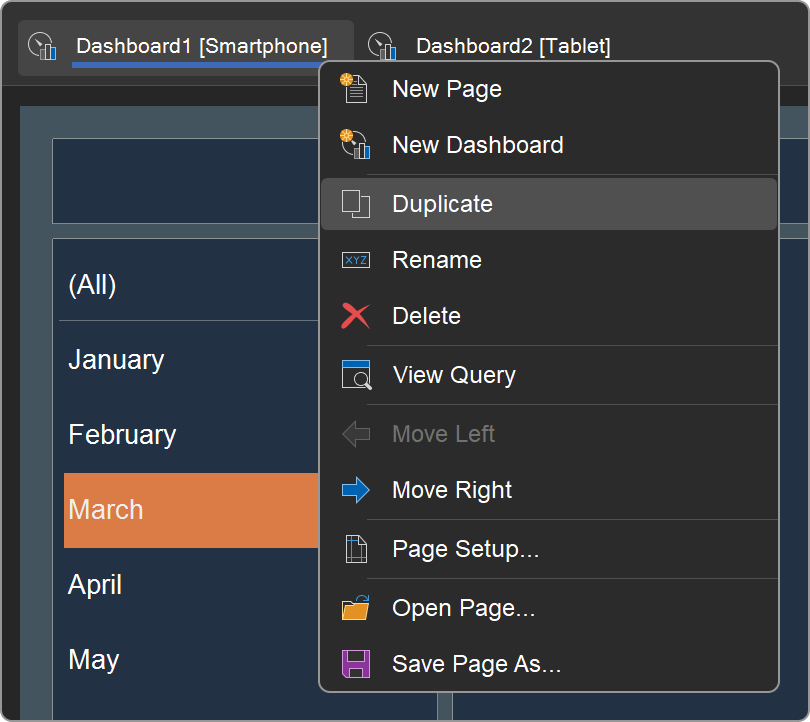
Since a single dashboard can only have one mobile and one desktop version, the best solution is to use multiple dashboards within the same template.
Example:
Since a single dashboard can only have one mobile and one desktop version, the best solution is to use multiple dashboards within the same template.
Example:
- You have a dashboard with a mobile version tailored for phones, where the device width is set to 520 px.
- Create a copy of this dashboard using the Duplicate command from the context menu on the dashboard header in the report designer.
- In the copy, set the device width for the mobile version to 800 px. If needed, adjust the layout and the list of components.
Now the template contains two dashboards, each with its own mobile version. In the viewer, they will appear as separate tabs, and the user can select the appropriate one depending on their device.
That’s essentially everything you need to know about responsive dashboard design. Responsive design makes dashboards truly versatile and user-friendly across all devices. It helps preserve readability and information clarity, regardless of screen size.
For a more visual explanation of how to create responsive dashboards, we’ve prepared several themed videos.