Today we will explain how to create auto series in charts in Stimulsoft products and walk through this topic with a specific example.
Introduction
Series in a chart are groups of data that are visualized on the graph as individual elements: lines, columns, points, and so on, depending on the chart type. Auto series in charts are used to group multiple graphical elements under a single argument. However, charts don’t have a built-in «group by argument» property, so to solve such tasks we recommend using the following approach.Starting with the data
First, we obtain the data, in our example, these are input JSON data, which we display in a table: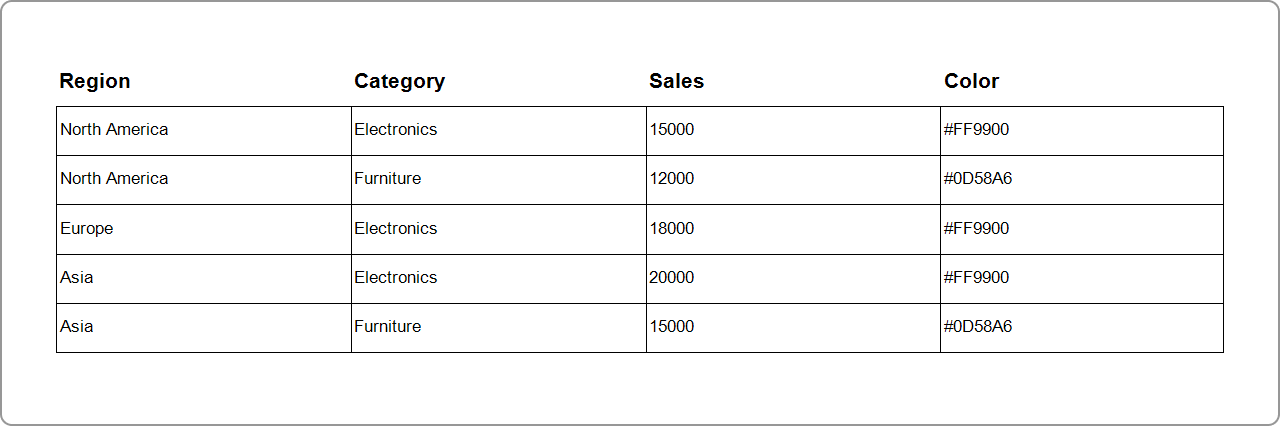
Building the chart
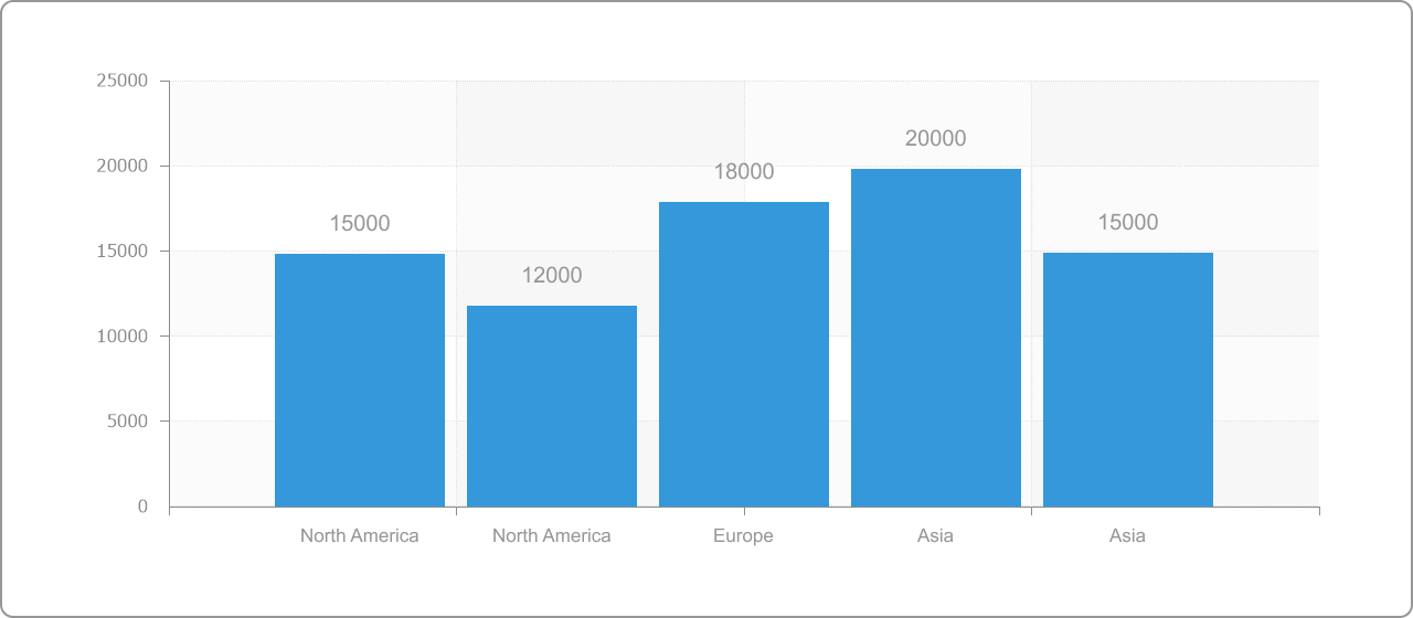
Next, we proceed to build the chart:- for the X-axis (Argument), we specify Region, for example: North America, Europe, Asia;
- for the Y-axis (Value), we specify Sales, meaning the sales values.
As a result, we obtain the following chart:
Properties for creating auto series
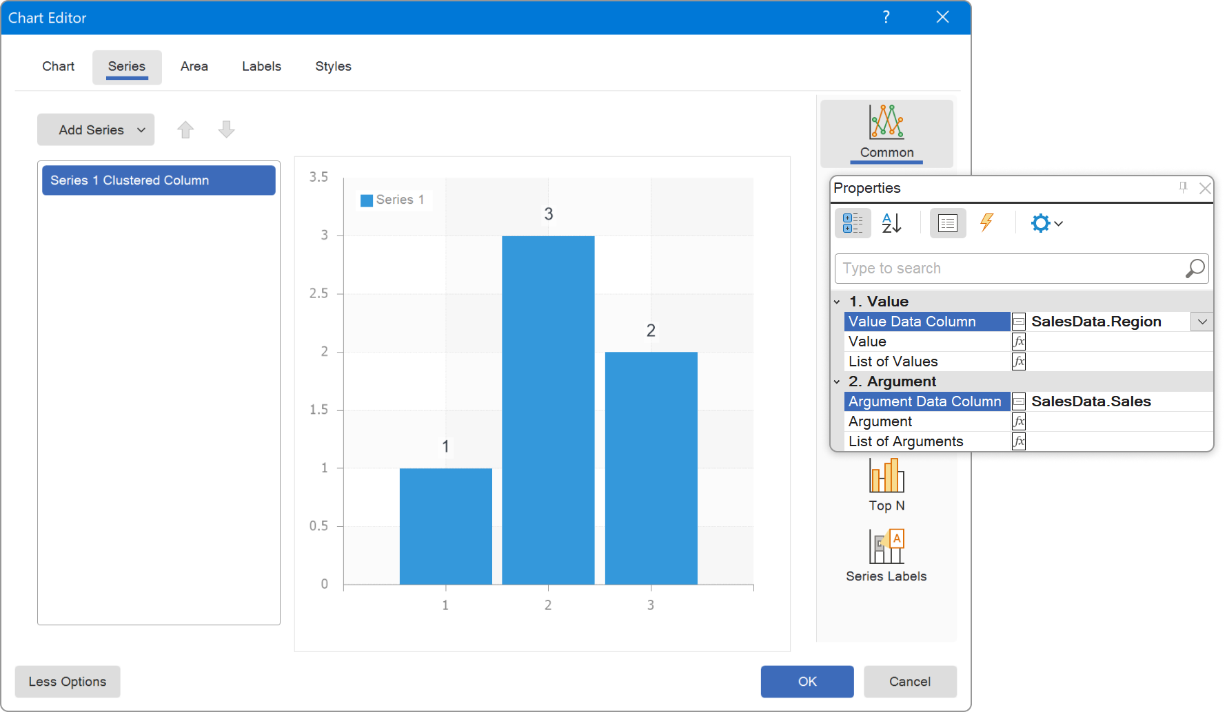
Next, we move on directly to the auto series.Stimulsoft products allow you to automatically create series based on data from a source. For this purpose, the following properties are used: Auto Series Key Data Column, Auto Series Color Data Column, and Auto Series Title Data Column. These properties belong to a chart series. Let’s take a closer look at them.
- Auto Series Key Data Column defines the column from which unique values are taken to create the series. Each unique value becomes a separate series.
- Auto Series Title Data Column sets the titles of the series. If this property isn’t specified, the value from the column defined in Auto Series Key Data Column is used as the title.
- Auto Series Color Data Column sets the color for each series. If this property isn’t specified, colors are assigned automatically.
Based on the Category column, we will split our main series into two auto series (Electronics and Furniture) as follows:
- Set the Auto Series Key Data Column to Category (in this case, for the unique value Europe, there is no Furniture value, so the value will be 0);
- For the Auto Series Color Data Column property, set the Color column, which contains the color code;
- Electronics and Furniture are self-explanatory series titles.
In the end
On the chart, the regions will be displayed along the X-axis, and the sales values along the Y-axis. Each series will correspond to a specific product category in a region, with its own color and title.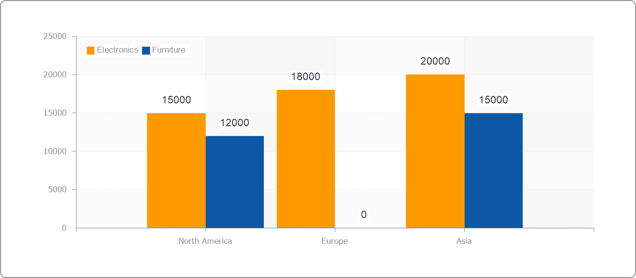
Below is an example of the report that we reviewed in this article.
If you have any questions, please contact us.