We’re getting back to the series of articles about the report designer and its components. Last time we acquainted you with the Pivot table element and its main settings on the example of a dashboard with restaurant attendance tracking statistics in the USA. Today, you’ll learn about the Region map element, its basic features, ways of data analysis, and its use in dashboards.
So, first of all, let’s take a closer look at what types of maps the element contains. To make it, we’ll explore the window with map selection in detail.

Now, let’s explore the types of data analysis in the Region map.
Region map
A region map is an element of display and visualization of data. Using it, you can show values in a dashboard with reference to a particular geographical object. It allows you to demonstrate data for individual countries, continents, and regions.So, first of all, let’s take a closer look at what types of maps the element contains. To make it, we’ll explore the window with map selection in detail.
Map type selection
The element editor contains a window in which you can select the map type that is displayed in the element. Here you’ll find maps of different countries, continents, and regions. There are Category and Name items for a quicker search of the desired object. The Category contains all continents of the world: Europe, North and South America, Asia, Oceania, and Africa. If you select, for example, Europe, maps of all countries of the continent will be displayed. The Name item is a search line where you enter the needed map name.Now, let’s explore the types of data analysis in the Region map.
Data analysis in the Region map
Data in the Region map can be analyzed and shown using the following types of analysis:- Show Bubbles;
- Heatmap;
- Group;
- Heatmap With Group.
Show Bubbles
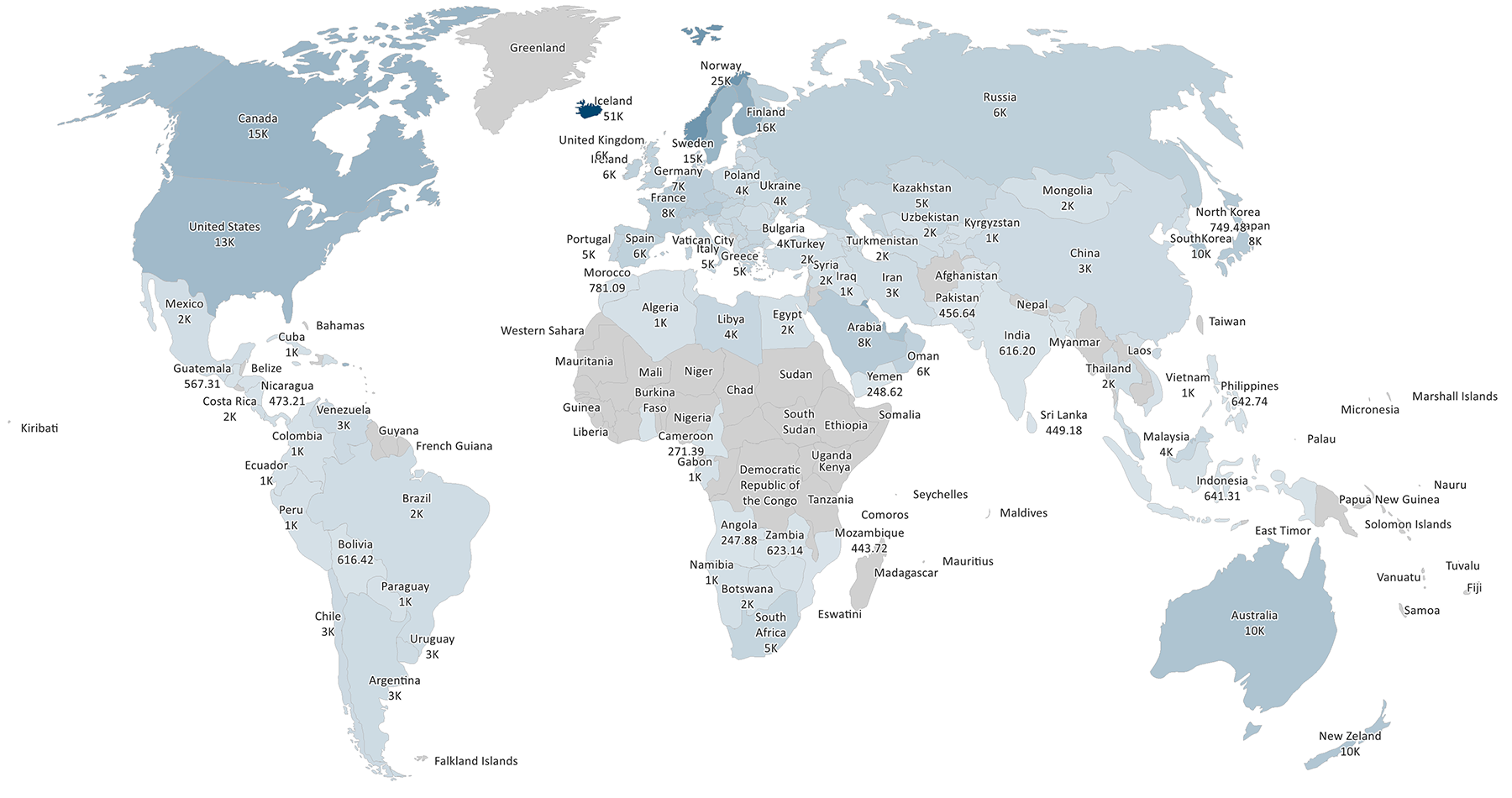
Using this type of analysis, you can identify the maximum and minimum values of geographic objects on your region map in the form of bubbles. In the example below, we displayed the population of France by region.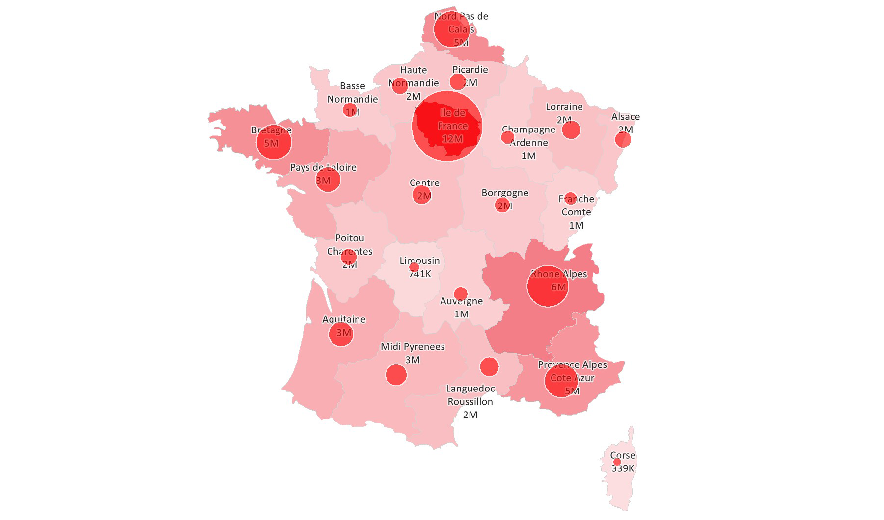
Heatmap
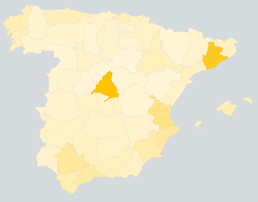
This type allows you to show data on the Region map as separate geographic objects, where a region with a maximum value will be displayed in one color, with a minimum in another. For the rest, a color will be generated as a result of mixing these two colors. Here you can see a region map with Spain population statistics. As you can see, the regions with the largest population are highlighted darker, while those with the smallest population are highlighted in a lighter color. This is another way of representing the population.Group
This analysis type will help you group geographic objects on the Region map according to a certain condition that will depend on the data you specify. For example, we set a condition on the map below, having created three groups. In the first, we displayed the states where most of the population traditionally supports democrats, which are highlighted in blue. In the second, the states where people support republicans more are highlighted in red. In the third, we showed the states where people don’t have clear electoral preferences. Thus, using this parameter, we could demonstrate political views in the USA.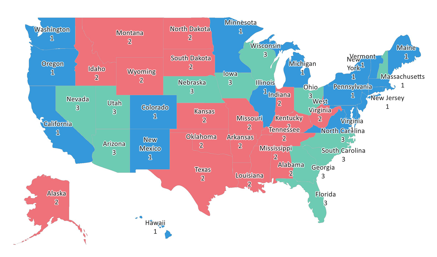
Heatmap With Group
This analysis type works in exactly the same way as the Heatmap. The only difference is that in addition to highlighting maximum and minimum values, you can combine them into groups. In this case, the heatmap analysis is carried out within one group. For example, when uniting Europe, the heatmap analysis type will be applied within only the group, as you can see in the example below, where all European countries are highlighted in red. The same applies to other continents.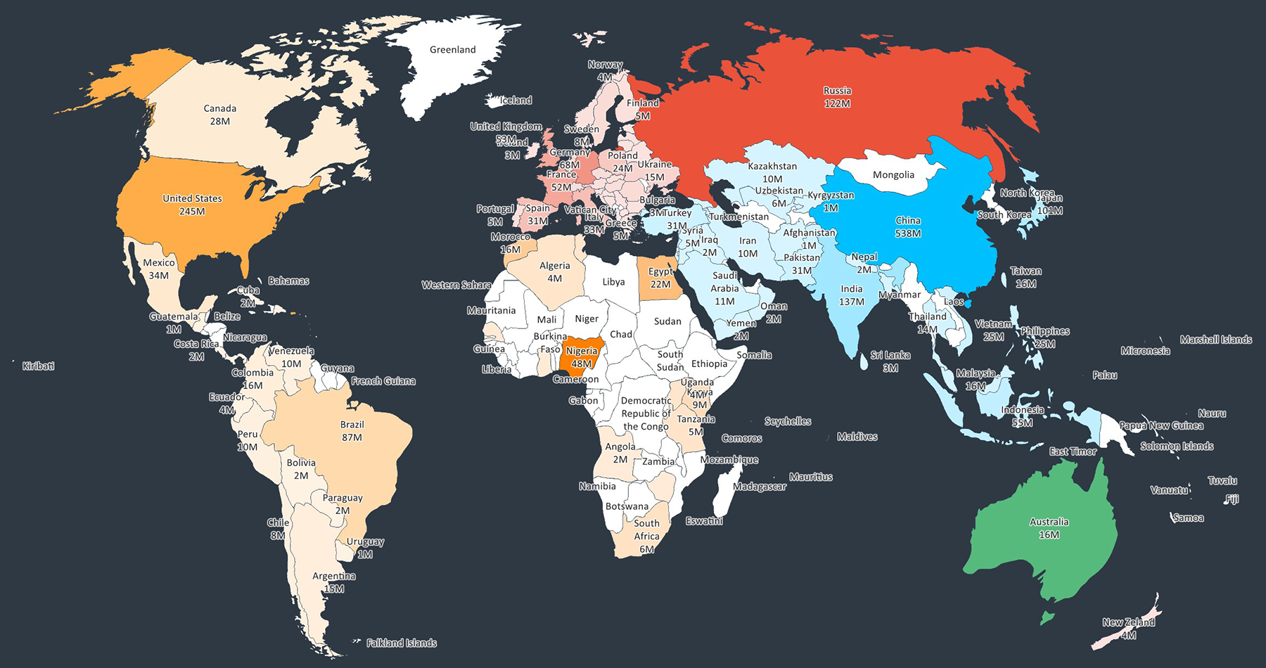
Let’s take a closer look at basic features of the Region map.
Basic features of the Region map
Adding a custom map
With the Region map, you may add a custom map. For example, you need to display India and China on the same map, but our product doesn’t have such a map. In this case, you should create your certain SVG file according to certain requirements and move it to report resources. After that, this map will be displayed in our report designer. You can read more detailed information about adding a custom map here.Signatures on maps
Signatures of geographic objects may be present when displaying the Region map. In the editor, you can select a mode of their display:- None. If you select the None mode, signatures will not be displayed on the map;
- Full. If you select the Full mode, the full name of the signatures will be displayed;
- Short. If the Short mode is selected, signatures of geographic objects will be displayed in the common standard two-letter or three-letter ISO 2 and ISO 3 abbreviations.
Show values
The region map editor contains an option to display values. Using it, you can show or hide values on your map.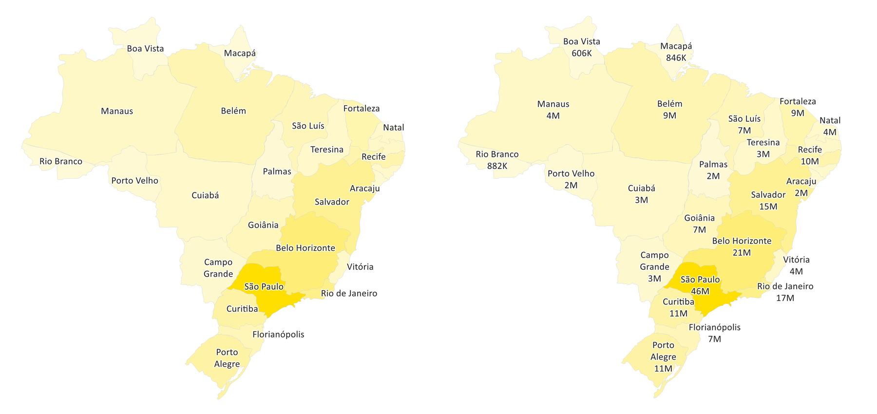
Color selection. The Color each parameter
This parameter allows you to display a separate color for each geographic object on the Region map. It is available only for maps with the Individual type.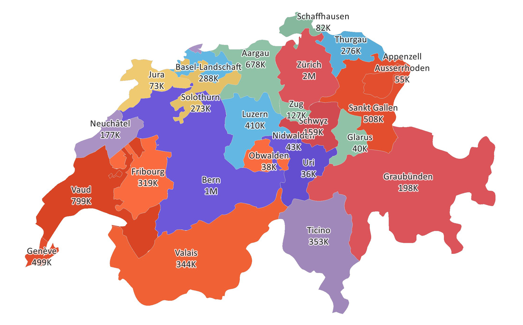
Language selection
Starting from version 2022.1, the Region map can display names of states, provinces, and regions for France, Russia, Germany, and Italy in the languages of these countries in the manual mode of data entry. You can find more detailed information about this feature here. For all other countries, the localization is in English. Important to know!We don’t have the localization of names of geographic objects for the map of China. But you can rename them, having specified native names of the country regions in the Name field. So, it’s high time to explore the practical use of this element in dashboards.
The use of the element in dashboards
Last time the role of cities and city way of life has considerably grown compared to living in the countryside. Every year, more and more people move to big cities in search of good jobs and better living conditions. In the dashboard below, we showed the top 50 countries with the highest level of urbanization. When creating the dashboard, we used the Region map element that helped us to highlight the countries with the highest and lowest levels of urbanization in separate colors. In addition, we displayed the number of people who live in cities in each country.China is the world's second largest economic power, a country with developed industry, magnificent nature, amazing sights, hospitable people, and, of course, the second largest population in the world. In addition, using the Region map, we could show the population of each region of the country and highlight the areas with the largest and smallest populations.
To learn how to create a dashboard with the Region Map element, click here.
The next article will be about the Image element. If you still have any questions about this article or creating a dashboard with the Region Map, contact us. We'll be glad to help you.