We continue to tell you about the report designer and its main components. Last time we presented you with the Progress element, showed how you may use it in dashboards and described its main options and features. This time, we’re going to tell you about the Pivot Table.
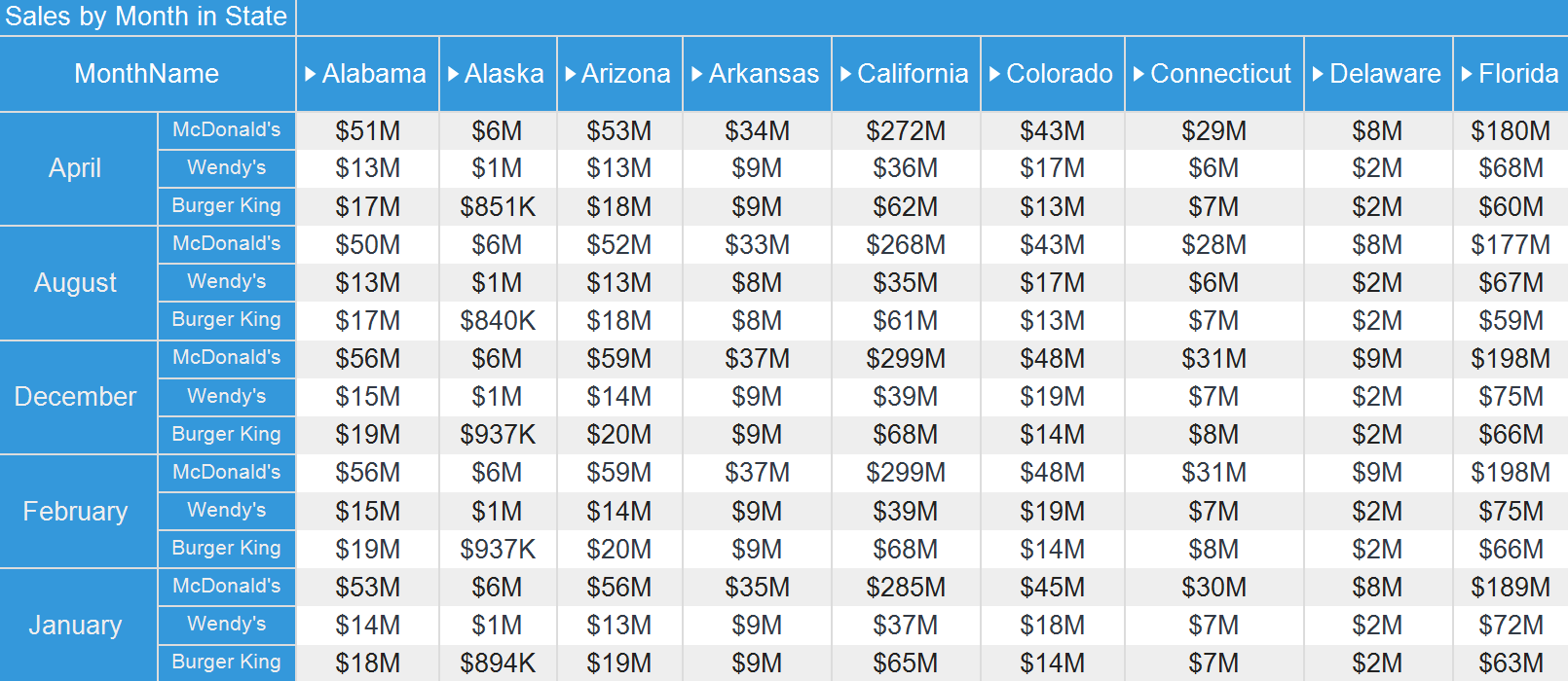
Let’s take a closer look at the main options and features of this element using the example of a dashboard with statistics for fast food restaurants in the United States, where we displayed the sales volume of such restaurants from each state using the Pivot Table.
Pivot Table
The Pivot table is an interactive tool for rapid and effective data visualization. It is widely used in business intelligence. Using it, you can perform calculations and create reports and dashboards. Unlike the usual table we wrote about earlier, it displays data a little differently: data value cells are formed at the intersection of columns and rows.Let’s take a closer look at the main options and features of this element using the example of a dashboard with statistics for fast food restaurants in the United States, where we displayed the sales volume of such restaurants from each state using the Pivot Table.
Let's start with the fact that the Pivot table editor contains 3 fields for adding data:
- Columns;
- Rows;
- Summary.
Columns
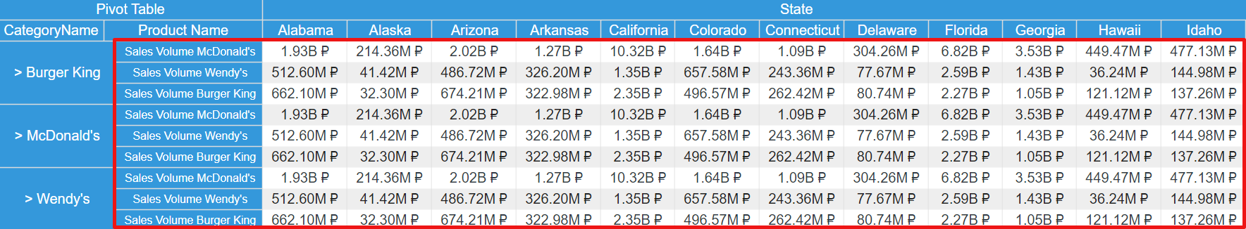
This field specifies the data displayed as column headers in the pivot table. Thus, having added the needed data here, we showed the names of states.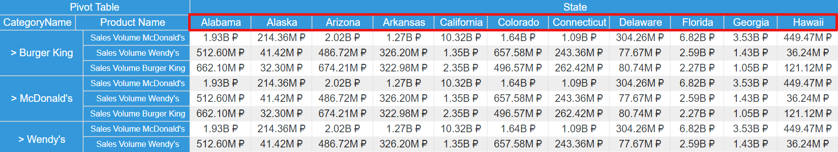
Rows
Headers of rows are specified here. Having dragged the data about the restaurants and products to this field, we displayed them in the pivot table as follows: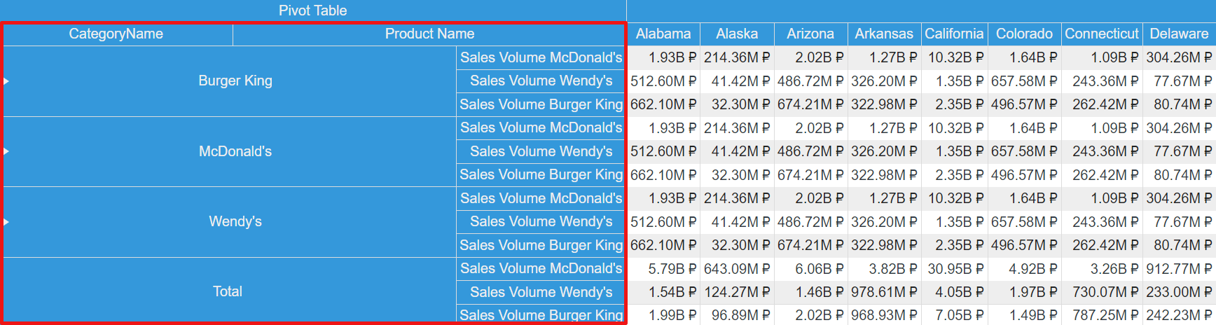
Important to know!
You can add several related data columns to Columns and Rows fields.
You can add several related data columns to Columns and Rows fields.
Summary
To display sales volume, we added data to the Summary field, since the values of the data columns from this field are displayed in the cells that are formed at the intersection of columns and rows.In addition, you can add several data columns to the Summary field, due to this your Pivot table will contain Total cells for each data field. As in our case, where we specified three data columns, having displayed sales volume:
- McDonald’s;
- Burger King;
- Wendy’s.
Important to know!
The Pivot table contains Total cells for each column and row. Values for these cells are displayed as a result of summing all the values of columns and rows.
The Pivot table contains Total cells for each column and row. Values for these cells are displayed as a result of summing all the values of columns and rows.
Now let's look at additional parameters of the Pivot table element.
You can find more information about the features of this parameter here.
You can read about how to create a dashboard with the Pivot Table element in the documentation.
Swap rows and columns
You can swap the Columns and Rows fields in the Pivot table editor. At the same time, they will retain the order in which data columns are placed.Top N
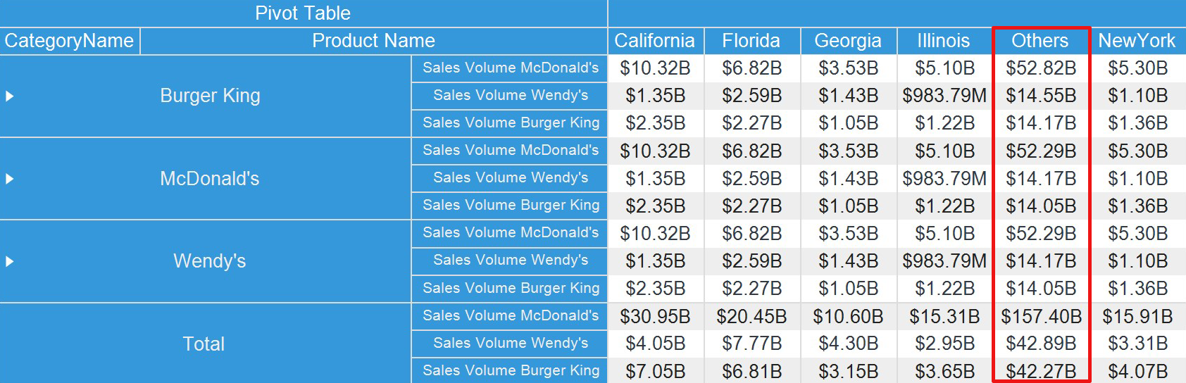
This option will help you create a list of maximum, minimum and summarized values in a Pivot table. Also, you can select the number of Top N values and the summary field, which values will be analyzed. Here is an example of a list of summarized (Others column) and maximum values that show the states with the highest sales volume.You can find more information about the features of this parameter here.
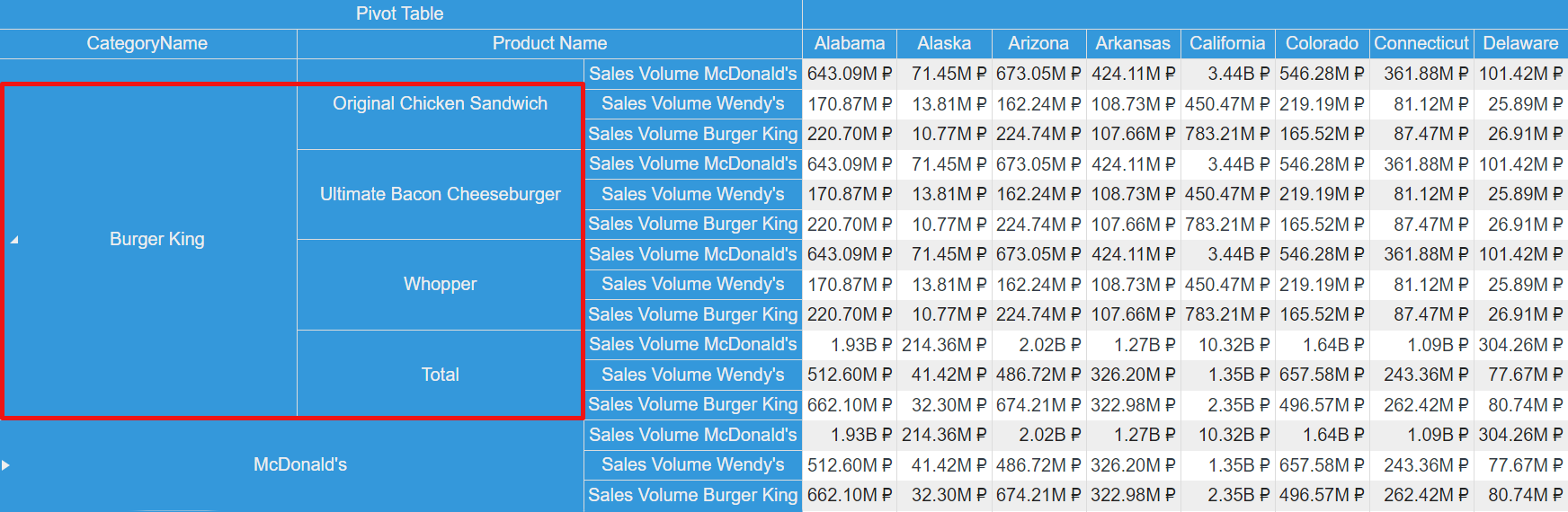
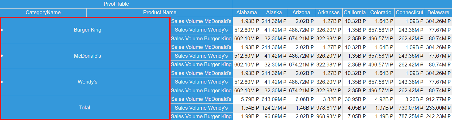
Nesting, Collapsing, and Expanding
In the PivotTable, you can nest rows or columns within others and then collapse and expand them when viewing. Also, the Expand property will help you to define the group expansion condition by default.Sorting rows and columns
This property allows you to sort columns and rows in ascending and descending order. If you select the None mode, the values of columns and rows will be displayed in the order they are in the data source. Below you can see an example of sorting a column in descending order.You can read about how to create a dashboard with the Pivot Table element in the documentation.
The next article will be about the Region map element. We will demonstrate to you some dashboards with the Region map and take a closer look at the main features and options of the element. Please contact us if you still have any questions about the Pivot table element or creating a dashboard with it. We’ll be glad to help you.