Greetings to all readers of the Stimulsoft blog! We continue the series of articles about the report designer and its basic components.
In the previous articles, we told you about:
Also, we’ve explored such dashboard elements as:
Today you’ll learn about another element – Progress, its basic features and how it is applied in dashboards.
The Progress has various features and settings, let’s take a closer look at the main of them.
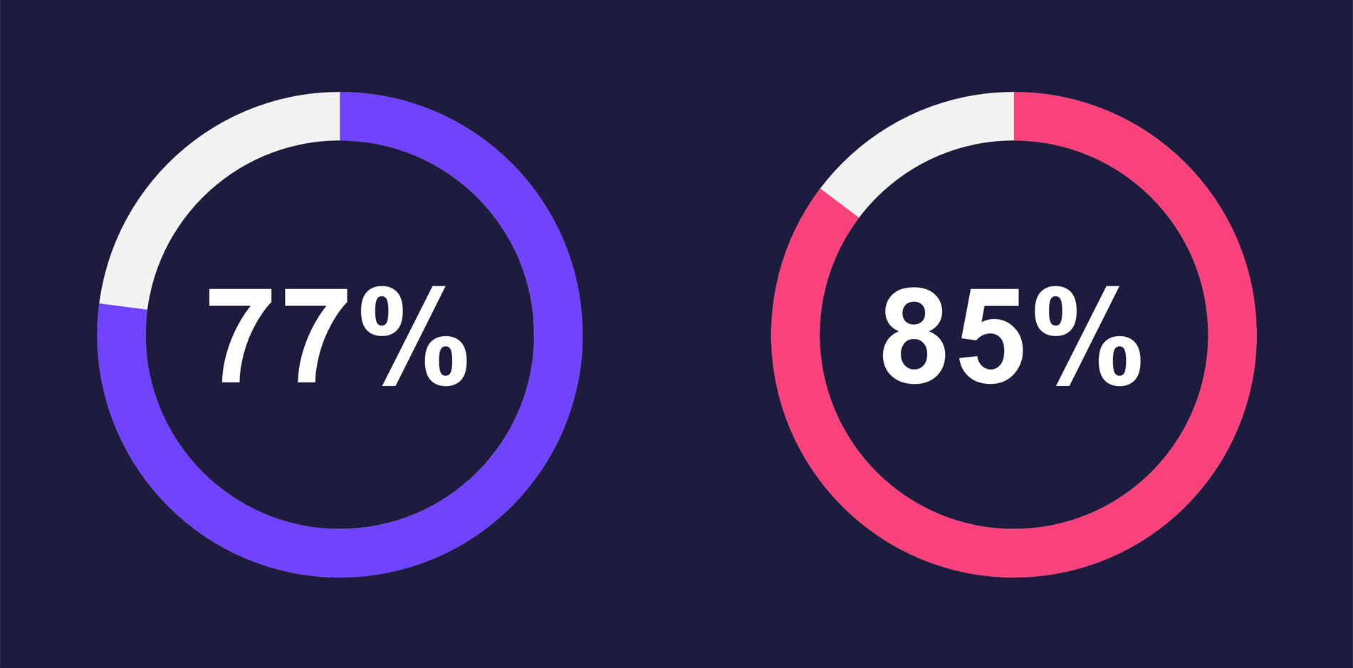
The first thing we’d like to start with is that it’s possible to enter data manually and add them from data sources in the element editor. Also, you can select a type of Progress using the Mode, where there are 3 options: Circle, Pie, and DataBars.
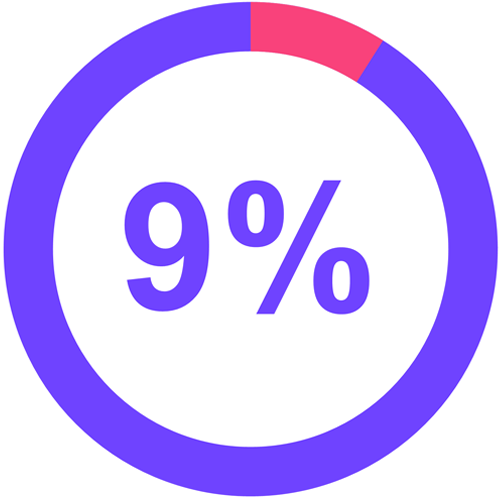
Circle

DataBars
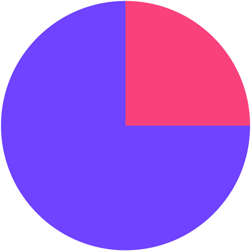
Pie
The Internet has drastically changed our lives. We’re always in touch with our relatives and friends, message each other every day, communicate using video calls, download books, movies, and music, and find the information we need in a split second – all this is due to the development of the World Wide Web. However, not all people on our planet use this wonderful invention: somewhere there are more Internet users, somewhere less, and somewhere they don’t exist at all. Using a dashboard, we showed the statistics on using the Internet worldwide. When creating it, we used the Progress element and showed the total percentage of Internet users worldwide. It’s worth noting that the data is quite old, and if you refer to it, only 35 % of all people in the world use the Internet. At the end of 2021, this figure was 65%.
As you know, oil is one of the most critical and expensive minerals. In the dashboard above, we displayed oil production statistics according to OPEC data for 2018-2019. It shows leading countries by production, the average and total global oil production rates, and the growth of black gold production for 2018-2019 that we displayed using the Progress element. As a result, we also calculated a relative share, having taken as basic data of oil production volume.
In the previous articles, we told you about:
- First run of the report designer, how and where to download and install it, about skill levels and how they exert influence over the application;
- Data connection, creating connections, a file data source, etc.
Also, we’ve explored such dashboard elements as:
- Table;
- Chart;
- Gauge;
- Online map;
- Indicator.
Today you’ll learn about another element – Progress, its basic features and how it is applied in dashboards.
Progress
Progress is a data visualization component that demonstrates the growth rate of a value relative to a target. In addition, it allows you to calculate the relative share of a value.The Progress has various features and settings, let’s take a closer look at the main of them.
The first thing we’d like to start with is that it’s possible to enter data manually and add them from data sources in the element editor. Also, you can select a type of Progress using the Mode, where there are 3 options: Circle, Pie, and DataBars.
Circle
DataBars
Pie
Using the Progress element in dashboards
Worldwide known Apple company, the largest producer of smartphones, computers, tablets, and software, has always been at the top of the rating of the most profitable companies in the world. According to pro forma data, the company’s revenue from January to March 2022 is almost $100 billion. We decided to show the company’s revenue from 2015 to 2021 in a dashboard. In this case, we used the Progress element. Using it, we displayed the statistics and calculated the relative share of the revenue for each year, having taken as the basic minimum and maximum indicators for the entire period.The Internet has drastically changed our lives. We’re always in touch with our relatives and friends, message each other every day, communicate using video calls, download books, movies, and music, and find the information we need in a split second – all this is due to the development of the World Wide Web. However, not all people on our planet use this wonderful invention: somewhere there are more Internet users, somewhere less, and somewhere they don’t exist at all. Using a dashboard, we showed the statistics on using the Internet worldwide. When creating it, we used the Progress element and showed the total percentage of Internet users worldwide. It’s worth noting that the data is quite old, and if you refer to it, only 35 % of all people in the world use the Internet. At the end of 2021, this figure was 65%.
As you know, oil is one of the most critical and expensive minerals. In the dashboard above, we displayed oil production statistics according to OPEC data for 2018-2019. It shows leading countries by production, the average and total global oil production rates, and the growth of black gold production for 2018-2019 that we displayed using the Progress element. As a result, we also calculated a relative share, having taken as basic data of oil production volume.
You can read about how to create a dashboard with the Progress element in the documentation.
The next article will be about the Pivot table. We will look at several samples of dashboards in which this element is used and explore its basic features and settings.This email address is being protected from spambots. You need JavaScript enabled to view it. if you have any questions regarding the Progress element or creating a dashboard with it. We’ll be glad to help you.
The next article will be about the Pivot table. We will look at several samples of dashboards in which this element is used and explore its basic features and settings.