Last time we told you about data connection in the report designer. This time you will know about the Table element and how to create a dashboard with it. But first of all, let’s figure out what the dashboard is and what it is intended for.
The dashboard is an informational panel for visualization and data analytics, usually presented in the form of key performance indicators. The most famous example of a dashboard is car gauges that help you track driving speed, engine temperature, stock and gasoline consumption, and much more. People of various professions use dashboards. For example, Internet marketing specialists use dashboards to track the effectiveness of advertising campaigns, and managers use them to control the workload and plan staff work. This tool is widely used in education, healthcare, finance, and industry.
For example, this dashboard shows key performance indicators of hospital performance. Using it, a manager of a medical institution can track the length of patient stay, average treatment costs, hospital-acquired infections, etc. Stimulsoft report designer contains a range of elements for creating dashboards, and today we will introduce you to one of them.
Table
The table is an interactive data analysis that allows you to display data in the dashboard in columns and rows. You can filter data, sort them, replace values and calculate running totals in it. Data fields and values in the table are customized in the table’s editor.Table editor
You can customize a selected data field in the table editor: duplicate it, rename or remove it. In addition, you can remove all data fields.Besides, you can specify various types of values for a selected data field in the table editor and enable or disable the display of selected columns.
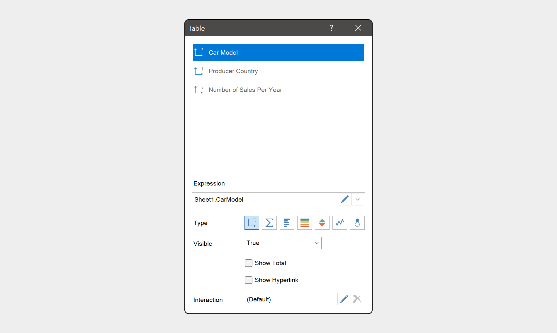
The Table editor has other features. For example, when editing data fields in the table you can:
- show value total;
- select the function that will be used to calculate the total for the current data field;
- show hyperlink for values of the current field.
It’s worth noting that the order of fields in the editor from top to bottom displays the sequence of their output in the table element. To change the order of fields output in the table, you should drag a field to the place you want to. At the same time, you can group data in the table.
Grouping data in the table
Let’s imagine, your table contains three data fields: Car model, Producer country, and Number of sales per year. You want to group your data by Producer country field. To do this, you should switch element type from Dimension to Measure for Number of sales per year field. After that, you will get the result you want.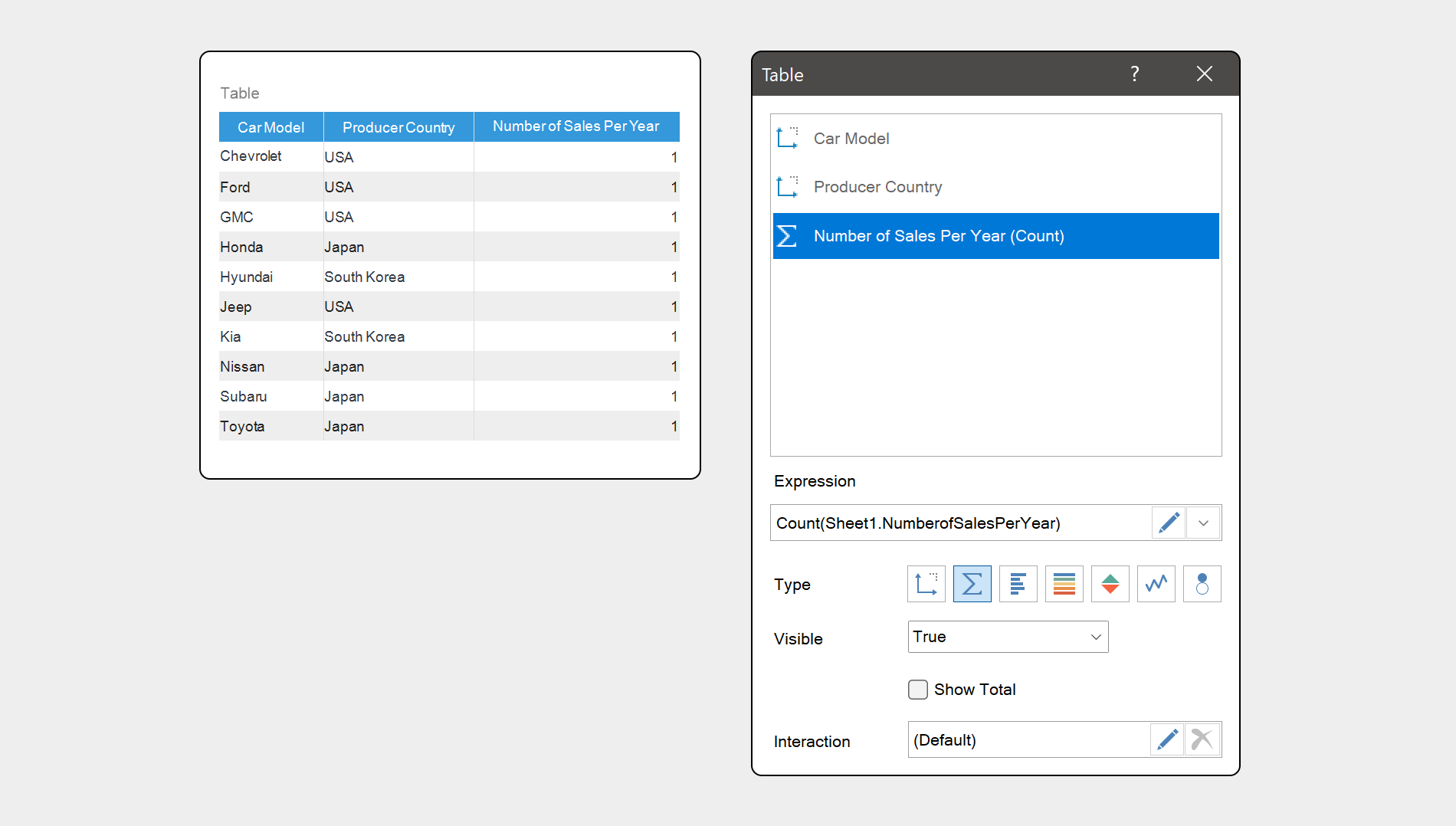
At the same time, you can sort and filter data fields in the table using the header menu.
Header menu
When adding data fields to the table, a header is automatically created for each of them. All headers contain a drop-down menu, in which you will find the settings using which you can sort and filter values of table columns.
Also, you can change the table itself, for example, its size and size of columns in it.
Also, you can change the table itself, for example, its size and size of columns in it.
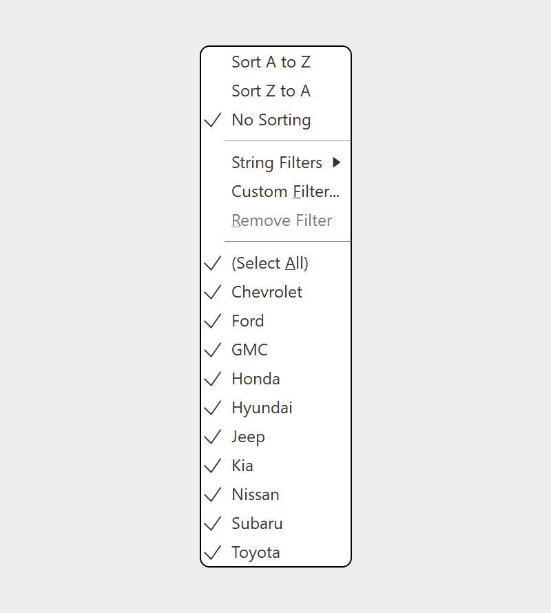
Table size
You should select the element and manually stretch it in width and height to change table size. By default, the Size Mode property is set to the Autosize value, which sets the minimum column width. However, if you set the Fit value, the width of columns will be changed.In addition to all the listed features of the table, you can also add images to it.
Image in the Table
You can add images to the table both from your data sources and the data obtained by URL. To do this, you should add a data field to the list of the table fields. Important to know!If a data field contains links to images, they will be displayed in the table as text. To display images in the table, you should select a data field with URL images in the element editor, then apply the Image() function to the expression of this field. It will look like this: Image(DataSource.DataColumn1). However, if your URLs redirect to the images of SVG type, you will need to specify the height and width of the image in the function arguments - Image(DataSource.DataColumn, height, width). You can read about how to create a dashboard with a table in our documentation.
Next time you will know about the features of the Chart element. If you have any questions regarding the table or creating a dashboard with it, feel free to contact us. We will be glad to help you.