We are pleased to announce the release of the new version Stimulsoft Reports and Stimulsoft Dashboards 2020.5.1, which is now available for download. This release comes with several improvements including .NET 5.0 compatibility, ability to connect to Google Firebase, support for the Box and Whisker chart, etc.
Expressions in properties
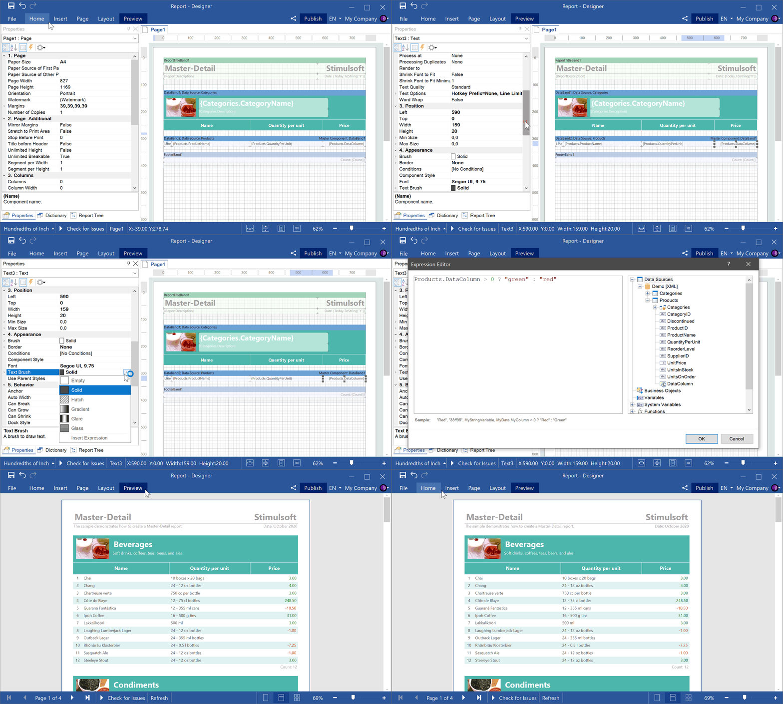
Starting with version 2020.5.1, you can use expressions as values for some properties of report components and dashboards. Depending on the result of calculating the expression, the component property will be set to a specific value. By using expressions as a property value, you can customize the condition of printing a component, the style of its content, and more.
.NET 5.0 compatibility
We are glad to announce that starting from version 2020.5.1 we have added support for the .NET 5.0 RC1 framework for our WinForms and WPF components. Also, the minimum required .NET Core version was increased from 3.0 to 3.1; the minimum version for the .NET Framework remained 4.5. Our Web components support .NET Standard 2.1, which is backward compatible with the .NET 5.0 framework. We closely follow the development of the .NET platform and do our best to ensure that our reporting and analytical components are compatible with the latest technologies.
Bubbles
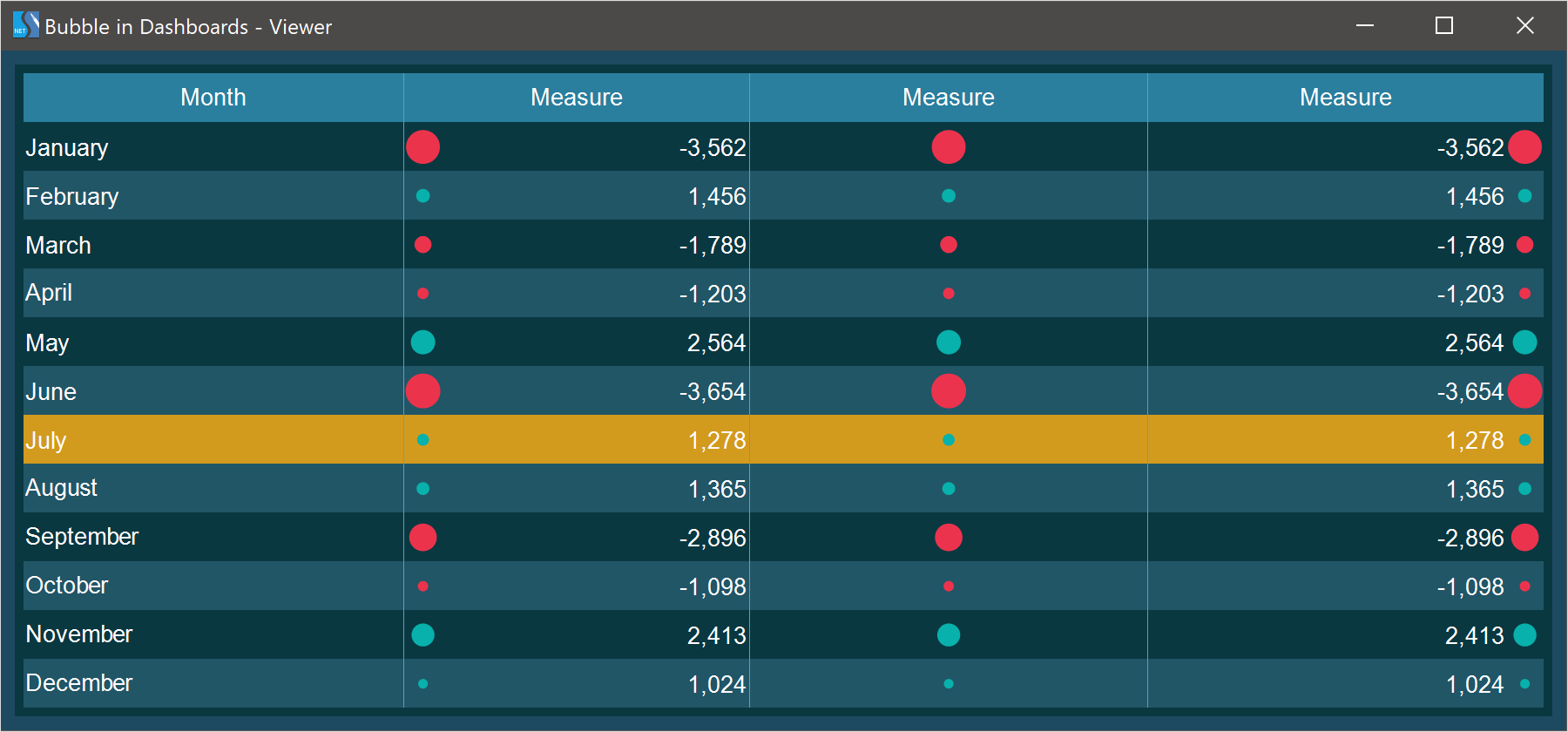
For the Table element on the dashboard, we added a new column type - Bubbles. Each value in the data column will be represented as a separate bubble, the size of which depends on the value that you set. Bubble colors for positive and negative values can be specified in the style of the current element or by the user in the element editor.
Sharing reports on Facebook and Twitter
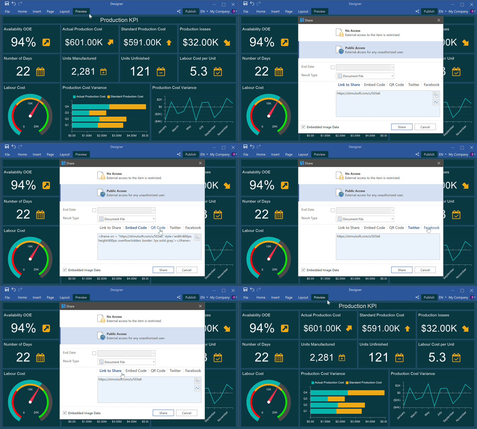
In the 2020.5.1 release, we added the Share command. Sharing your report or dashboard is not as easy as ABC! Also, now you can publish it directly to a social network - Facebook or Twitter.
The new chart - Box and Whisker
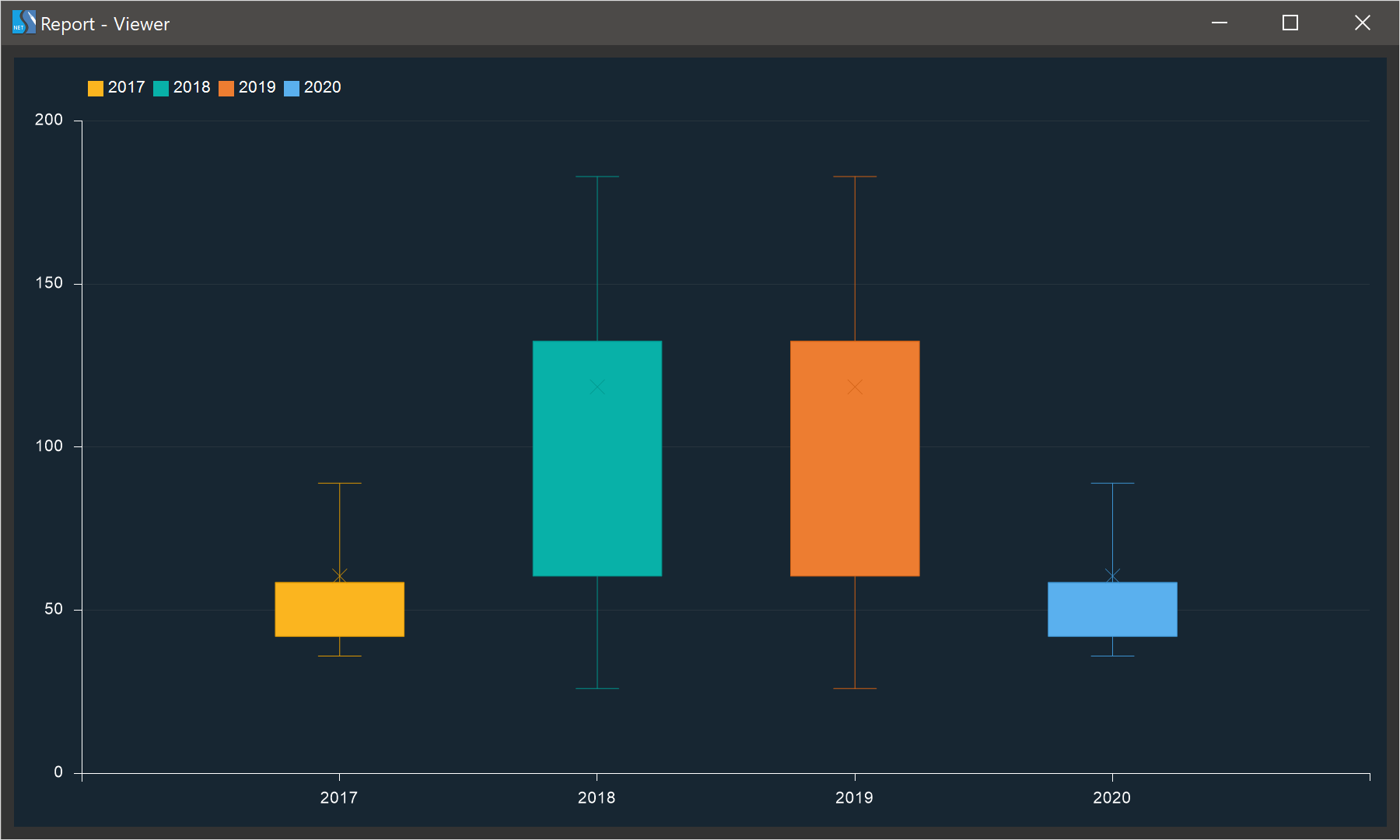
In the 2020.5.1 release, we have added a new Box and Whisker chart. You may use this type of chart to display groups of numeric data using quartiles. Just add a diagram to your report or dashboard and analyze your data.
The new adapter - Google Firebase
Starting with the 2020.5.1 release, you can get data from Google Firebase. When creating a new data source, select the connection type - Firebase, specify the Data URL and Database secret. After that, all data from the specified data storage will be converted into tables, based on which you may design reports and dashboards.
The new data source - GIS
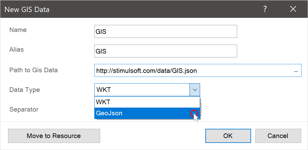
In the last release, we added the ability to display graphical information on an online map. In the new release 2020.5.1, we decided to go further and developed the ability to create a GIS data source based on WKT or GeoJSON files. You can use the obtained data in online maps to display graphical information.
The new functionality for GIS
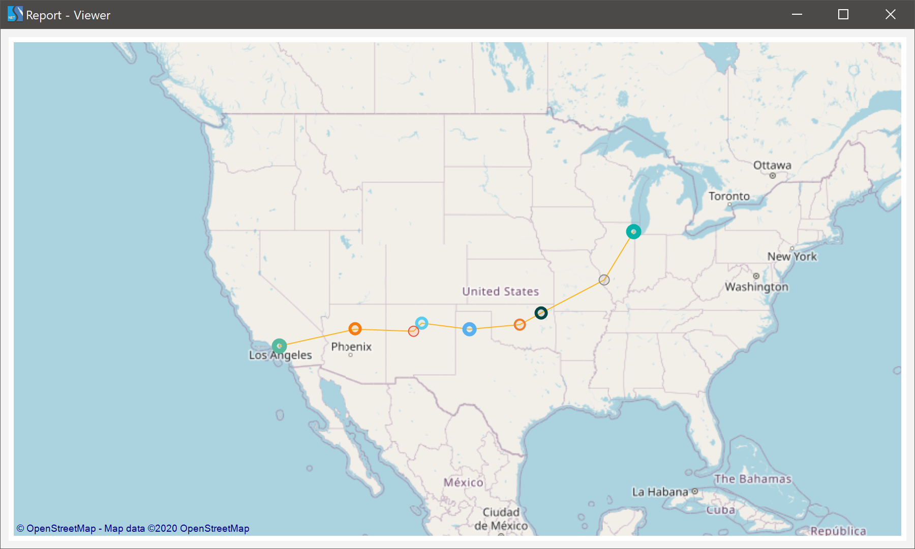
In release 2020.5.1, we have improved the GIS map, and now you cannot only display primitives on an online map but also define their color and size. To do this, in the online map editor, you should specify the data columns with the color and size encoding in the appropriate fields. Also, for Point primitives, you can display tooltips as additional information. To make this work, you should specify the data column with the description text in the Description field of the editor. Then, when you hover the cursor over a point on the map, you will see the additional information in the tooltip.
The updated Image element
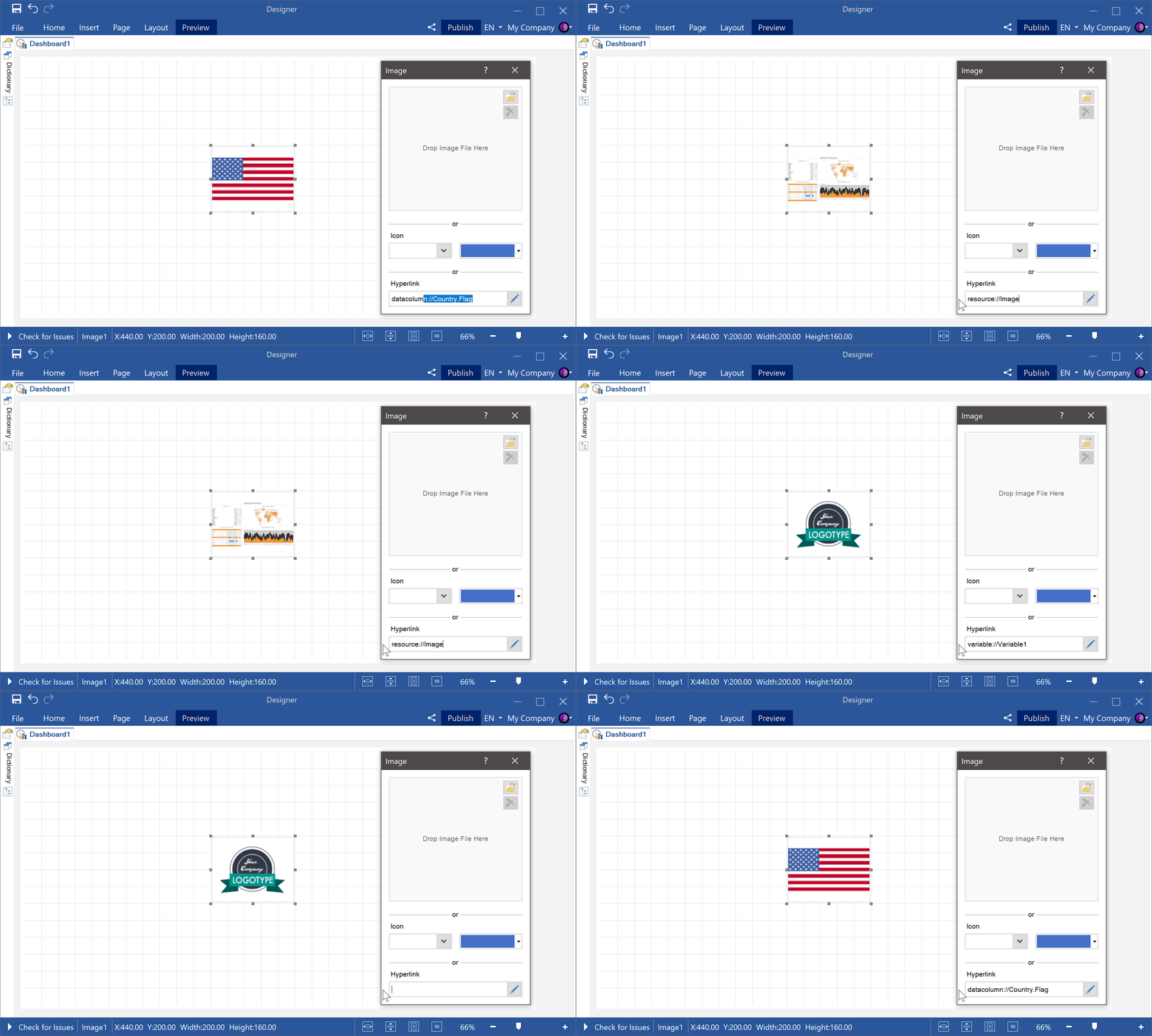
Starting with the 2020.5.1 release, we have improved the Image element for dashboards. This dashboard element has changed from static to dynamic. Now you can get images from data columns, variables, and files using hyperlinks.
Conditional formatting
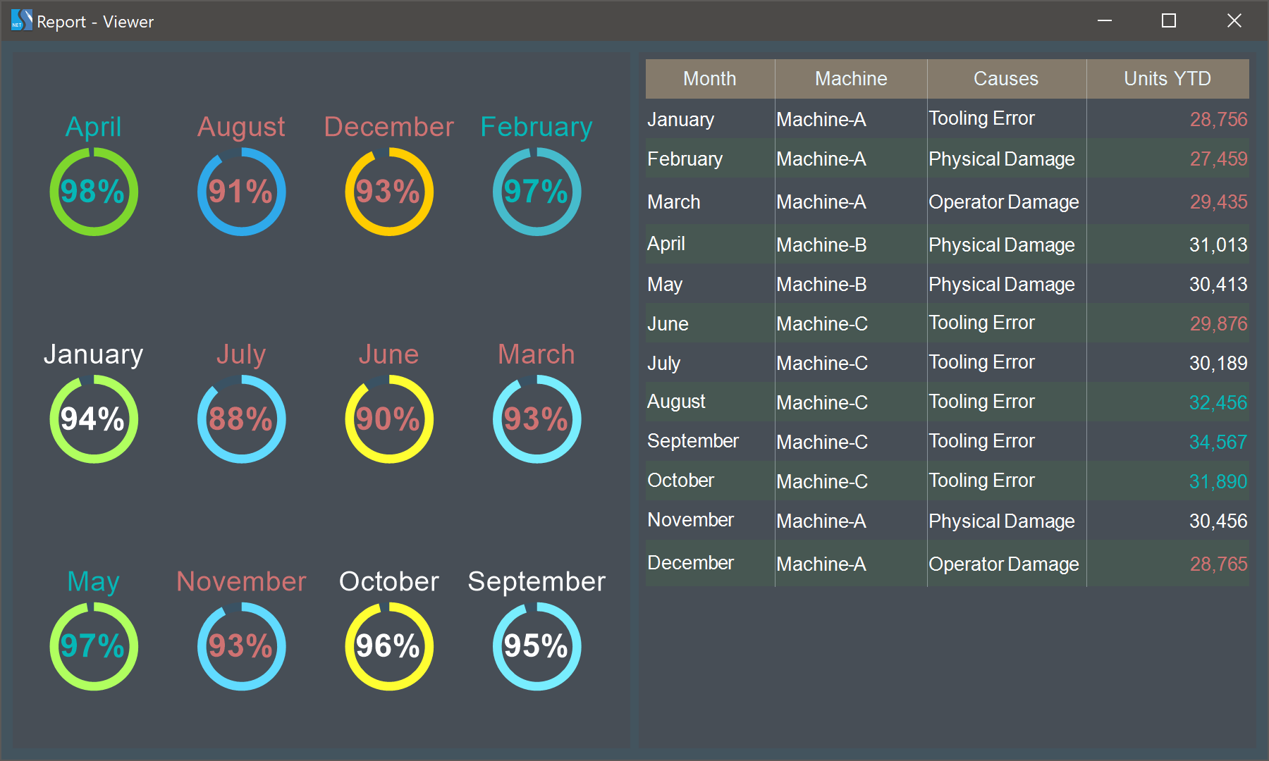
In this release, we have expanded the data analysis capabilities for the Table and Progress elements of the dashboard. You can now apply conditional value formatting to these elements.
Sparkline styles
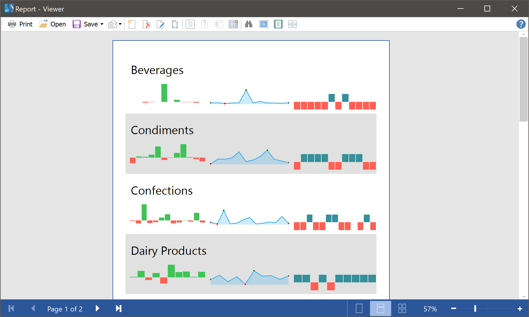
In the previous release, we added a new component for reporting - Sparkline. In this version, you can apply styles to this component. Create a style of the Indicator type, configure it, and use the Component Style property to assign this style to the sparkline.
Sparkline colors in dashboards
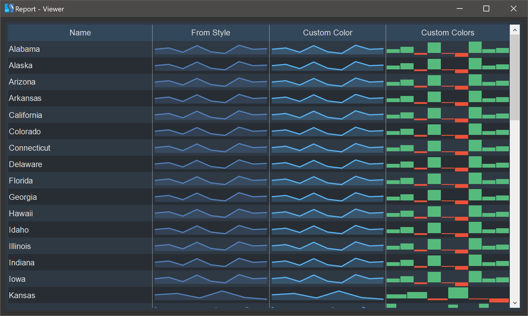
You can use sparklines in dashboard tables from the first release of the product. By default, the colors for table sparklines are assigned from the element style. In the 2020.5.1 release, we added the ability to customize table sparkline colors from the element editor. Open the Table editor, select the sparkline column, set the Color parameter to Custom, and specify the colors for the values of this column.
The new map - Oceania
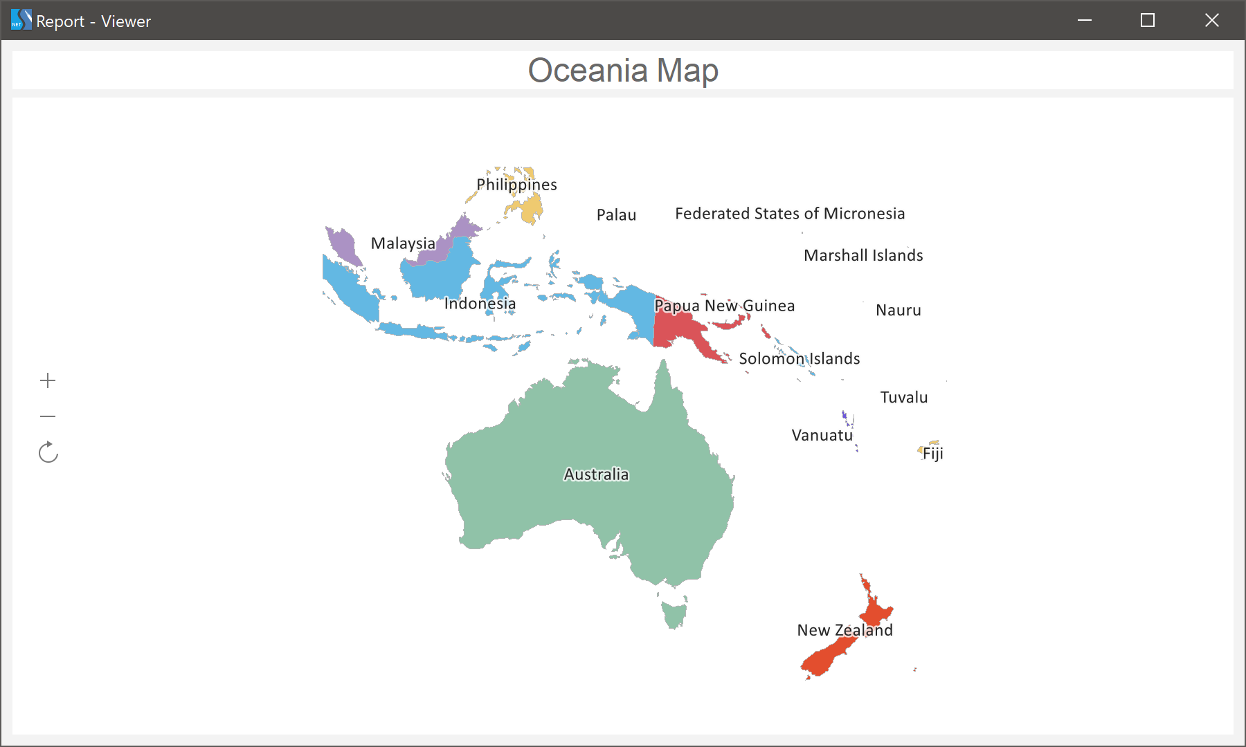
In the release 2020.5.1, we have added a new type of a regional map - Oceania. Now you can use this map for designing reports and analytical panels.
ZUGFeRD v2.1 support
Since 2016, Stimulsoft components support the ZUGFeRD format when exporting to PDF. In the 2020.5.1 release, we added support for the new specification of this format - ZUGFeRD v2.1.
Expressions in properties
Starting with version 2020.5.1, you can use expressions as values for some properties of report components and dashboards. Depending on the result of calculating the expression, the component property will be set to a specific value. By using expressions as a property value, you can customize the condition of printing a component, the style of its content, and more.

.NET 5.0 compatibility
We are glad to announce that starting from version 2020.5.1 we have added support for the .NET 5.0 RC1 framework for our WinForms and WPF components. Also, the minimum required .NET Core version was increased from 3.0 to 3.1; the minimum version for the .NET Framework remained 4.5. Our Web components support .NET Standard 2.1, which is backward compatible with the .NET 5.0 framework. We closely follow the development of the .NET platform and do our best to ensure that our reporting and analytical components are compatible with the latest technologies.
Bubbles
For the Table element on the dashboard, we added a new column type - Bubbles. Each value in the data column will be represented as a separate bubble, the size of which depends on the value that you set. Bubble colors for positive and negative values can be specified in the style of the current element or by the user in the element editor.

Sharing reports on Facebook and Twitter
In the 2020.5.1 release, we added the Share command. Sharing your report or dashboard is not as easy as ABC! Also, now you can publish it directly to a social network - Facebook or Twitter.

The new chart - Box and Whisker
In the 2020.5.1 release, we have added a new Box and Whisker chart. You may use this type of chart to display groups of numeric data using quartiles. Just add a diagram to your report or dashboard and analyze your data.

The new adapter - Google Firebase
Starting with the 2020.5.1 release, you can get data from Google Firebase. When creating a new data source, select the connection type - Firebase, specify the Data URL and Database secret. After that, all data from the specified data storage will be converted into tables, based on which you may design reports and dashboards.
The new data source - GIS
In the last release, we added the ability to display graphical information on an online map. In the new release 2020.5.1, we decided to go further and developed the ability to create a GIS data source based on WKT or GeoJSON files. You can use the obtained data in online maps to display graphical information.

The new functionality for GIS
In release 2020.5.1, we have improved the GIS map, and now you cannot only display primitives on an online map but also define their color and size. To do this, in the online map editor, you should specify the data columns with the color and size encoding in the appropriate fields. Also, for Point primitives, you can display tooltips as additional information. To make this work, you should specify the data column with the description text in the Description field of the editor. Then, when you hover the cursor over a point on the map, you will see the additional information in the tooltip.

The updated Image element
Starting with the 2020.5.1 release, we have improved the Image element for dashboards. This dashboard element has changed from static to dynamic. Now you can get images from data columns, variables, and files using hyperlinks.

Conditional formatting
In this release, we have expanded the data analysis capabilities for the Table and Progress elements of the dashboard. You can now apply conditional value formatting to these elements.

Sparkline styles
In the previous release, we added a new component for reporting - Sparkline. In this version, you can apply styles to this component. Create a style of the Indicator type, configure it, and use the Component Style property to assign this style to the sparkline.

Sparkline colors in dashboards
You can use sparklines in dashboard tables from the first release of the product. By default, the colors for table sparklines are assigned from the element style. In the 2020.5.1 release, we added the ability to customize table sparkline colors from the element editor. Open the Table editor, select the sparkline column, set the Color parameter to Custom, and specify the colors for the values of this column.

The new map - Oceania
In the release 2020.5.1, we have added a new type of a regional map - Oceania. Now you can use this map for designing reports and analytical panels.

ZUGFeRD v2.1 support
Since 2016, Stimulsoft components support the ZUGFeRD format when exporting to PDF. In the 2020.5.1 release, we added support for the new specification of this format - ZUGFeRD v2.1.