Greetings to all readers of the Stimulsoft blog! We continue the series of articles about the components of the report designer. Last time you learned about the Image element: its settings, features of adding, and the use in data analytics. Today we’re going to take a detailed look at the dashboard filtering elements from the Filter group.
When using them, data is filtered on all components of a dashboard by default. However, you can apply filtering using these elements only to individual components. The Group property will help you with this.
You can use the same way to create interaction between components that are placed on different dashboards. You can read about how to work with this property in our documentation.
Let’s go to the data filtering elements.
Time period can set in 3 modes:
The Condition parameter is available only if the Single mode is selected. A parameter value is a logical operation that determines the continuation of the date range from the current date. For example, if the Greater than value is selected, a range of an element by default will include all subsequent dates from the current operating system date.
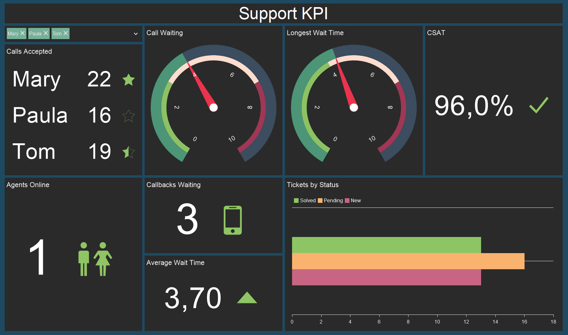
Let’s analyze data filtering using this category of elements. Below you can see a dashboard that displays support staff KPI.
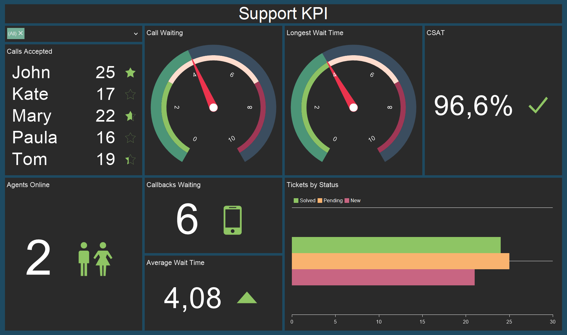
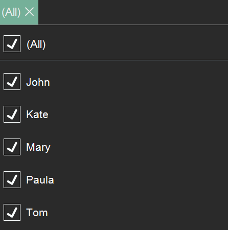
So, we add the Combo Box element to the dashboard, specify the names of the employees. After, open the viewer, find and hide names of some employees. Let’s hide John and Kate, for example.
As you noticed, the data on the dashboard changed after the filtering: KPI decreased since we don’t take into account the contribution of John and Kate anymore.
So, now let’s take a closer look at the hierarchical lists category.
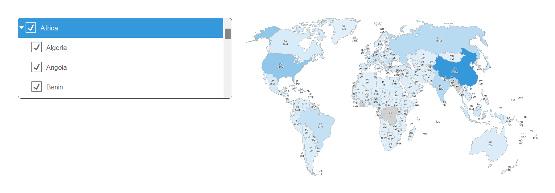
As you can see, the data are presented as a hierarchy of continents and countries that allows you to filter them in the appropriate order. As well as in the Simple lists category, data are filtered by hiding certain values. The Tree View Box is presented as a drop-down menu as in the case with the Combo Box element, and the Tree View is presented as a simple list as the List Box element. The same applies to the height of elements when collapsing in the viewer.
As well as with Simple lists, you can not only hide values in the Tree View Box but also remove them in comparison with the Tree View.
In our documentation, you can read about how to create a dashboard with the elements: Combo Box, Date Picker, List Box, Tree View, Tree View Box.
Elements of the Filter group
Our report designer contains the Filter group with a set of elements which allow you to filter data on a dashboard:- Combo Box;
- Date Picker;
- List Box;
- Tree View Box;
- Tree View.
When using them, data is filtered on all components of a dashboard by default. However, you can apply filtering using these elements only to individual components. The Group property will help you with this.
Group
The property allows you to divide dashboard components into groups when filtering data. For example, you want to place two different tables on a dashboard and filter data in them. To do this, you should divide them into groups using the Group property, having specified different values for them. After that you can filter them separately from each other on one dashboard.You can use the same way to create interaction between components that are placed on different dashboards. You can read about how to work with this property in our documentation.
Let’s go to the data filtering elements.
Data filtering elements in the report designer
There are three categories of data filtering in our report designer:- Date Picker;
- Simple lists;
- Hierarchical lists.
Date Picker
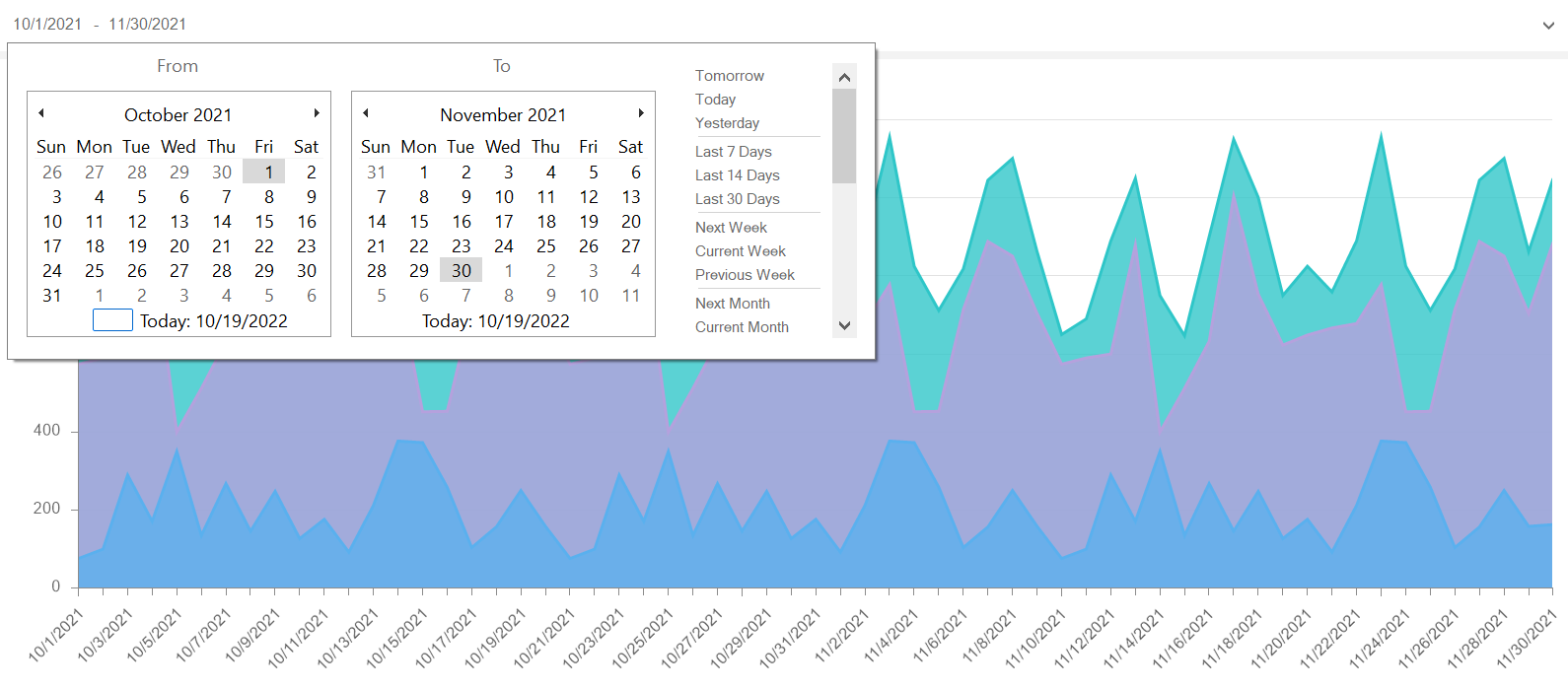
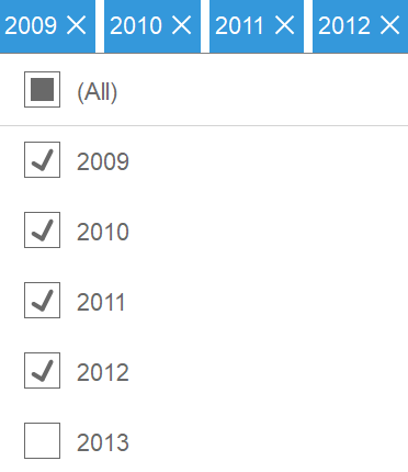
The Date Picker element allows you to set a time period and filter data on a dashboard using it. Below is a dashboard with sales statistics from October to November 2021. Using the DatePicker element, you can change dates and observe the statistics, for example, from March to June or from May to October.Time period can set in 3 modes:
- Single. If you select the Single mode, the current date of your operating system and the corresponding range will be set based on a condition you select in the Condition parameter;
- Range. This mode automatically sets a range of the current month;
- Auto Range. The mode sets a time period from the earliest date specified in a data source to the latest date.
The Condition parameter is available only if the Single mode is selected. A parameter value is a logical operation that determines the continuation of the date range from the current date. For example, if the Greater than value is selected, a range of an element by default will include all subsequent dates from the current operating system date.
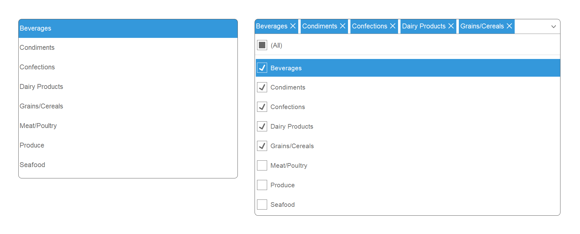
Simple lists
Simple lists contain the List Box and Combo Box elements. The Combo Box element is a drop-down menu that includes a list of values. In the List Box element, values are presented as a simple list without any drop-down menu. Their main difference between each other is that when opening the Preview tab and when the viewer is collapsed, the height of the List Box element changes, while the Combo box does not. In addition, in the Combo Box, you can not only hide values but also remove them, while you can’t do it in the List Box element.Let’s analyze data filtering using this category of elements. Below you can see a dashboard that displays support staff KPI.
So, we add the Combo Box element to the dashboard, specify the names of the employees. After, open the viewer, find and hide names of some employees. Let’s hide John and Kate, for example.
As you noticed, the data on the dashboard changed after the filtering: KPI decreased since we don’t take into account the contribution of John and Kate anymore.
So, now let’s take a closer look at the hierarchical lists category.
Hierarchical lists
In comparison with the previous data filtering elements, Tree View and Tree View Box allow you to create a hierarchy of values based on which you can filter dashboard data. Below you can see an example of this element work.As you can see, the data are presented as a hierarchy of continents and countries that allows you to filter them in the appropriate order. As well as in the Simple lists category, data are filtered by hiding certain values. The Tree View Box is presented as a drop-down menu as in the case with the Combo Box element, and the Tree View is presented as a simple list as the List Box element. The same applies to the height of elements when collapsing in the viewer.
As well as with Simple lists, you can not only hide values in the Tree View Box but also remove them in comparison with the Tree View.
Additional features
All mentioned elements contain parameters of additional customization in the editor - Selection Mode, Show (All) Value and Show Blanks:- Selection Mode. This parameter allows you to specify one or several values to filter data. That is, if you select the Single mode, data will be filtered by one current value of an element. If you select the Multi mode, data will be filtered by all selected values;
- Show (All) Value. If you activate the parameter, the All value will be displayed in the viewer above a selected element. When activating it, all values of the element will be selected;
- Show Blanks. Using the parameter, you’ll be able to show empty values from your data source in the list of values of a selected element as one empty value.
In our documentation, you can read about how to create a dashboard with the elements: Combo Box, Date Picker, List Box, Tree View, Tree View Box.
In the next article, we will tell you about the Text element. If you still have any questions about this article or creating a dashboard with the use of the data filtering elements, please contact us. We’ll be glad to help you.