We continue to acquaint our users with the changes and additions of the new version of Stimulsoft products 2021.3. The next new functionality to create dashboards is setting icons for indicator series.
This way, if, when creating a dashboard, a creator uses series in the Indicator element with an icon, it has two options:
What is it for?
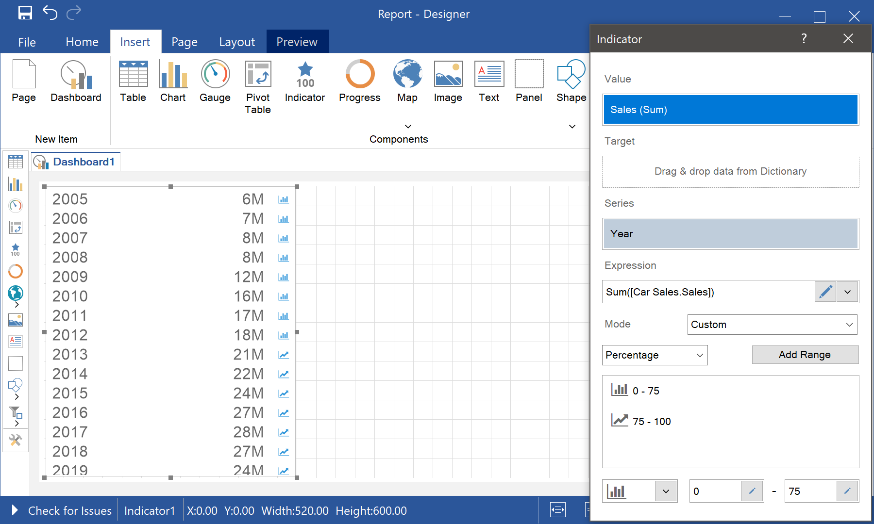
The Indicator is an analytics element, which is often used in dashboards to display the sum of values, deviation values, etc. In addition, it is used to display several values in the case of using series. In other words, when working with one value, the set of icons is quite diverse, and in the case of using series, you were able to apply only five preset kits of icons.This way, if, when creating a dashboard, a creator uses series in the Indicator element with an icon, it has two options:
- create a lot of components on a dashboard with the risk of the lack of place there;
- work only with the proposed set of icons, limiting the choice of icon for a specific situation and making data display less visual and understandable.
What's new?
From the 2021.3 version, you can add ranges for indicator values with series and define icons for these ranges. Accordingly, the icon for the indicator record will correspond to the icon of the range to which this record belongs. Moreover, the borders of ranges can be defined as relative or absolute values.You should know that the color of the indicator style is used for icons, so if you want to change it, you can do this when editing the style or using conditional formatting.
We hope this article will help you understand the new capabilities of Stimulsoft products for report and dashboard creation. If you have any questions, feel free to contact us – we will be glad to help you.