We start the series of articles about new features of the version of Stimulsoft Reports and Dashboards 2022.3 that was released on June 21, 2022.
The ribbon chart is created similarly to the pictorial stacked chart, and the difference is that argument values are sorted in descending order. Thus, the maximum value of the argument is always at the top of the graphic element of the chart. Then, between the values of one series from various arguments, the ribbon is created that displays the transition of one value to another. Thus, it’s enough to look at the chart to understand the tendencies of changing values of a series, their dynamics, and trends, as well as to compare data of different series with each other.
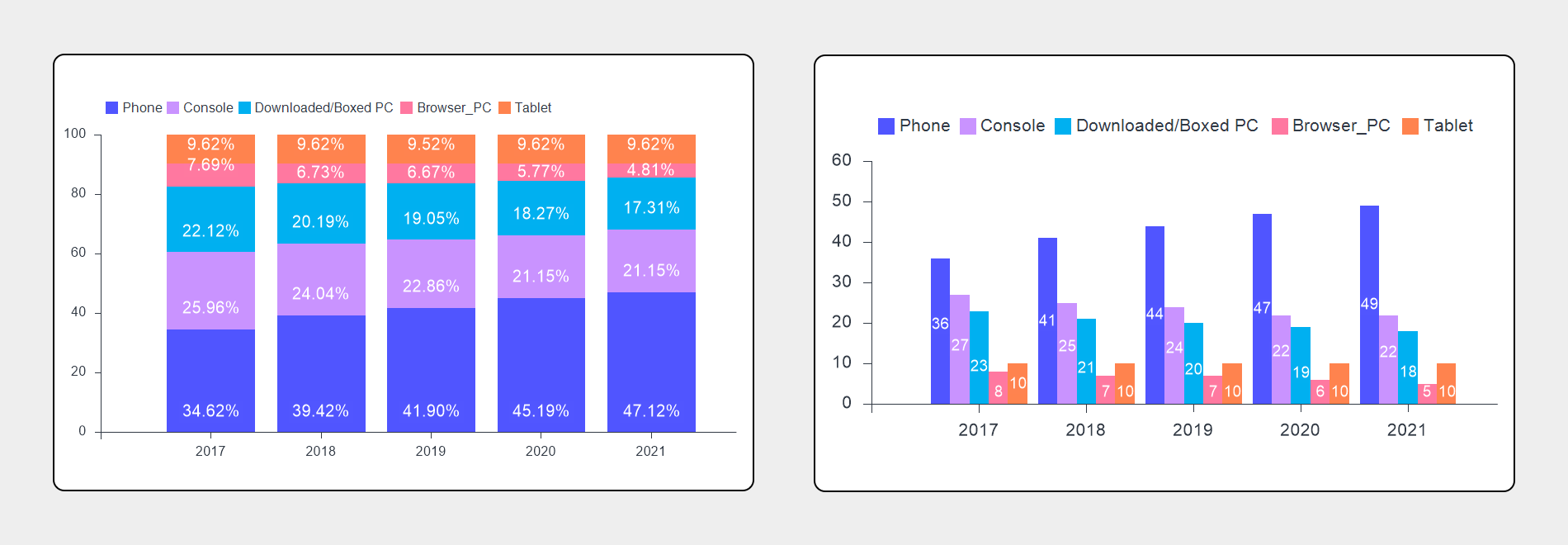
Ribbon chart
Today we will tell you about a new chart type – Ribbon. This chart type is an excellent component for analyzing and visualizing data. The predecessor of the ribbon chart can be called a stacked column chart or stacked area. However, the ribbon type is universal for visualizing and analyzing data. In the example of the stacked column chart, let me remind you that stacked means that argument values in the chart area are displayed not near each other but on top of each other. Thus, one graphic chart element with the number of segments is created. Each segment is the series value for a particular argument.The ribbon chart is created similarly to the pictorial stacked chart, and the difference is that argument values are sorted in descending order. Thus, the maximum value of the argument is always at the top of the graphic element of the chart. Then, between the values of one series from various arguments, the ribbon is created that displays the transition of one value to another. Thus, it’s enough to look at the chart to understand the tendencies of changing values of a series, their dynamics, and trends, as well as to compare data of different series with each other.
Adding to a report
This chart type is added to a report as well as any other chart type. To do this, you should select the Ribbon type from the Histogram category on the Insert tab or the Toolbox in the report designer and after placing the component in your report. Next, you should fill in data columns of values and arguments.Placing the element on a dashboard
To use ribbon charts in dashboards, you should place the Chart element in a dashboard and specify data columns for fields of values and arguments and select the Ribbon chart type.Generally, the process of creating this chart in reports or dashboards is similar to creating charts of other types. It’s important to understand the algorithm of data analysis and the display of results in a ribbon chart.
To better understand work with this new chart type, we have prepared a thematic video on our YouTube channel.
If you have any questions, contact us or ask a question on the forum.