Recently, we released the new version of Stimulsoft Reports and Dashboards (version 2022.4), in which we implemented new ways to visualize data - 3D charts. Let's talk about this in more detail.
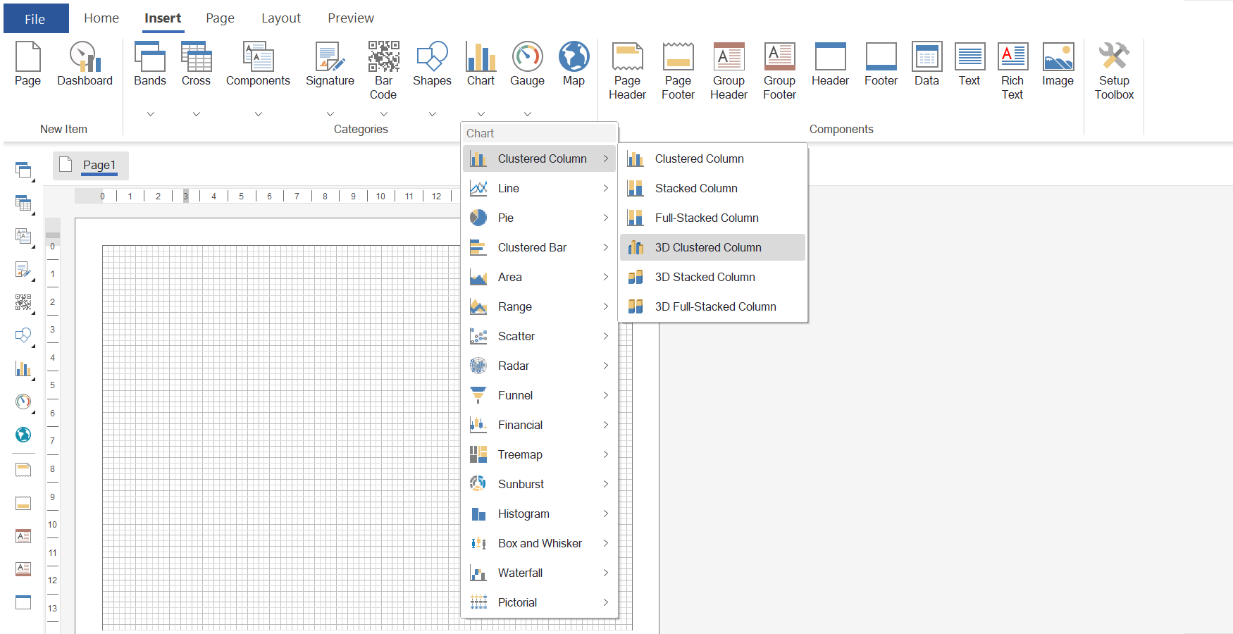
So, we have added the following types of 3D clustered column charts to Stimulsoft - 3D Clustered Column, 3D Stacked Column, and 3D Full-stacked Column. In terms of data analysis, 3D charts have no difference from 2D charts. Compared to regular charts, the difference is only in a way the chart element is visualized in space.
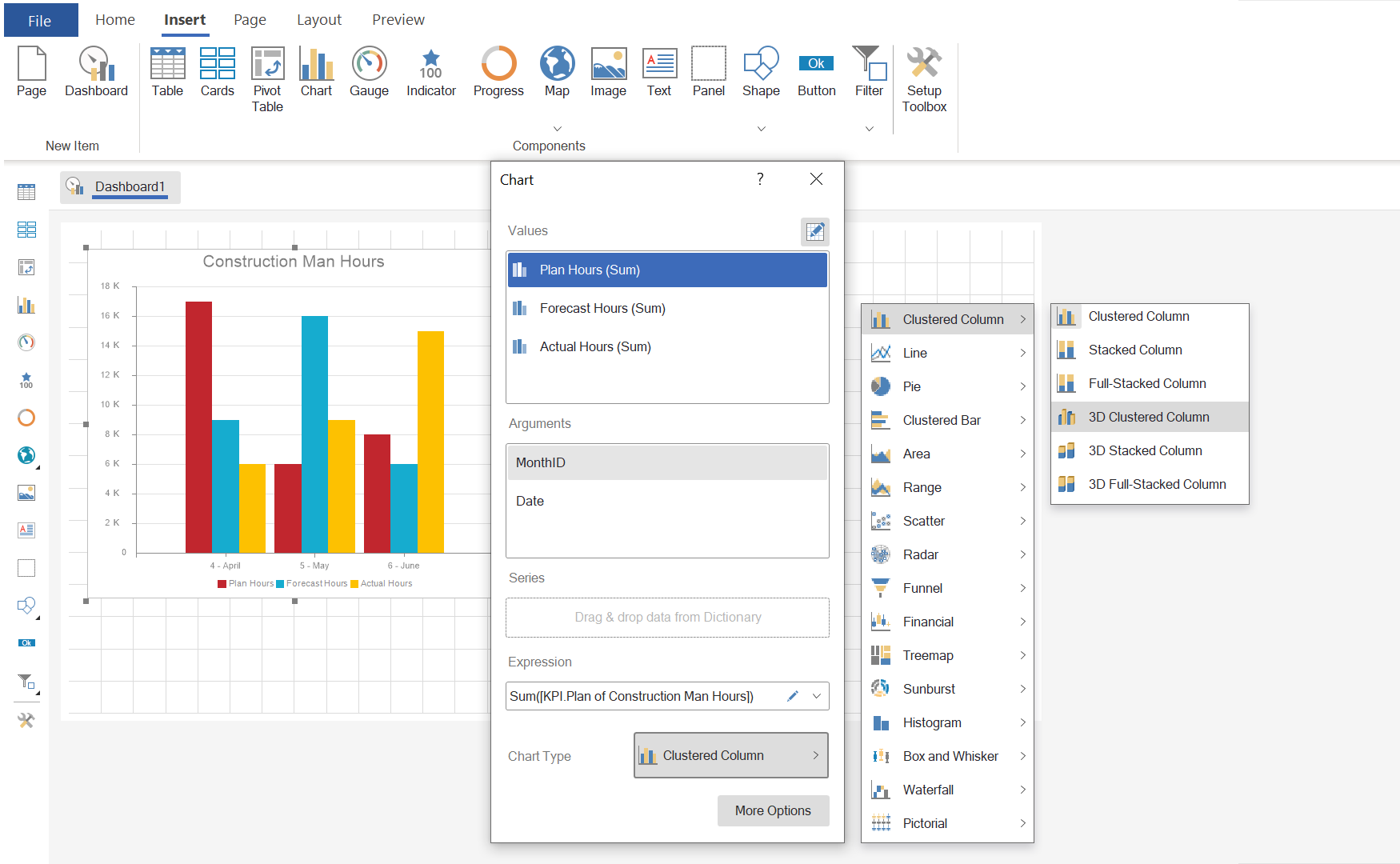
To use three-dimensional histograms in dashboards, you need to place the Chart element on the dashboard. Then, in the element editor, you should specify data columns for the value and argument fields and select the required type of 3D diagram from the Clustered Column category.
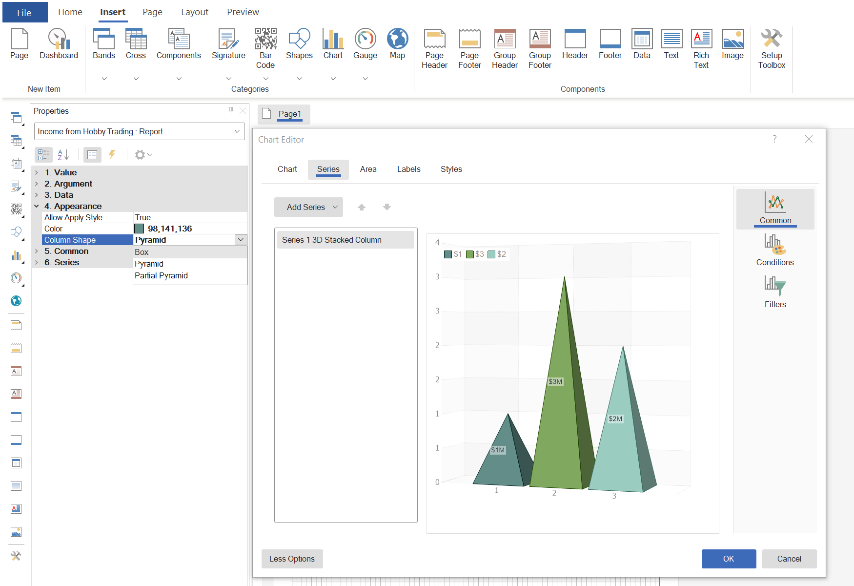
In dashboards, the parameter for specifying the shape of a graphic element is located in the element editor on the More Options panel. Note!
When manually entering data in the dashboard, it is impossible to change the shape of the chart.
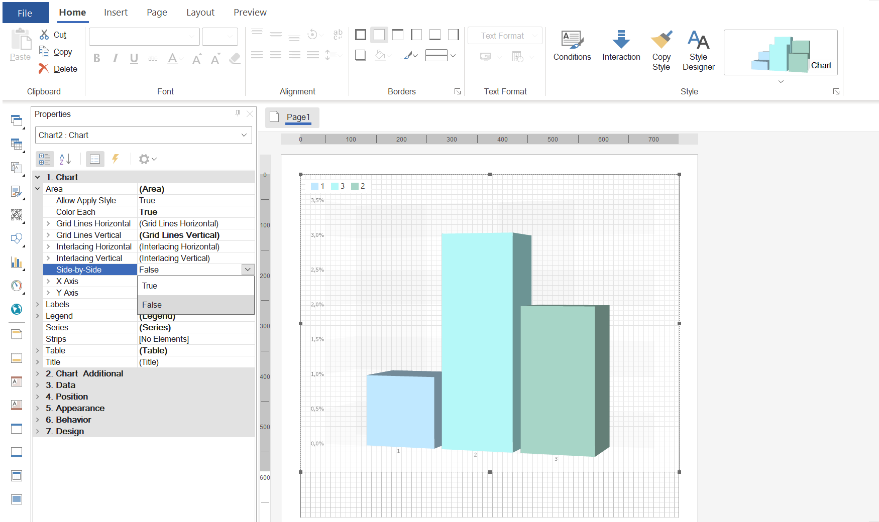
By default, the Side-by-Side property is set to False. Thus, the graphic elements for each argument of the chart are located one after the other, in fact, along the Z axis. If the Side-by-Side property is set to True, then, as in two-dimensional graphs, the graphic elements for each argument of the chart will be located next to each other.
You may use 3D charts not only to display data in space but also to open up new opportunities like using various figures for their drawing, the arrangement of argument values, etc. All this provides many different options to diversify user reports and dashboards.
We have prepared a video tutorial on how to use 3D charts in reports.
So, we have added the following types of 3D clustered column charts to Stimulsoft - 3D Clustered Column, 3D Stacked Column, and 3D Full-stacked Column. In terms of data analysis, 3D charts have no difference from 2D charts. Compared to regular charts, the difference is only in a way the chart element is visualized in space.
What products include 3D charts?
3D charts have been added to reports and dashboards in all products except Reports.JAVA. All 3D charts you may find in the Clustered Columns category in the list of component types or the Chart element.How do I add 3D charts to reports and dashboards?
Adding 3D charts to a report or dashboard is done the same way as any other type of diagrams. When editing or creating reports, the required type of three-dimensional chart is selected from the Clustered Column category on the Insert or Toolbox tab in the report designer, and then the component is placed in the report template. Next, you should specify data column values and row arguments. The number of rows in 3D charts is not limited.To use three-dimensional histograms in dashboards, you need to place the Chart element on the dashboard. Then, in the element editor, you should specify data columns for the value and argument fields and select the required type of 3D diagram from the Clustered Column category.
Types of graphic elements
When using 3D charts in reports and dashboards, you can use different shapes to draw the graphical elements of the chart series. It can be a rectangle, pyramid, or partial pyramid. Moreover, different rows of the diagram can be of different shapes. To change the shape of a graphic element in reports, select a row in the component editor and change the value of the Column Shape property on the Properties panel.In dashboards, the parameter for specifying the shape of a graphic element is located in the element editor on the More Options panel. Note!
When manually entering data in the dashboard, it is impossible to change the shape of the chart.
Side-by-side
Using diagrams of the 3D type, you may change the arrangement of the graphic elements of the values for the argument along the X axis or in space, in fact, along the Z axis. The arrangement mode of the graphic elements depends on the value of the Side-by-Side property. This property of a component in reports or an element in dashboards is located in the Area group on the properties panel. Also, in the reports, with the extended editor, you can go to the Area tab and change this property on the Properties panel.By default, the Side-by-Side property is set to False. Thus, the graphic elements for each argument of the chart are located one after the other, in fact, along the Z axis. If the Side-by-Side property is set to True, then, as in two-dimensional graphs, the graphic elements for each argument of the chart will be located next to each other.
You may use 3D charts not only to display data in space but also to open up new opportunities like using various figures for their drawing, the arrangement of argument values, etc. All this provides many different options to diversify user reports and dashboards.
We have prepared a video tutorial on how to use 3D charts in reports.
If you have any questions, feel free to contact us.