One of the new features of the 2022.3 release is the ability of advanced settings for tooltips design when hovering. Generally, a tooltip when hovering is an excellent way of drilling down information about an element or its value when hovering. However, one thing is to display a tooltip, and absolutely another is to design it in such a way so that it fits a dashboard design and doesn't fall out of the context of a corporate style.Note!
At the time of this writing, the ability to customize the tooltip is not available for all dashboard elements. Before moving on to the tooltip appearance settings, we'll walk through the process of creating hover tips.
 Note!
Note!
In the Table element tooltips are defined for each column separately. That’s why the tooltip editor can be opened only in the Interaction menu for data fields. You can get acquainted in more detail about how to create a tooltip and about the Interaction menu generally in our documentation by following the link.It’s impossible to create a tooltip for other dashboard elements at the moment.
Only these two settings are already able to add considerable variety and expand the flexibility of the visual tooltip design. The only thing that is worth mentioning is that the color scheme of the brush and the text brush should be different. Otherwise, your text will simply merge with the background of the tooltips, and it will not be possible to perceive it visually. Also, for tooltips, you can customize:
We have listed the main settings that will help you vary the appearance of dashboard elements tooltips. Now, let’s go to the placement of these properties.
Some tips
At the time of this writing, the ability to customize the tooltip is not available for all dashboard elements. Before moving on to the tooltip appearance settings, we'll walk through the process of creating hover tips.
Tooltips creation
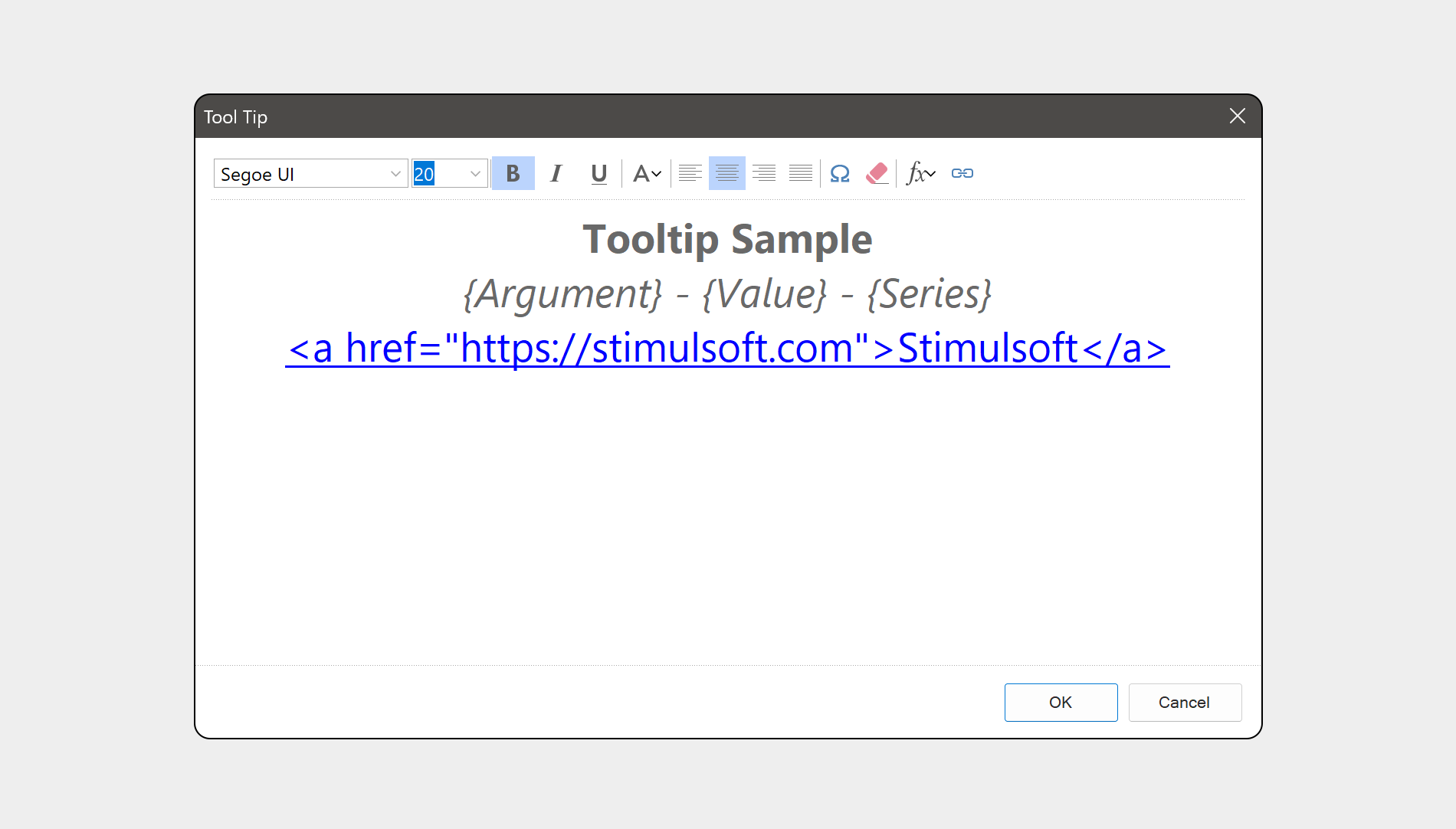
For some dashboard elements, tooltips are created automatically and have a value by default. It means that when adding an element to a dashboard and filling its fields, a tooltip is created that contains drilled information about the values of this element. We’re talking about the following elements: Region map and Chart. For such elements as Table, Indicator, Image, and Text, a tooltip is created in a special editor that can be opened in the Interaction menu. In the tooltip editor, you can define its content – text, expression, special symbols, hyperlinks, or their combinations. Also, you can set basic design settings here – font, size, style, tooltip content alignment.Note!In the Table element tooltips are defined for each column separately. That’s why the tooltip editor can be opened only in the Interaction menu for data fields. You can get acquainted in more detail about how to create a tooltip and about the Interaction menu generally in our documentation by following the link.It’s impossible to create a tooltip for other dashboard elements at the moment.
New features of design
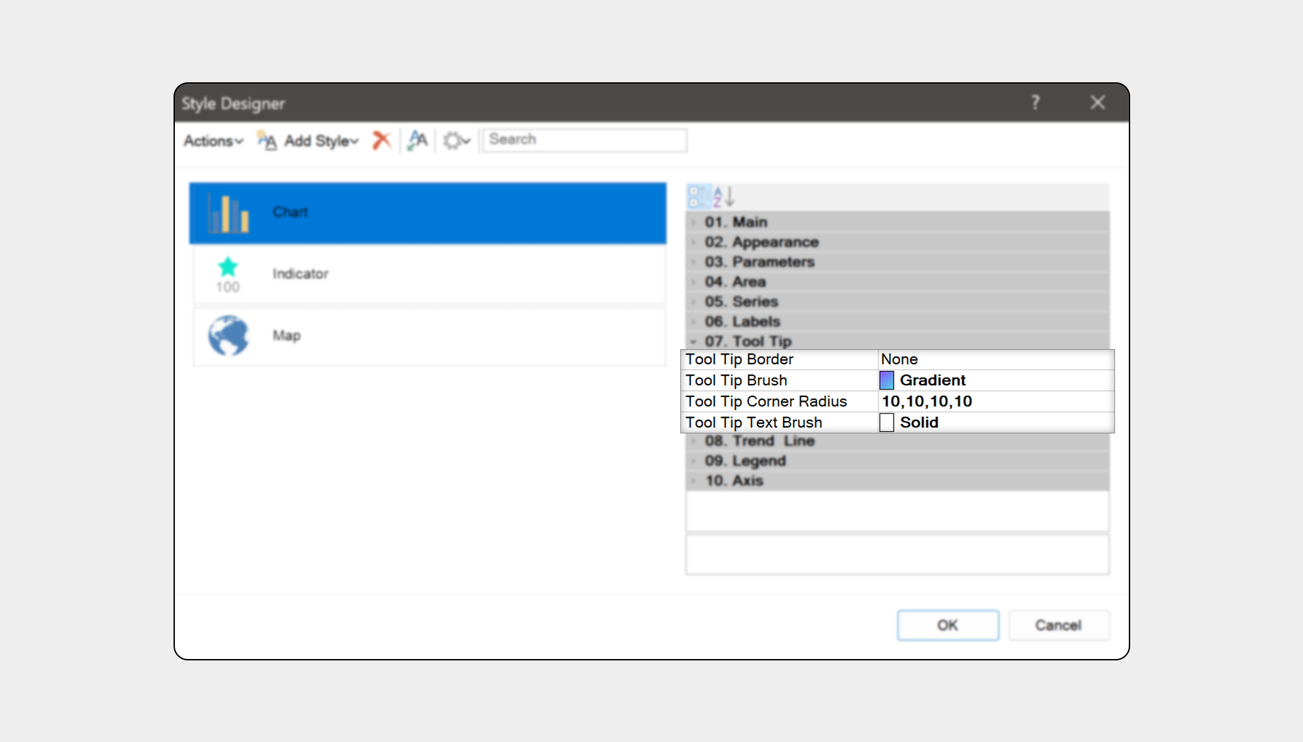
Now, we’re going to tell you about the features of the tooltip design we added. It concerns tooltips for such elements as Chart, Region map, and Indicator. All new features are presented by separate properties. So, for the dashboard elements that support custom design settings, you can define:- Tooltip Brush. You can’t just change the font color and change the brush type. For example, apply gradient or texture to the tooltip background;
- Tooltip Text Brush. Here, you can change the brush type of the tooltip text. Instead of a solid brush, you can use, for example, a glare or glass.
Only these two settings are already able to add considerable variety and expand the flexibility of the visual tooltip design. The only thing that is worth mentioning is that the color scheme of the brush and the text brush should be different. Otherwise, your text will simply merge with the background of the tooltips, and it will not be possible to perceive it visually. Also, for tooltips, you can customize:
- Tooltip Border. Define the tooltip sides for which borders should be drawn. Define the style for drawing the border, such as a solid line or a dashed line. You can also change the size of the border, i.e. its thickness, as well as its color;
- Tooltip Corner Radius. Earlier, we added an ability to round corners for dashboard elements, and now we applied the same principle for tooltips. You can round both all four corners of the tooltip and each separately. Besides, you can define for each tooltip corner its round radius.
We have listed the main settings that will help you vary the appearance of dashboard elements tooltips. Now, let’s go to the placement of these properties.
Design settings
As mentioned above, basic tooltip design settings are defined in the tooltip editor. The brush, text brush, border, and round of a tooltip are customized in the styles of dashboard elements using the ToolTip property group. You need to select a dashboard element which tooltip settings should be changed and open the Style Designer. After, you should select a style and change the values of appropriate properties.Some tips
- Perhaps, you need to define the transparency of the tooltip background. There is no separate property that sets the transparency of the tooltip background in the list of new features. However, you can set it, having specified the alpha parameter on which transparency depends on the code of color for the Tooltip Brush property. The same technique can be applied to text brushes if required;
- Perhaps, you use preset styles for a dashboard and its elements. How to edit the design of tooltips in this case? It’s impossible to change a preset style when writing an article. However, you can create and edit a style based on a component. To do this, you should select the element, open the Style Designer and click the Get Style From Selected Components. Afterward, you should edit a created style and apply it to its element.
If you have any questions, contact us or ask a question on our forum. We’re always glad to help you.