Today due to the development of information technologies, many spheres of human activity got an opportunity quickly and qualitatively keep, process and analyze the data of their work and its effectiveness.
Medicine isn`t also exception. So as it`s very important sphere of human activity. It has quite a lot of information and data, which require qualitatively analysis. Stimulsoft was always interested in creating modern tools of data analysis including medicine. We developed dashboards, which reflect key performance indicators in medicine.
Medicine isn`t also exception. So as it`s very important sphere of human activity. It has quite a lot of information and data, which require qualitatively analysis. Stimulsoft was always interested in creating modern tools of data analysis including medicine. We developed dashboards, which reflect key performance indicators in medicine.
These examples of dashboards give an opportunity to analyze data in the following categories of medical coefficients of performance indicators (KPI): Emergency, Finance, Internal, Operations, Patient Health, Public Health. Except KPI dashboards, we also have dashboards, such as: Hospital Overview, Hospital Performance, Medical, Patient Satisfaction.
Emergency KPI
Dashboard Emergency KPI gives an opportunity to analyze data in emergency departments of medical care.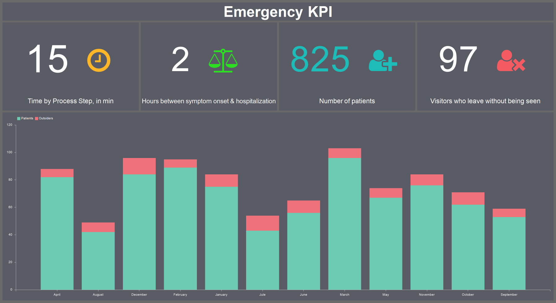
In this example the following KPIs are presented:
- The Time by Process Step, in min metric shows the time from patient`s visit to his hospitalization.
- The Hours between symptom onset & hospitalization metric displays the time from the moment a person develops a symptom until his hospitalization.
- The Number of patient metric displays the number of patients for the last period.
- The Visitors who leave without being seen metric indicates the number of visitors who were unwilling to wait to see a doctor. It can help determine if more beds or staff are needed to handle the number of patients coming in.
- The Chart element displays the ratio of the number of admitted to discharged patients.
Finance KPI
In the dashboard Finance KPI economic indicators of a medical institution are presented.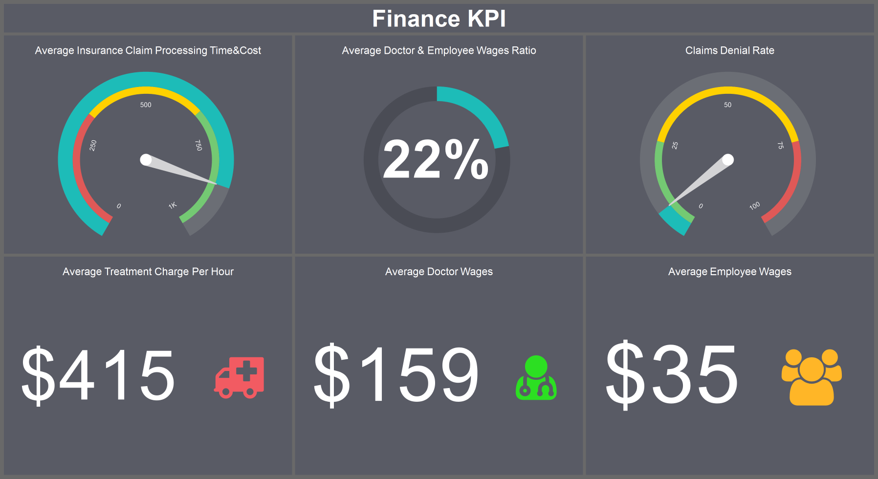
This example includes the following analytical elements:
- Average Insurance Claim Processing Time & Cost metric averages the amount of time and money spends processing insurance claims. When low, it indicates that the facility receives payment faster and there is less cost to the patient.
- Average Doctor & Employee Wages Ratio metric displays average ratio of doctor`s and employee`s wages.
- Claims Denial Rate metric provides insight into the effectiveness of the organization`s revenue cycle.
- Average Treatment charge Per hour metric gives an opportunity to display the average amount that a facility charges a patient for a treatment.
- Average Doctor Wages metric displays the value of wages paid to a doctor for an hour.
- Average Employee Wages metric shows the value of wages paid to an employee for an hour.
Internal KPI
Internal KPI dashboard is an analytics of the internal interaction of a hospital.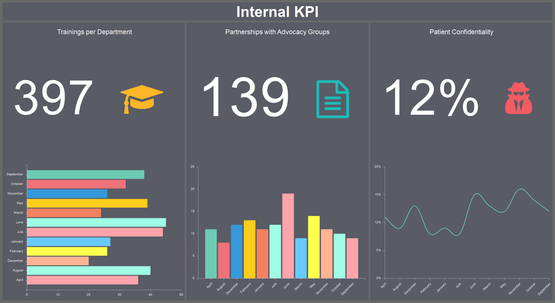
This dashboard includes the following metrics:
- Trainings per Department metric displays the number of trainings conducted for medical staff and also their statistics by months.
- Partnerships with Advocacy Groups metric displays the total number of partnership agreements of a hospital with legal organizations as well as their statistics by month.
- Patient Confidentiality metric element displays the number of times a patient`s confidential medical records were compromised or seen by an unapproved party.
Operations KPI
In the Operations KPI dashboard the data analytics of patient care in a hospital is presented.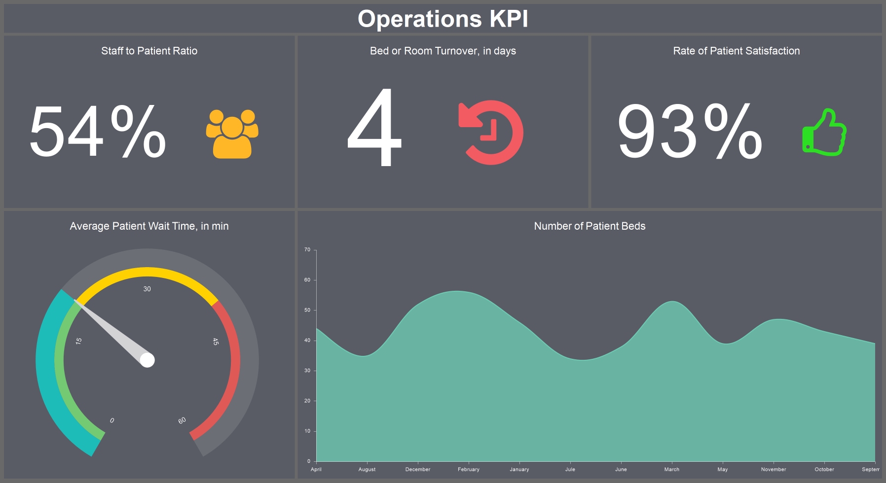
All these data are presented with the following metrics:
- Staff to Patient Ratio metric measures the number of active staff, looking after patients in a hospital in a definite period of time.
- Bed or Room Turnover metric, in days displays the number of turnovers of beds or rooms a day.
- Rate of Patient Satisfaction metric shows the level of satisfaction with medical staff`s work.
- Average Patient Wait Time, in min fixes the average calculates the average number of time a patient must wait between checking in and seeing a provider. This can help with staffing and scheduling and provide insight into patient satisfaction.
- The chart element Number of Patient Beds displays the number of beds for patients by months.
Public Health KPI
In the Public Health KPI dashboard the data analytics of public health is presented: childhood immunizations, the number of educational programs and the number of preterm births.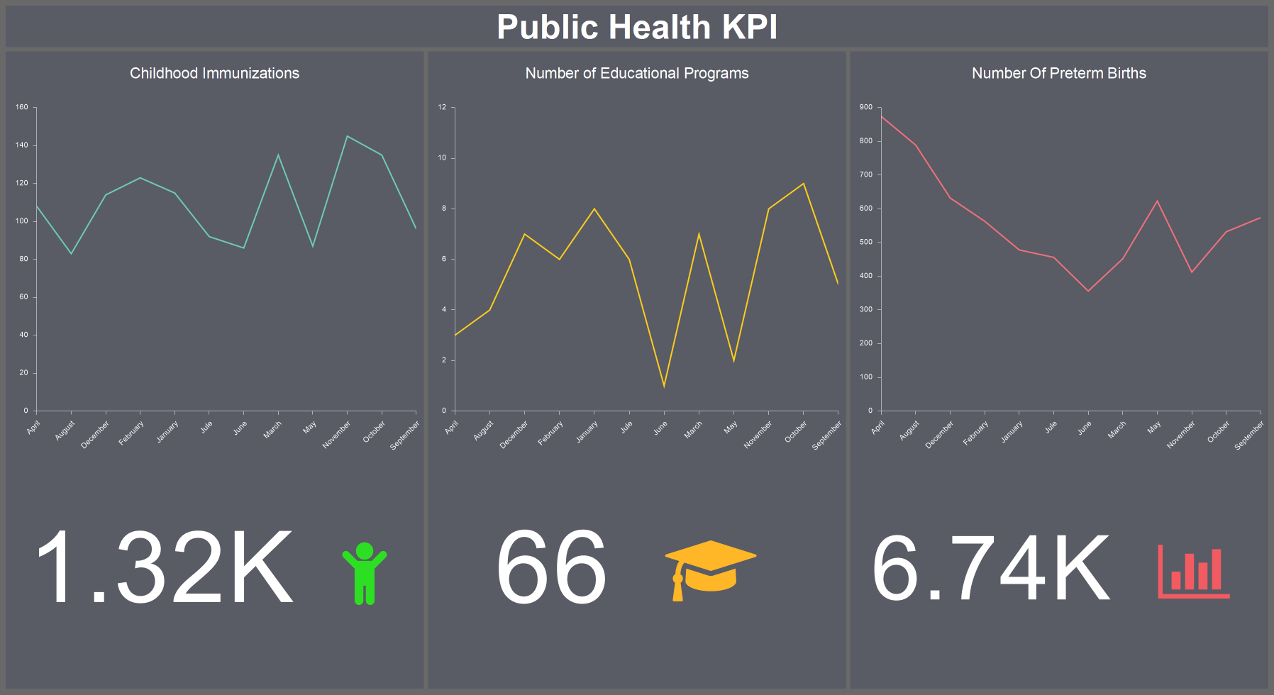
- Childhood Immunizations metric displays the number of childhood immunizations by months.
- The Number of Educational Programs metric displays the number of educational programs in medicine conducted with the total of all programs by months.
- The Number of Preterm Births metric displays the number of preterm births with the common sum of all preterm births by months.
Medical Dashboard
Also, in our examples you can find Medical dashboard, which includes all of the above dashboards.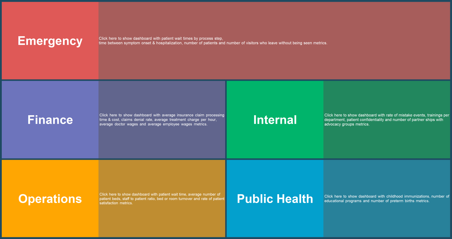
Choose appropriate dashboard and analyze your data.
We considered the examples of dashboards directly in key areas of medical institutions. However, among the examples of Stimulsoft some dashboards for analyzing patients` health and their satisfaction are presented.
Health Patient KPI
Dashboard Health Patient KPI displays the total data of a patient and his health.
- Blood Type indicator displays patient`s blood type.
- Age indicator displays patient`s age.
- Height indicator reflects patient`s height.
- Weight indicator reflects patient`s weight.
- Cholesterol metric records the patient`s cholesterol level.
- Heart Rate metric displays patient`s heart rate.
- Body Temperature metric shows patient`s body temperature.
- Triglycerides metric displays patient`s triglycerides level.
- HDL metric displays the level of high density lipoproteins.
- LDL metric reflects the level low density lipoproteins.
- Systolic metric displays the upper blood pressure.
- Diastolic metric displays the lower blood pressure.
- Pulse metric records the number of heartbeats per minute.
- Blood Glucose metric displays the blood glucose level.
Patient Satisfaction
With the help of dashboard Patient Satisfaction you can display how satisfied patients are with the treatment and medical staff`s work.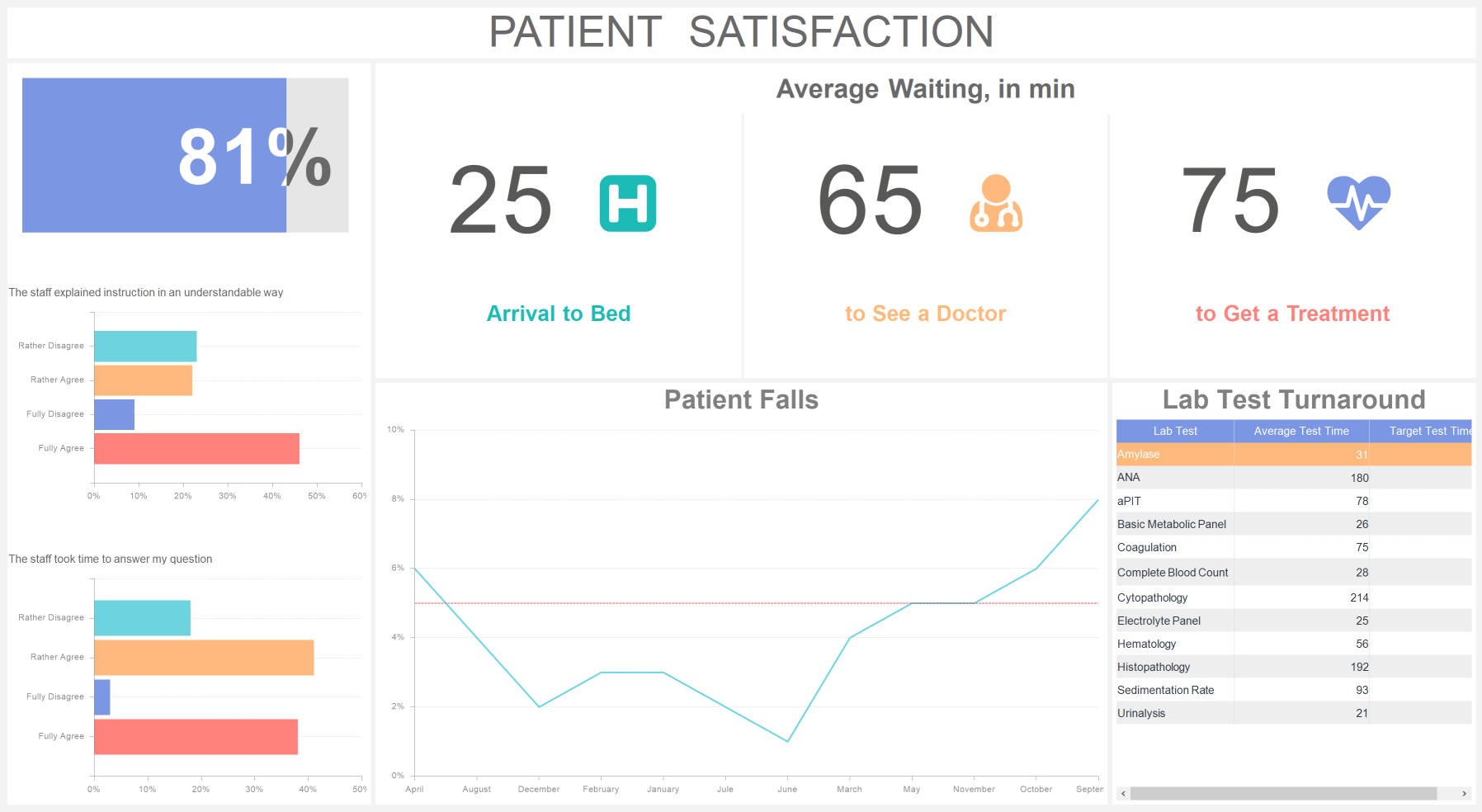
In this dashboard the following metrics are presented:
- Patient Satisfaction records the common prcent of patient`s satisfaction.
- Arrival to Bed metric displays the time a person waits until to be put into bed.
- To See a Doctor metric reflects the waiting time for an appointment.
- To Get a Treatment metric displays the duration of treatment`s process.
- The Staff explained instructions in an understandable way metric displays the patient`s agreement with staff`s understandable explanation of instruction.
- The Staff took time to answer my question metric reflects the patients` agreement with staff`s taking time to answer patients` questions.
- Patient Falls metric displays the precent of patients` falls.
- Lab Test Turnaround shows the results of laboratory tests and the time taken to complete them.
Hospital Overview
Except this, among the examples of Stimulsoft there are dashboards for a hospital. In the dashboard Hospital Overview total analytical information about a hospital is presented.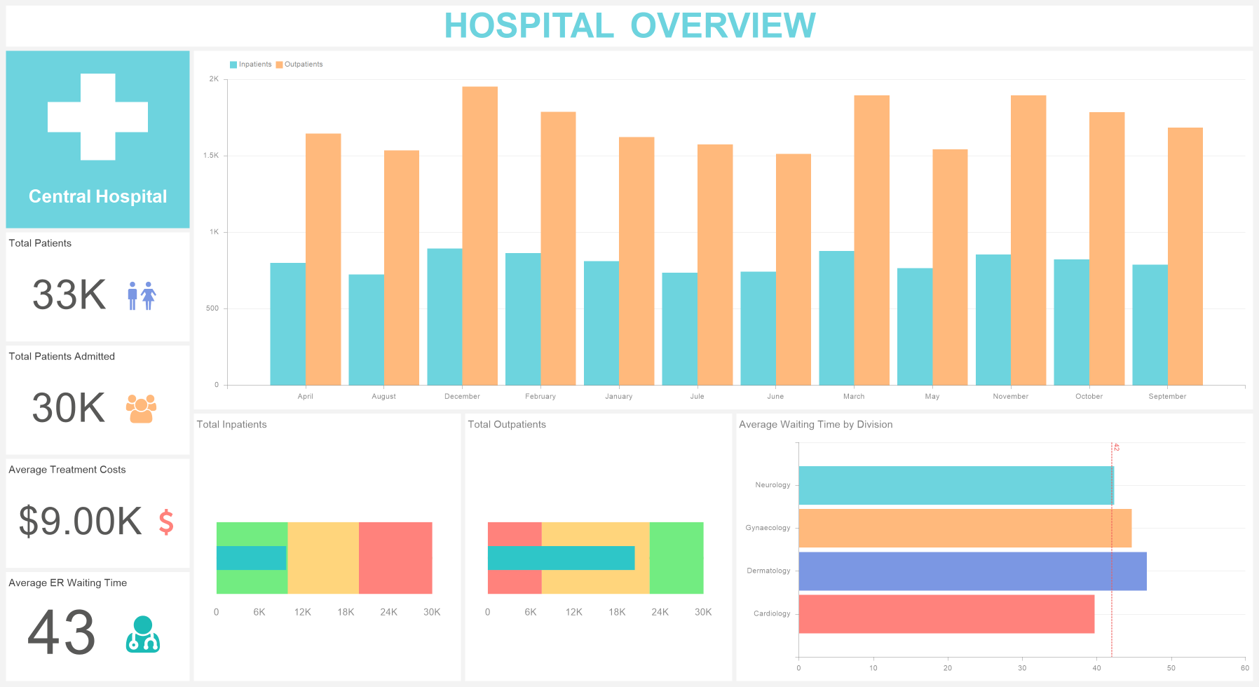
All these data are presented with using such elements as indicators, measuring instruments and charts:
- Total Patients metric displays the common number of patients who applied.
- Total Patients Admitted metric gives an opportunity to display the common number of hospitalized patients from the number of those who applied.
- Average Treatment Costs metric displays the average treatment cost.
- Average ER Waiting Time displays the waiting time for a doctor`s appointment on average equivalent.
- The Chart element displays the number of inpatients and outpatients by months.
- With the help of Total Inpatients metric you can analyze the number of patients who are in a hospital.
- And with the help of Total Outpatients metric you can display the number of patients who are on outpatient treatment.
- Average Waiting Time by Division metric displays the patient`s waiting time (in minutes) for a doctor`s appointment, for each department of medical institution.
Hospital Performance
The Hospital Performance dashboard displays the analytics of hospital`s activity.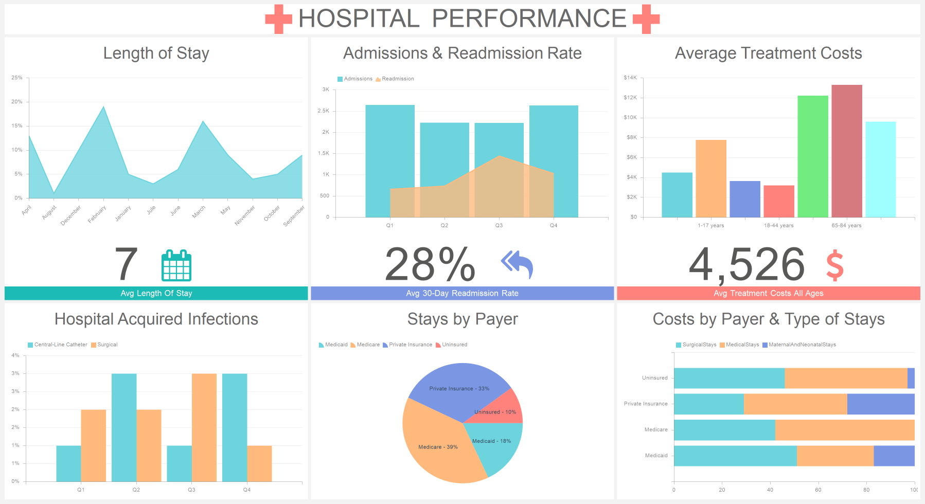
All of this is presented with the using of different charts:
- Length of Stay chart shows the duration of stays in a hospital by months.
- Admissions & Readmission Rate element records the number of admissions and readmission rate.
- Average Treatment Costs element records the number of money spent on treatment over the years.
- Hospital Acquired Infections element records the precent of surgical and central-line catheter infections of a hospital.
- Stays by Payer element records the number of stays by payer. That is to say the percent of people getting treatment with private insurance, uninsured, medicate, medicare is displayed.
- The Costs by Payer & Type of Stays element displays costs by payer and type of stays. That is to say surgical stays costs, medical, maternal and neonatal stays. And also costs on private insurance, uninsured, medicare, medicaid patients.
This way you can use the examples of Stimulsoft Dashboards to analyze the activity of your medical institution. We wish our clients good health and polite patients.