Most recently, in a software product Stimulsoft Reports.Silverlight we added support for the new Office 2013 themes.
Now let's talk more about the features of this theme. We have implemented 8 basic colors, but sometimes our users want to implement a custom theme based on our one, or just slightly change the color palette, as it cannot be good for the customer applications.
If you have the source code of Stimulsoft Reports.Silverlight product, then you can do it. But there are some specific things. The current theme files contain an average of about 5000 lines of code, which consequently complicate the task.
The new theme is so unique compared to the previous ones that, in a few minutes, it is now possible to apply a new color, based on the ready theme, creating a new file which contains only about 15 lines.
How to do this?
In the assembly Stimulsoft.Controls.SL.dll, add a new theme file based on any existing one (for example: MyColor.xaml) into the folder Themes/Office2013.
Further, in the enumeration of StiSilverlightThemes, add a new field in the end (e.g. Office2013MyColor).
And finally, to show a new theme in the designer in the list of settings you need to add the new theme in the Stimulsoft.Report.StiOptions.Silverlight.Themes.ThemeList() method.
The description of resources of a theme being added.
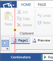
1. office15AppButton2010Background – the color of the MainRibbonButton in the Normal state.
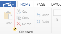
2. office15AppButton2010MouseOverBackground - the color of the MainRibbonButton in the MouseOver state.
3. office15AppButton2010PressedBackground - the color of the panel item in the MainRibbonButton in the MouseOver state.
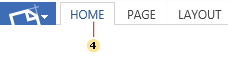
4. office15ForegroundSelected - the color of the selected tab of the RibbonTab. Identical to the office15AppButton2010Background.
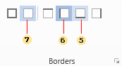
5. office15ButtonMouseOver - the color of the button in the MouseOver state.
6. office15ButtonPressed - the color of the button in the Pressed state.
7. office15ButtonChecked - the color of the button in the Checked state.
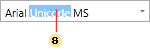
8. office15SelectionBackground - the color of the text selection in the TextBox.
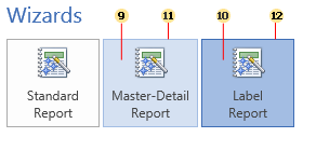
9. office15ColorButtonMOBackground - the background color of a big button in the MouseOver state.
10. office15ColorButtonPRBackground - the background color of a big button in the Pressed state.
11. office15ColorButtonMOBackground - the border color of a big button in the MouseOver state.
12. office15ColorButtonPRBackground - the border color of a big button in the Pressed state.
Now let's talk more about the features of this theme. We have implemented 8 basic colors, but sometimes our users want to implement a custom theme based on our one, or just slightly change the color palette, as it cannot be good for the customer applications.
If you have the source code of Stimulsoft Reports.Silverlight product, then you can do it. But there are some specific things. The current theme files contain an average of about 5000 lines of code, which consequently complicate the task.
The new theme is so unique compared to the previous ones that, in a few minutes, it is now possible to apply a new color, based on the ready theme, creating a new file which contains only about 15 lines.
How to do this?
In the assembly Stimulsoft.Controls.SL.dll, add a new theme file based on any existing one (for example: MyColor.xaml) into the folder Themes/Office2013.
Further, in the enumeration of StiSilverlightThemes, add a new field in the end (e.g. Office2013MyColor).
And finally, to show a new theme in the designer in the list of settings you need to add the new theme in the Stimulsoft.Report.StiOptions.Silverlight.Themes.ThemeList() method.
The description of resources of a theme being added.
1. office15AppButton2010Background – the color of the MainRibbonButton in the Normal state.
2. office15AppButton2010MouseOverBackground - the color of the MainRibbonButton in the MouseOver state.
3. office15AppButton2010PressedBackground - the color of the panel item in the MainRibbonButton in the MouseOver state.
4. office15ForegroundSelected - the color of the selected tab of the RibbonTab. Identical to the office15AppButton2010Background.
5. office15ButtonMouseOver - the color of the button in the MouseOver state.
6. office15ButtonPressed - the color of the button in the Pressed state.
7. office15ButtonChecked - the color of the button in the Checked state.
8. office15SelectionBackground - the color of the text selection in the TextBox.
9. office15ColorButtonMOBackground - the background color of a big button in the MouseOver state.
10. office15ColorButtonPRBackground - the background color of a big button in the Pressed state.
11. office15ColorButtonMOBackground - the border color of a big button in the MouseOver state.
12. office15ColorButtonPRBackground - the border color of a big button in the Pressed state.