We are pleased to announce the release of the new version Stimulsoft Reports 2019.1 which is now available for download. The new version comes with minor and major updates including huge improvements in dashboards, enhancements in the Globalization editor, redesigned start page on the report designer, date and time formatting and etc.
New maps
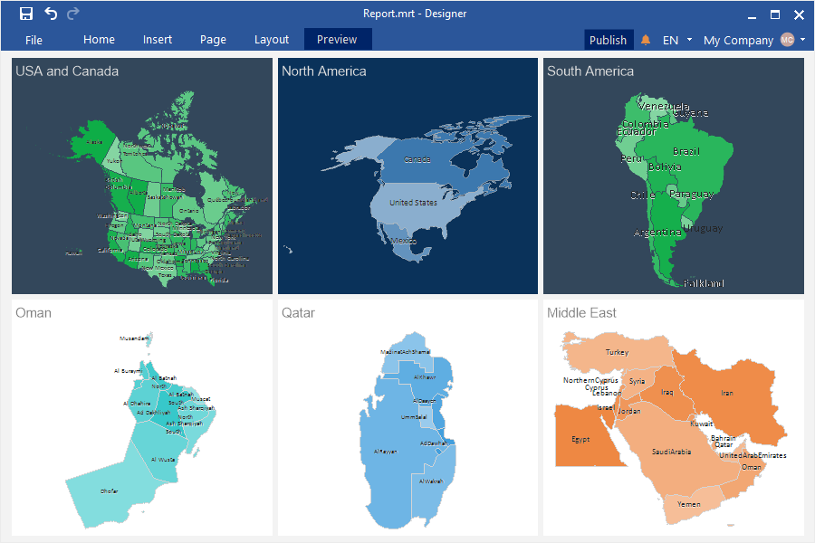
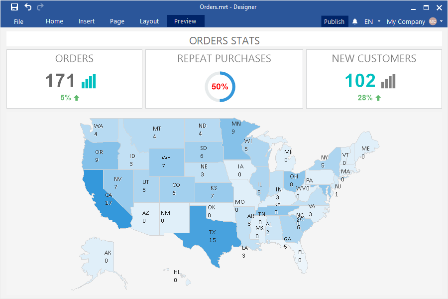
In the release 2019.1, we added new maps - North America, USA and Canada, South America, Oman, Qatar, and the Middle East. Add the Region Map element, open the editor and select the required map view.
The new item in WEB
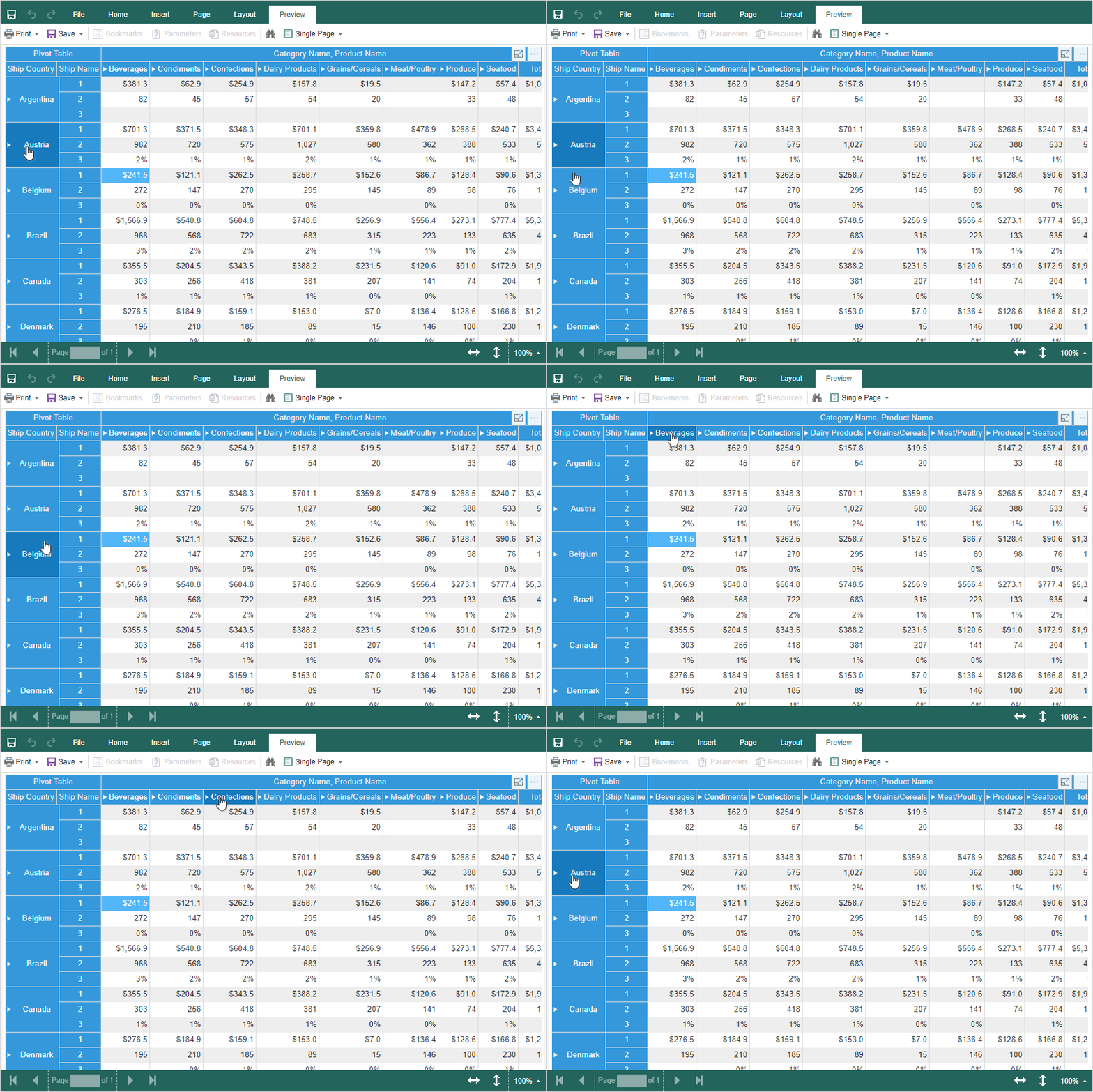
In the new version, we added a pivot table for Dashboards.WEB. This element can be used to process, group, and sum up data values by rows and columns in a table. Add a PivotTable element to the dashboard and enter the data columns in the respective fields of the rows, columns, and results. Also, the rows and columns in the Pivot Table can be nested. To do this, add a few data columns in the appropriate field. Each lower data column will be nested with respect to the top one.
New export for Tables
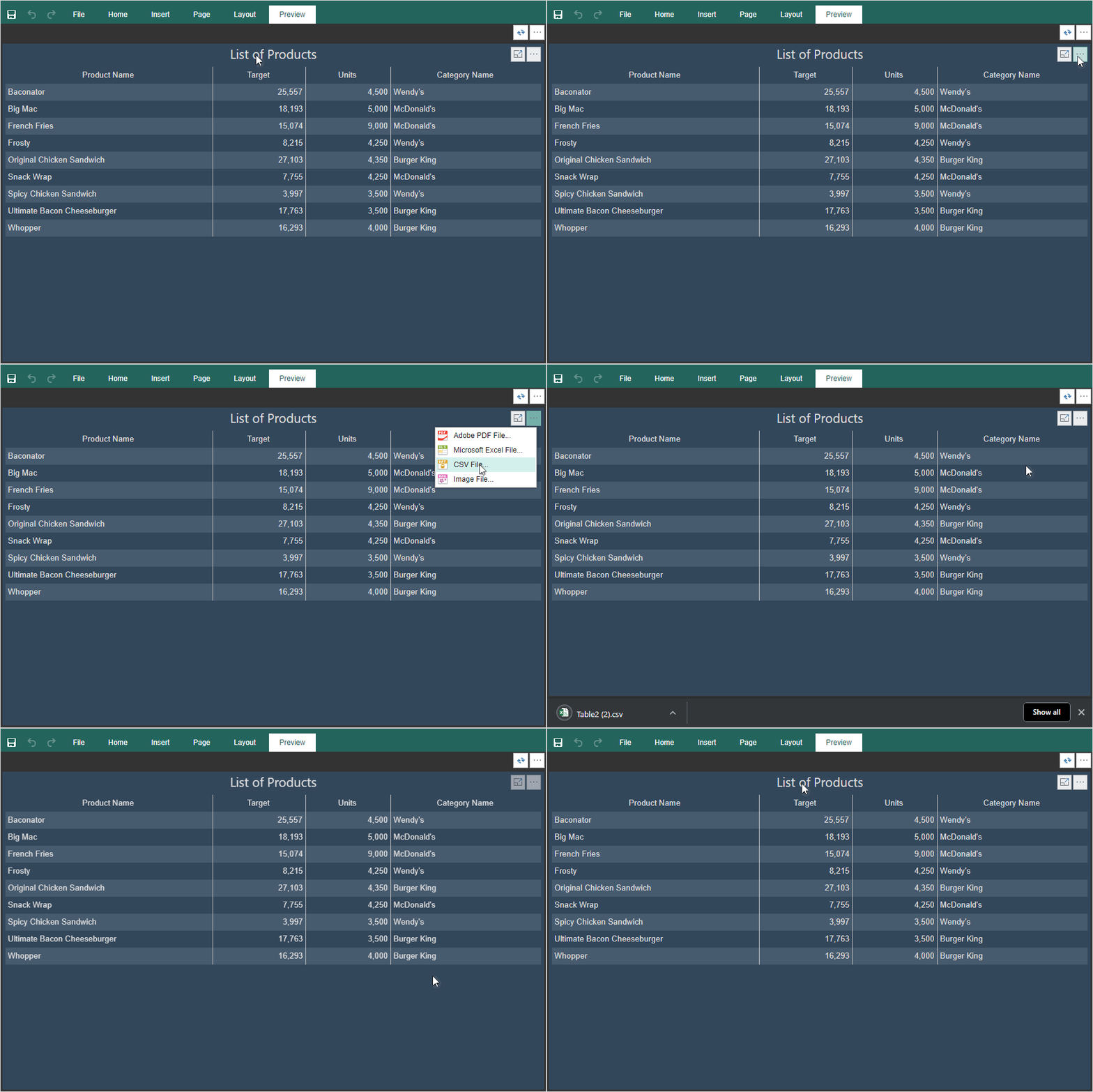
Now you can export the data of the Table element in the dashboards to the CSV format. Click the More button on the dashboard item and select the CSV file command.
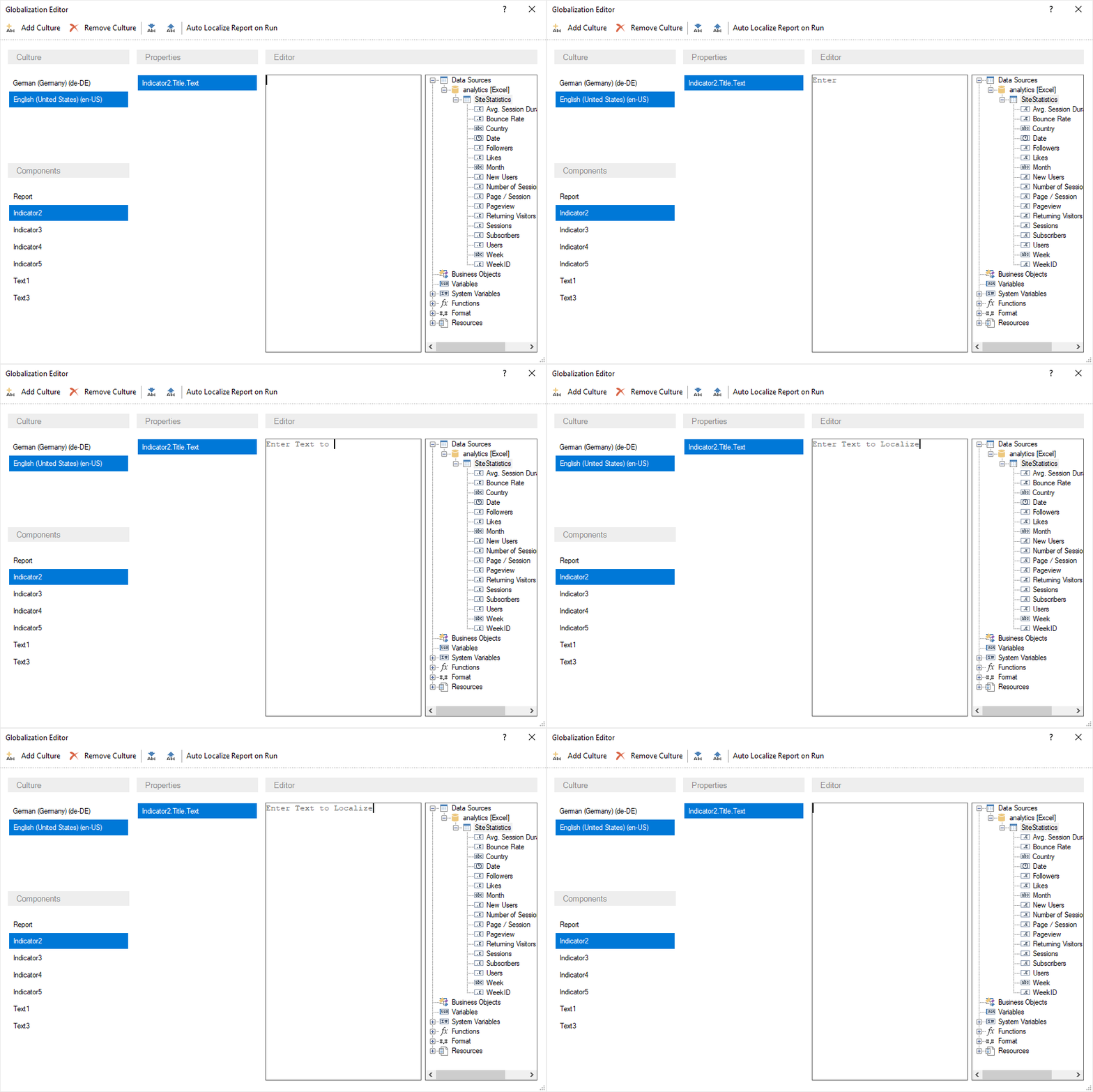
Updated Globalization String editor
In this release, we redesigned and updated the GlobalizationString editor. Also, the ability to localize the elements of the dashboard has been added. Add a culture in the editor and define the field values. Now, when selecting this culture in the report, the fields from the list with the specified settings will be applied to the fields of the report or the dashboard.
Interactive charts in WEB
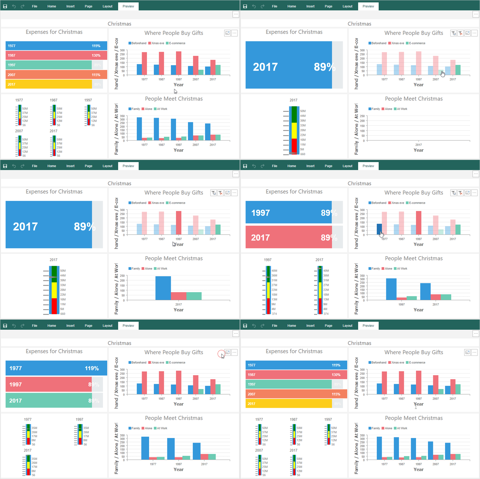
In release 2019.1, the charts in Dashboards.WEB support interaction with other elements. When selecting any graphical element of the chart, the data for other elements related to each other of this dashboard will be filtered.
Start page in the report designer
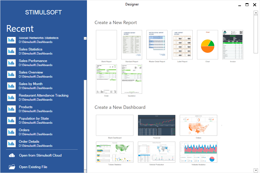
In the version 2019.1, when launching report designers for the .NET Framework and WPF, the start page of the designer will be displayed. This page contains a list of reports recently opened, commands for opening a report from local and cloud storage as well as a wizard to create reports and indicator panels. If necessary, you can change the mode of the start page of the designer in the settings, which can be accessed by selecting the Options item from the File menu. In the settings of the designer, you can set the mode of the start page, empty report or empty dashboard.
Formatting dates and times in reports
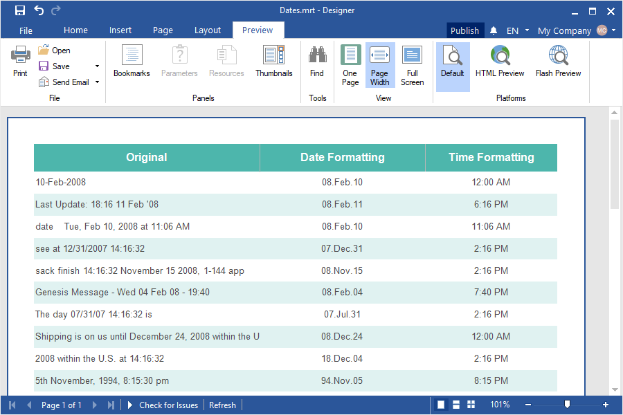
In 2019.1, the algorithm for analyzing date and time in the report data was completely redesigned. Now, if the date or time format is applied to the text component, the report engine will automatically analyze the data, highlight the date and time, and display it in the report. Also, the values will be automatically analyzed and transferred to the date and time, if the data column indicates the data type datetime or timespan. You can change the format mask in the Format dialog.
Publishing Dashboards
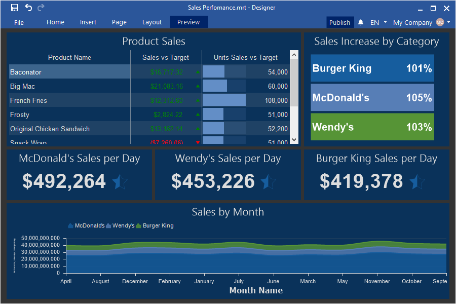
Starting with release 2019.1, we added a wizard for publishing dashboards. This functionality is available from to the report designer. Now the process of integrating dashboards into applications to various platforms is greatly simplified and accelerated. To call the publish wizard, you should create or open the dashboard, click the Publish button in the report designer, or select a similar command in the File menu of the report designer.
Formatting items on dashboards
It became possible to format the values of the elements of the dashboard. For the Table element, you can change the formatting for each column. Select the data column in the Table element editor and define the format using the Text format tool. For the Indicator and Progress elements, select the item on the indicator panel and specify the format using the Text Format tool. In the charts of dashboards, the formatting of the axes can be changed using the properties – Argument Format and Value Format.
New styles
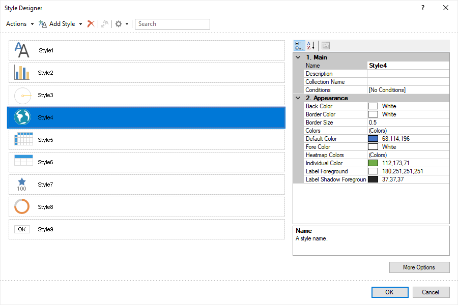
In the release of 2019.1, we redesigned the styles and made them universal. Now the same style can be used both for report components and for elements of the dashboard. We also added settings options in these styles, as well as new styles for the Indicator and Progress elements.
Color schemes for series
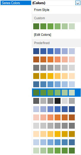
In the release 2019.1.1, we added several presets of color schemes for series of Charts and Progresses. Choose a color scheme, and the values of the series of charts will have a certain shade. To change the color scheme of the series, select the chart and on the property panel, click the Browse button on the Series Colors property. In the drop-down list, select the color scheme or select the Edit Colors command to open the color editor and create a color scheme.
New Color Collection editor
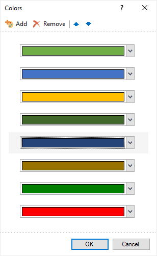
We completely redesigned the color collection editor for such styles as Map, Chart, and Progress. Now the process of creating a list of color styles is simplified. The new color collection editor contains the command to add a new color to the collection, the command to remove the selected color from the collection, the commands to move colors in the collection list.
Design of the dashboard elements
Now you can customize the appearance for each element of the indicator panel. We added properties with which you can change the fill color and the color values of the elements. Also, in the table item, you can specify your font, customize the size and color for the selected column. Depending on the type of element, the number of properties to customize the design may vary.
Customization of the chart design
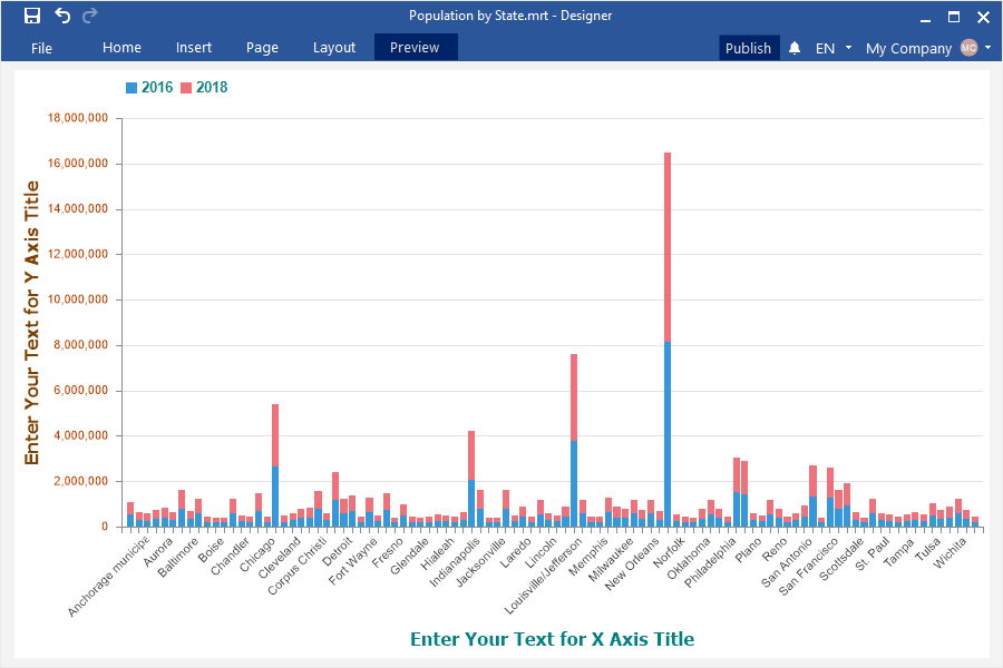
In the release of 2019.1, you can customize the design of the area, axes, legends, signatures. All the settings for the chart design are located in the Chart property group – Chart Additional on the property panel. To do this, select the Chart element and change the property values.
View settings
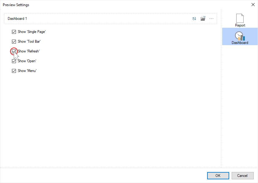
Now you can define the parameters for viewing dashboards, for example, disable the toolbar or some buttons in the viewer. To do this, select the template area in the report designer and click the Browse button of the Preview Settings property. Go to the Dashboard tab and check the controls that you want to enable in the viewer.
Settings to place items
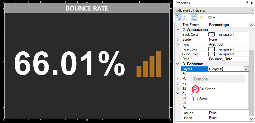
In addition to the settings for the preview of the dashboard, you can also disable or enable the options of the elements on the indicator panel. To do this, select the element in the report designer, in the drop-down list of the Layout property check the box next to the option that you want to enable for the current item.
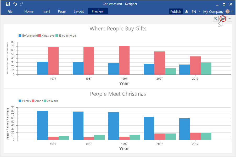
The Open button in dashboard preview
Starting with the release 2019.1, when previewing the dashboards, you can now open the report file. This file can contain both a report and dashboard.
New Gauge editor
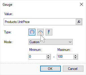
In the 2019.1 release, we significantly simplified and optimized the editor of the Gauge component in the HTML5 designer. You should select the type of a gauge in the editor and also specify the range of values of that gauge. You can enable the old Gauge editor in the report settings.

New maps
In the release 2019.1, we added new maps - North America, USA and Canada, South America, Oman, Qatar, and the Middle East. Add the Region Map element, open the editor and select the required map view.

The new item in WEB
In the new version, we added a pivot table for Dashboards.WEB. This element can be used to process, group, and sum up data values by rows and columns in a table. Add a PivotTable element to the dashboard and enter the data columns in the respective fields of the rows, columns, and results. Also, the rows and columns in the Pivot Table can be nested. To do this, add a few data columns in the appropriate field. Each lower data column will be nested with respect to the top one.

New export for Tables
Now you can export the data of the Table element in the dashboards to the CSV format. Click the More button on the dashboard item and select the CSV file command.

Updated Globalization String editor
In this release, we redesigned and updated the GlobalizationString editor. Also, the ability to localize the elements of the dashboard has been added. Add a culture in the editor and define the field values. Now, when selecting this culture in the report, the fields from the list with the specified settings will be applied to the fields of the report or the dashboard.

Interactive charts in WEB
In release 2019.1, the charts in Dashboards.WEB support interaction with other elements. When selecting any graphical element of the chart, the data for other elements related to each other of this dashboard will be filtered.

Start page in the report designer
In the version 2019.1, when launching report designers for the .NET Framework and WPF, the start page of the designer will be displayed. This page contains a list of reports recently opened, commands for opening a report from local and cloud storage as well as a wizard to create reports and indicator panels. If necessary, you can change the mode of the start page of the designer in the settings, which can be accessed by selecting the Options item from the File menu. In the settings of the designer, you can set the mode of the start page, empty report or empty dashboard.

Formatting dates and times in reports
In 2019.1, the algorithm for analyzing date and time in the report data was completely redesigned. Now, if the date or time format is applied to the text component, the report engine will automatically analyze the data, highlight the date and time, and display it in the report. Also, the values will be automatically analyzed and transferred to the date and time, if the data column indicates the data type datetime or timespan. You can change the format mask in the Format dialog.
Publishing Dashboards
Starting with release 2019.1, we added a wizard for publishing dashboards. This functionality is available from to the report designer. Now the process of integrating dashboards into applications to various platforms is greatly simplified and accelerated. To call the publish wizard, you should create or open the dashboard, click the Publish button in the report designer, or select a similar command in the File menu of the report designer.

Formatting items on dashboards
It became possible to format the values of the elements of the dashboard. For the Table element, you can change the formatting for each column. Select the data column in the Table element editor and define the format using the Text format tool. For the Indicator and Progress elements, select the item on the indicator panel and specify the format using the Text Format tool. In the charts of dashboards, the formatting of the axes can be changed using the properties – Argument Format and Value Format.

New styles
In the release of 2019.1, we redesigned the styles and made them universal. Now the same style can be used both for report components and for elements of the dashboard. We also added settings options in these styles, as well as new styles for the Indicator and Progress elements.

Color schemes for series
In the release 2019.1.1, we added several presets of color schemes for series of Charts and Progresses. Choose a color scheme, and the values of the series of charts will have a certain shade. To change the color scheme of the series, select the chart and on the property panel, click the Browse button on the Series Colors property. In the drop-down list, select the color scheme or select the Edit Colors command to open the color editor and create a color scheme.

New Color Collection editor
We completely redesigned the color collection editor for such styles as Map, Chart, and Progress. Now the process of creating a list of color styles is simplified. The new color collection editor contains the command to add a new color to the collection, the command to remove the selected color from the collection, the commands to move colors in the collection list.

Design of the dashboard elements
Now you can customize the appearance for each element of the indicator panel. We added properties with which you can change the fill color and the color values of the elements. Also, in the table item, you can specify your font, customize the size and color for the selected column. Depending on the type of element, the number of properties to customize the design may vary.

Customization of the chart design
In the release of 2019.1, you can customize the design of the area, axes, legends, signatures. All the settings for the chart design are located in the Chart property group – Chart Additional on the property panel. To do this, select the Chart element and change the property values.

View settings
Now you can define the parameters for viewing dashboards, for example, disable the toolbar or some buttons in the viewer. To do this, select the template area in the report designer and click the Browse button of the Preview Settings property. Go to the Dashboard tab and check the controls that you want to enable in the viewer.

Settings to place items
In addition to the settings for the preview of the dashboard, you can also disable or enable the options of the elements on the indicator panel. To do this, select the element in the report designer, in the drop-down list of the Layout property check the box next to the option that you want to enable for the current item.

The Open button in dashboard preview
Starting with the release 2019.1, when previewing the dashboards, you can now open the report file. This file can contain both a report and dashboard.

New Gauge editor
In the 2019.1 release, we significantly simplified and optimized the editor of the Gauge component in the HTML5 designer. You should select the type of a gauge in the editor and also specify the range of values of that gauge. You can enable the old Gauge editor in the report settings.
