Progress
Progress is an element of the dashboard panel that represents the ability to display the growth rate (relative share) of a value relative to the target value.
This chapter will cover the following:
 Progress Target Value;
Progress Series;
Progress Types;
Table of Properties.
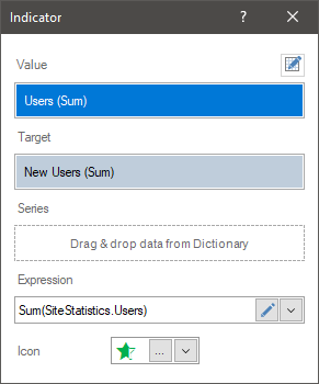
To display Progress, you need to add a data field to the Value and Target fields. In this case, using the graphical element, the growth rate of the value in relation to the target will be displayed. You can setup the Progress element in the editor. To call the editor, you should:
Double-click on the Progress element in the dashboard panel;
Select the Progress element and select the Design command in the context menu;
Select the Progress element, and, on the property panel, click the Browse button of the Value, Target, and Rows properties.
Information |
Text formatting can be applied to the values of the current element.
|
In the Progress editor, you can add elements with data, edit the expressions of these elements, select the type of a graphic element to display the calculated value.
In the Progress editor you can:
Specify the data field for the Progress value;
Specify the data field for the target Progress value;
Specify the data field for the Progress series;
Select the type of the graphic element.
In the Value field, you can specify only one data field. All values of this field will be aggregated, i.e. a function will be applied to them. By default, this is a summation function for numeric values. If a data field with non-numeric values is added, then, by default, the function of the number of rows in this data field is applied to them.
Information |
Without a target value, the growth rate will always be 100 percent.
|
To display the growth rate with the help of progress, besides the value in the progress it is necessary to indicate the target value. The target value is the aggregated value of the data field specified in the Target field of progress. Only one data field can be specified in this field. By default, the summation function for numeric values is applied to the data field in the Target field. If a field with non-numeric values is added, then by default the function of counting the number of rows in this data field is applied to it.
Information |
If only a target value is specified in the Progress element, but no value is specified, then the growth rate in progress will be 0 percent.
|
A series of progress is a separate progress for a specific segment of values selected by a certain condition. The condition in this case will be the values of the data field, which is specified in the Series field.
For example, in the Progress value field, a field with the number of orders issued is set, and the planned number of orders is set to Target field. One progress will be displayed without specifying a series. The value of progress will be the growth rate (the value relative to the target value).
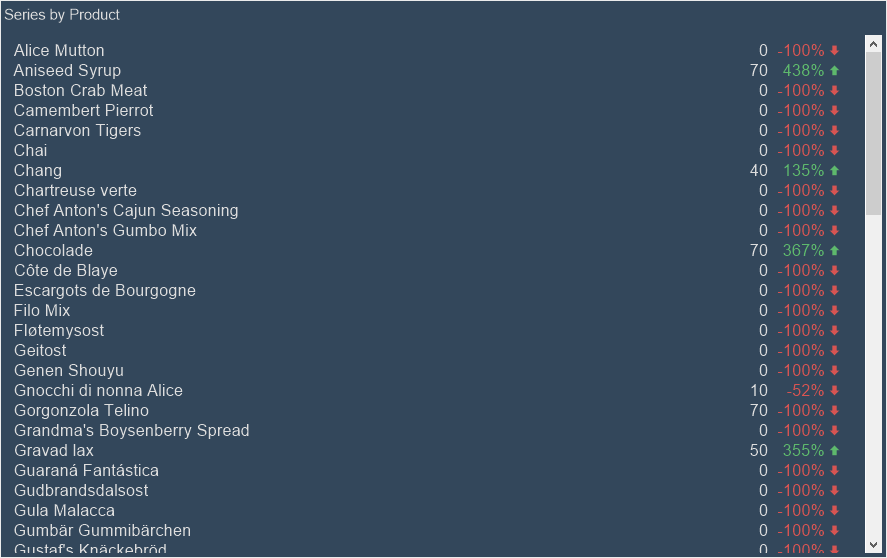
If you specify a data field with a list of products in series, then the progress will be displayed for every product, i.e. the growth rate will be displayed for every product.
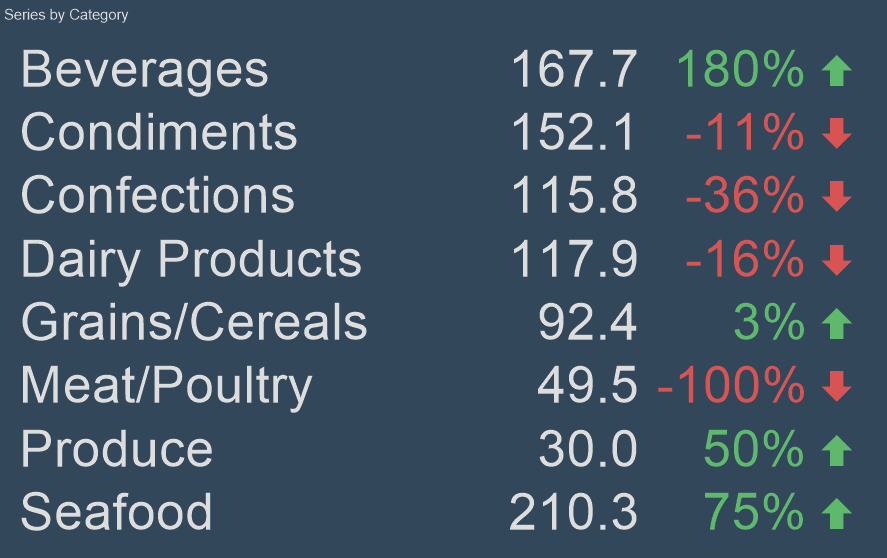
If you specify a data field in the rows with a list of product categories, then progress will be displayed for every category, i.e. growth rate will be calculated by aggregating the growth rate of all products included into this category. In other words, the growth rate of every product will be grouped into the categories to which they relate.
To set the series of progress, you should:
Double-click the left mouse button on the Progress element;
Drag and drop the data column from the dictionary to the Series field in the editor.
Create New Field in the Series field. Set the expression for this data field, the processing result of which will be the values of the progress series.
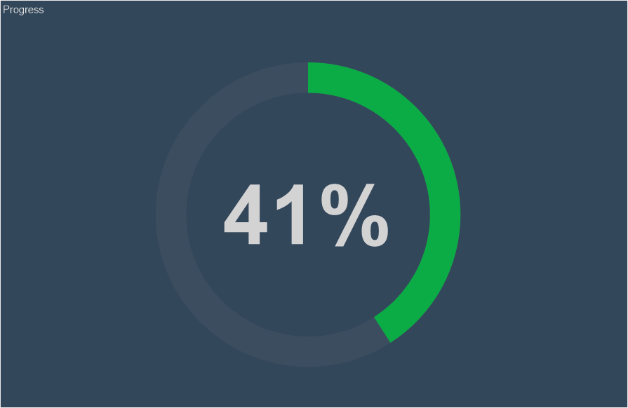
When creating the progress, you can select the type of graphic element with which the growth rate value will be displayed. To do this:
Call the editor of the Progress element;
Use the buttons to select the mode of the graphic element - Circle, Pie, Data Bars.
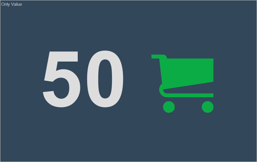
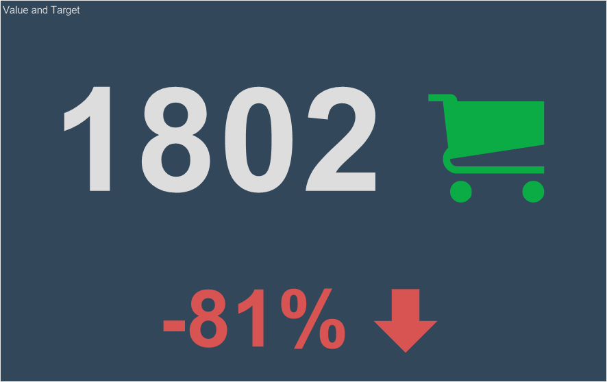
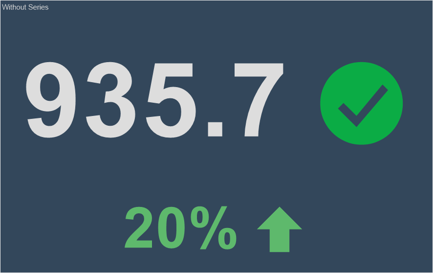
Below are the three elements of progress with different modes.
Information |
Within one Progress element, you can select only one type of graphic element.
|
The list shows the name and description of the properties of the element which you may find in the properties panel of the report designer.
Name |
Description |
Cross-Filtering |
It allows you to enable or disable the cross-filtering mode for the current element. |
Data Transformation |
Customizes the data transformation of the current element. |
Group |
Adds the current item to a specific group of items. |
Color Each |
Sets a unique shade for every graphic element of the progress. If this property is set to True, the colors from the style collection will be applied to the graphic elements. A different color will be applied to each graphic item. After all the colors from the collection are used, the same colors with the lightening cofficient will be applied to the remaining graphical elements. This way, each graphic item will be with a certain shade. If this property is set to False value, one color from the collection of style colors will be applied to graphic items of the one row. |
Back Color |
Changes the background color of the element. By default, this property is set to From Style, i.e. the color of the element will be obtained from the settings of the current element style. |
Border |
A group of properties that allows you to customize the borders of the element - color, sides, size, and style. |
Conditions |
Customizes the conditions element of the progress. |
Corner Radius |
It allows you to define the rounding radius for the corners of an element on the dashboard. You can round each corner of the element separately: Top - Left, Top - Right, Bottom - Right, Bottom - Left. The property can be set to a value between 0 and 30, where 0 is no rounding angle and 30 is the maximum value of the rounding radius. |
Font |
A group of properties defines the font family, its style, and size for the values of the element. |
Fore Color |
Specifies the color of the values of the element. By default, this property is set to From Style, i.e. the color of the values will be obtained from the settings of the current element style. |
Series Color |
Customizes the list of colors for the series of the element. |
Shadow |
A group of properties that allows configuring the shadow of an element:
|
Style |
Selects a style for the current element. The default it is set to Auto, i.e. the style of this element is inherited from the style of the dashboard. |
Enabled |
Enables or disables the current item on the dashboard. If the property is set to True, the current item is enabled and will be displayed when previewing the dashboard in the viewer. If this property is set to False, this element is disabled and will not be displayed when previewing the dashboard in the viewer. |
Interaction |
Sets interaction of the current element. |
Margin |
A group of properties that allows you to define margin (left, top, right, bottom) of the value area from the border of this element. |
Padding |
A group of properties that allows you to define padding (left, top, right, bottom) of the columns from the range of values. |
Show Blanks |
Allows displaying or hiding the label "Show (blank)" in the dashboard element when there is no data available for that element. |
Text Format |
Sets the formatting values of the element. |
Title |
A group of properties that allows you to customize the title of the element:
|
Name |
Changes the name of the current element. |
Alias |
Changes the alias of the current item. |
Restrictions |
Configures the permissions to use the current item in the dashboard:
|
Locked |
Locks or unlocks resizing and movement of the current element. If the property is set to True, the current element cannot be moved or resized. If this property is set to False, then this element can be moved and resized. |
Linked |
Binds the current location to the dashboard or another element. If the property is set to True, then the current item is bound to the current location. If this property is set to False, then this element is not tied to the current location. |