Appearance
In addition to creating dashboards, an important role plays the setting of this panel and its elements.
In this chapter, we will describe the parameters of the dashboard and its elements:
 Styles;
Information |
Some elements, besides those listed below, may also have individual design options.
|
Styles of a dashboard and elements
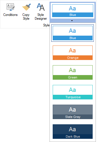
When creating a dashboard, the report designer contains predefined styles. The first style from the list is applied to the dashboard. For all newly added elements on this dashboard, the current color scheme of the dashboard is used. By default, when you change the style of the dashboard, the newly selected color scheme will be applied to all elements on this panel. However, for each component of the dashboard you can assign your style.
To change the style of the dashboard, you should:
Left-click on the empty area of the dashboard;
Select the dashboard style on the Home tab, in the styles menu.
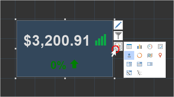
To change the style of an element in the dashboard, you should:
Select an dashboard element;
Select the desired element style on the Home tab, in the style menu.
Information |
In this case, if you change the style of the dashboard, the color scheme of the element will not change.
|
In addition, you can create custom styles for the elements of the dashboard. To do this, call the Style Designer and create styles for the elements. You can also assign the created style using the style menu on the Home tab or using the Style property of the element.
One of the settings for the design is to set the background color of the element. By default, the background color is used from the assigned style. To change the background color of the dashboard or its elements you should:
Select the dashboard or element;
Change the value of the Back Color property in the property panel.
After that, select the background color from the drop-down list.
Also, you can change the background color of the element on the Home tab in the report designer:
Select the dashboard or element;
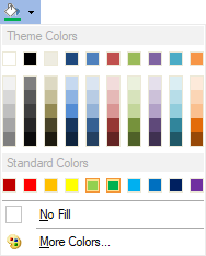
Use the Background tool to select a background color from the palette or specify a custom color.
When customizing the design, you can change the text color of a specific item. To do this:
Select an element;
Select the required color from the drop-down list in the Fore Color property.
Information |
The Table element also has its own color for each column. To do this, select the data field in the Table element editor and change the text color.
|
Each element in the dashboard can define the margin and padding of the element. To do this:
Select an item on the dashboard;
Change the values of the Margins and Padding property groups on the property panel.
You can also customize the type, borders, size and color of the borders of the element. To do this:
Select an item on the dashboard;
Change the type, size, sides, borders color using the Border property group on the property panel, or tools on the Home tab in the report designer.
The titles of elements on the dashboard can be created in various ways. For example, using the Text element. However, elements also have the ability to enable and configure an element title. To include the title:
Move the cursor to the top of the element;
In the upper right corner, check the box to enable the title display or uncheck the box to disable the title display. By default, the title of the elements is enabled.

You can also enable or disable displaying of the title by setting the Visible property from the Title group on the property panel to true or false.
To change the title text you should do the following:
Double-click the input pointer on the header area on the item.
Enter the title text.

You can also change the title on the property panel:
Select an item;
In the Title property group, change the Text property value.
In addition, text of the title can also be changed:
Align the title horizontally;
Header background color;
The color of the text and its font.
You can apply formatting to the elements of the dashboard. You should do the following steps:
Select an item on the dashboard;
Using the Text Format tool on the Home tab of the ribbon panel, apply the format to the element values.
Also, you should remember that for the Table and Pivot Table elements you can set the formatting for the values of each data field. You should do the following steps:
In the Table or Pivot Table element editor, select the data field;
Select a format using the Text Format tool on the Home tab of the ribbon panel.
For charts, you can specify the formatting of the chart axis values. To do this:
Select a chart on a dashboard panel;
Click the Browse button of the Argument Format or Value Format property and respectively set up the formatting of the arguments or chart values.
Information |
Please note that the Text element on the Dashboard doesn't support the Text Format tool. However, to format data of the DateTime type, you can use the Format function. For example: {Format("{0:MM/dd/yyyy}", Today)} - the result of this will be the current date in the following format: "Month/Day/Year"; {Format("yyyy", Today)} - the result of this will be the year from the current date; {Format("From {0:yyyy} ", Today)} - the result of this will be the text "From" + year from the current date.
|
When creating dashboards for watermark you can specify:
Text which will be displayed in a dashboard.
Image, which will fill image background
Weave, basic and auxiliary icons. Using them you can create different weaves.
Information |
When creating watermark for a dashboard, you can use various combinations of watermark modes. For example, image and text or text and weave or all of them.
|
Watermark is set in a special editor. To call the watermark editor you should:
Select a dashboard;
Click the Browse button in the Watermark property.
Click the Watermark on the Page tab in the report designer.
All parameters of the watermark text are placed on the corresponding tab in the watermark editor.
 The Enabled parameter allows you to enable or disable watermark text;
 The Text parameter allows you to define the text which will be displayed as watermark;
 The Font parameter allows you to define font, its size and style for watermark text;
 The Text Color parameter allows you to select watermark text color;
 The Angle parameter allows you to define rotation angle for watermark text.
You can specify image as watermark. The parameters of this watermark type are placed on the corresponding tab in the watermark editor.
The Enabled parameter allows you to enable or disable watermark text;
The field of image loading, which will be watermark for the dashboard.
Controls of horizontal and vertical image alignment;
The Image Transparency parameter allows you to change the transparency of watermark image;
The Multiple Factor parameter allows you to set a multiplier for watermark image sizes;
 The Aspect Ratio parameter allows you to enable or disable the mode of saving image aspect ratio when it is stretched.
 The Image Stretch parameter allows you to stretch an image over the entire area of a dashboard.
 The Image Tiling parameter allows you to fill the entire area of a dashboard with image copies not stretching it.
You can specify image as watermark. The parameters of this watermark type are placed on the corresponding tab in the watermark editor.
The Enabled parameter allows you to enable or disable watermark weaves;
The Icon parameter allows you to specify main icon and its color for weave.
The Size parameter allows you to define the size of the main icon;
The Icon parameter allows you to specify an additional icon and its color for weave;
The Size parameter allows you to define the size of an additional icon;
The Distance parameter allows you to change the distance between icons in weave;
The Angle parameter allows you to define rotation angle of icons in weave.
Transparency of elements can be defined using the Alpha parameter in the color picker of a component or specify ARGB color code as a value of the Back Color property. As a result, the component background will have the transparency you specified and the using of watermark will become more obvious.
When designing a dashboard, you can round the angles of elements. You can do it using the Corner Radius property group. These properties can be set to value from 0 to 30, where 0 is the absence of rounding, and 30 is max radius of element angle rounding.
To round element angles you should:
Select the element in a dashboard;
Define the radius of each angle rounding of the element.
Also, when designing a dashboard you can apply shadows of elements. You can do it using the group of the Shadow element properties.
To set shadow of an element, you should:
Select the element in a dashboard;
Set the Visible property in the True value;
Change shadow color using the Color property;
Define the depth of shadow using the Size property;
Change the location of shadow on the X and Y axis of the element using the Position property group. The X and Y properties can be set from 0 to 10, where 0 is absence of shadow shift on the axis and 10 is max shadow shift on the X and Y axis.