Chart
Chart is a graphical element of data analysis, using which the data can be processed and the result is displayed as graphs.
Information |
Text formatting and Interaction can be applied to the values of the current element.
|
This chapter will cover the following:
 Chart Editor;
The Color Each Property;
Chart Legend;
You can configure the Chart element in the special editor. To call the chart editor, you should:
Double-click the left mouse button;
Select the Chart item and select the Design command in the context menu;
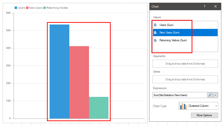
Select the Chart item, and, on the property panel, click the Browse button for the Values, Arguments or Series properties.
In the chart editor, you can do the following:
Specify data fields with values for the chart;
Specify chart arguments;
Specify the rows of the chart;
Choose a chart type;
Modify the expression of the selected item.
Information |
The chart area is configured using the Area group on the property bar. You can adjust the horizontal, vertical lines and etc.
|
To create a chart in the dashboard, at least one data field specified in the Value field is required:
Drag and drop the data column from the dictionary into the Value field, and for newly added items - into the editor or chart area.
Create New Field. Set the expression for this element, the processing result of which will be the values for the chart.
Also, the chart can specify the arguments and series. If the arguments and series are not specified, then all element values will be processed and displayed using one graphic element. For example, if three data fields are created in the Value field, then three graphical elements will be displayed in the Chart.
Information |
For some types of charts require setting values in several fields. For example, for financial charts you need to specify the value in the fields - Open, Close, Max, and Min. In this case, you should create at least one data field for every Value field.
|
Depending on the type of a chart chosen, the data will be displayed using one or another graphic element. You can display several types of charts within the same chart element. For example Clustered Column and Line.
Information |
Within the same Chart element, not all types are compatible. It is impossible to display the Funnel and Gantt in one element. You should know that only one type of a chart can belong to one data field. If it is necessary to display the same data field with different types of charts within the same Chart element, you should create several duplicates of this data field in the Value field and specify one of the chart types for every copy.
|
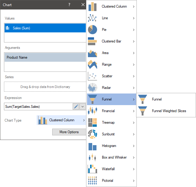
To change the type of a chart, you should do the following:
Double-click the left mouse button on the Chart item;
Click the chart type button in the editor;
Select the chart type you need.
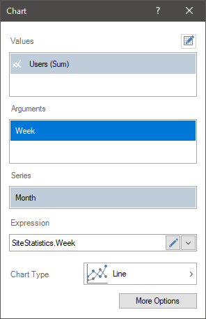
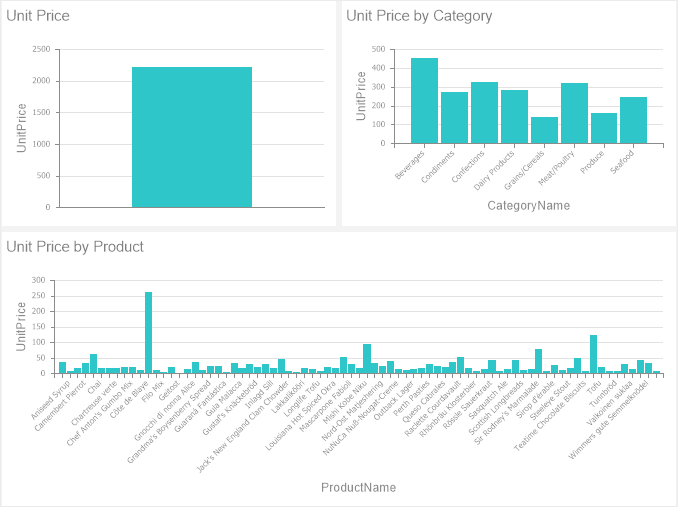
The argument refers to data that is associated with the values of the chart. In other words, every value of the chart will correspond to some value. For example, product prices are related to the list of products, i.e. every product has its own price. In this case, in the chart, each product will be represented in a separate graphic element.
Also, for product prices, an argument may be a category of products. In this case, for each category of products, a graphic element will be presented. The value of this graphic element will be the sum of the prices of products which are included into this category.
For charts with an area of X - Y, the arguments are the values along the X axis (except for bar charts). In the case of other chart types, the arguments are separate chart segments.
To set chart arguments, you should to the following:
Double-click the mouse left button on the Chart element;
In the element editor, drag ad drop the data column from the dictionary to the Arguments field.
Create New Field in the Arguments field. Set the expression for this element, the processing result of which will be the arguments for the chart.
Information |
In the chart editor, you can specify multiple data fields for the Arguments field. |
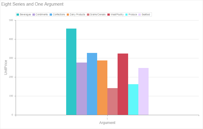
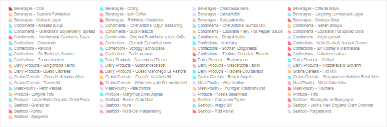
Series of charts are graphical elements with or without arguments and grouped by a specific value.
For example, you have a chart with product prices (chart values) and a list of products (chart arguments). If you add an element to the series of the chart with the category data for these products, then a list of products will be displayed for every category. Below is a chart with prices for every product category and one argument.
To set the series of a chart, you should do the following:
Double-click the mouse left button on the Chart item;
In the element editor, drag and drop the data column from the dictionary to the Series field.
Create New Item in the Series field. Set an expression for this element, the processing result of which will be series for the chart.
Information |
The chart axes are configured using the X Axis and Y Axis property groups (you can find them on the property panel). You can customize axis labels and titles.
|
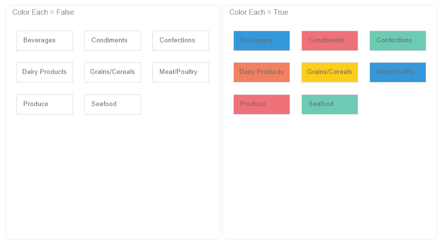
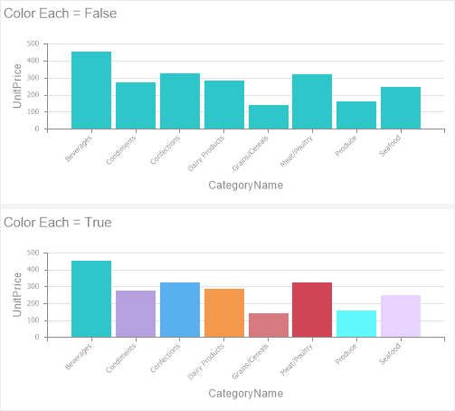
By default, the graphical elements of a diagram within one series have one color. However, if you need to display each graphic element in a separate color, you should:
Select the Chart element;
set the Color Each property to true on the property panel.
The chart legend is a description for the graphic elements. If the chart has series, the legend will automatically be enabled. The legend shows:
Marker is a special graphic icon with the color of the graphic element to which it belongs.
The value of the series for a specific graphic element of the chart;
If the arguments are set for the chart, it shows the value of the argument for a specific graphic element of the chart.
Information |
Setting the legend is done using properties from the Legend group on the property panel. You can adjust the alignment of the legend horizontally and vertically, the title of the legend, the text of the legend, and etc.
|
Constant lines are used to display value lines in the chart area.

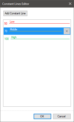
You should do the following to add constant lines in the chart:
Select a chart in the dashboard;
On the property panel, click the Browse button of the Constant Lines property.
After that, the editor will open. Configure constant lines for the current chart in the editor.
In the current editor, you can add, setup and remove constant lines for the current chart.

click the Add Constant Line button to create a new constant line. After that, you can use the properties on the properties panel to set this constant line. For each constant line, you can specify value, color, style, width, text and it position.
You can move constant lines in the list of lines by dragging.
You can remove constant line from the list hovering over and click Delete button.
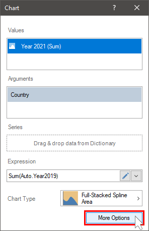
There are additional parameters on the More Options panel. However, a list of additional parameters depends on the type of a chart. Some of them can be available only for Line charts, other only for Clustered Columns, the third, such as the bind to the right Y-axis, depend on the values of the element properties. To open the additional parameters panel you should click the More Options button in the element editor. To hide the additional parameters panel you should click the Less Options button.
Below we will consider each parameter separately.
You can display a graphic value as a selected icon. It`s worth noting, that if the Color Each parameter is set, the icons of each graphic value will be of different colors. This parameter is available not only for all chart types. For example, you can`t display values by an icon for lines.
The menu of icon selection is placed on the additional panel of parameters in the element editor. To display a value using an icon, you should select an icon. If you select the None value, an icon will not be applied to draw graphic chart values.
The Round Values parameter allows you to display all or part of the icons for Clustered Columns. Accordingly, whether or not this parameter is present depends on whether or not the current chart type supports icons. If the property is set to True value, then only the entire icons will be displayed in Clustered Columns. If the property is set to False value, then the icons can be partially displayed.
The Show Zeros and Show nulls parameters allow you to display zeros and nulls in a chart as chart zero values, a gap, a line connection points using a line. These parameters can be present individually for a specific chart type or together. These parameters are not available for some chart types.
You can change line width and line style for the charts that use lines when drawing values. It can be made using the Line Width and the Line Style parameters.
Bind to various axis of values
Sometimes there are situations when several data fields need to be displayed in one chart. In addition, the values of these fields may differ by several orders. For example, sales volumes (millions and billions) and average bill (hundreds and thousands), or number of visitors (hundreds, thousands, millions) and bounce rate (relative index from 0 to 100). Since the range of Y-axis values is calculated automatically during data processing, displaying values of different orders in a chart, especially the lowest ones, may not be comprehensible.
Pay your attention to the values of the red line. It was impossible to perceive values, tendencies of their behavior. To do that you should enable the display of the right Y axis. It can be done having set the Area - Y Right Axis – Visible property of chart element in the True value. Next in the chart editor, you should select data field and define an Y axis to which it will be assigned. The bind is carried out using the Y axis parameter in the additional parameter panel and by default, it is set to Left Y value, i.e. all data fields are bound to the left Y axis.
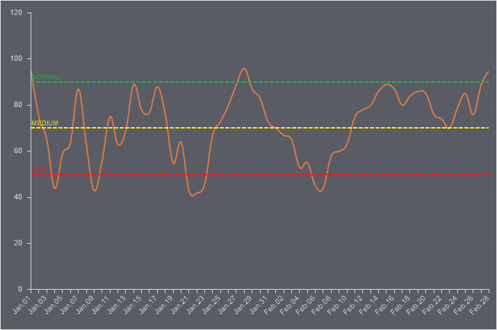
For the example above, we will set the right Y-axis to the red line. In this case, the range of the left Y-axis values will be calculated from the values of the blue line, and the range of the right Y-axis values will be calculated from the values of the red line. Now, you can analyze the graph of the red line, its values, and tendencies.
You can create several chart views in one element and then use controls to switch chart view when viewing a dashboard in the viewer. To add an alternative view to the current chart, you should select the New command in the additional parameters panel, from the drop-down menu of the Views parameter. Each view should be set, i.e. you should specify data, define chart type, and change some properties. A maximum of 5 views the Chart element can have, i.e. the main kind element and 4 views. The Duplicate command allows you to create a copy of the current view. It is comfortable if you need to display the same data in a new view, but with another chart type.
The views are controlled using controls (buttons) in a chart when editing or viewing a dashboard. Each button includes a certain view. This way, views within one chart are switched using buttons.
The list shows the name and description of the properties of the element which you may find in the properties panel of the report designer.
Name |
Description |
Area |
A property group that is used to customize the chart area:
|
Cross-Filtering |
It allows you to enable or disable the cross-filtering mode for the current element. |
Constant Lines |
Customizes the constant lines of the chart element. |
Data Transformation |
Customizes the data transformation of the current item. |
Group |
Adds the current item to a specific group of items. |
Labels |
A group of properties that is used to customize the chart labels:
|
Legend |
A property group that is used to customize the chart legend:
|
Trend Line |
It allows you to set a trend line in the current chart. |
Marker |
A group of properties that is used to customize the chart markers:
|
Back Color |
Changes the background color of the Chart element. By default, this property is set to From Style, i.e. the color of the element will be obtained from the settings of the current element style. |
Border |
A group of properties that allows you to customize the borders of a table - color, sides, size, and style. |
Conditions |
Customizes the conditions element of the chart. |
Corner Radius |
It allows you to define the rounding radius for the corners of an element on the dashboard. You can round each corner of the element separately: Top - Left, Top - Right, Bottom - Right, Bottom - Left. The property can be set to a value between 0 and 30, where 0 is no rounding angle and 30 is the maximum value of the rounding radius. |
Negative Series Color |
Customizes the list of colors for negative values of the rows of the Chart element. |
Series Color |
Customizes the list of colors for the values of the rows of the Chart element. |
Shadow |
A group of properties that allows configuring the shadow of an element:
|
Style |
Selects a style for the current element. The default it is set to Auto, i.e. the style of this element is inherited from the style of the dashboard. |
Argument Format |
Customizes the formatting of the arguments the Chart element. |
Enabled |
Enables or disables the current item on the dashboard. If the property is set to True, the current item is enabled and will be displayed when previewing the dashboard in the viewer. If this property is set to False, this element is disabled and will not be displayed when previewing the dashboard in the viewer. |
Interaction |
Customizes the interaction element of the chart. |
Margin |
A group of properties that allows you to define indents (left, top, right, bottom) of the value area from the border of this element. |
Padding |
A group of properties that allows you to define indents (left, top, right, bottom) of the columns from the range of values. |
Show Blanks |
Allows displaying or hiding the label "Show (blank)" in the dashboard element when there is no data available for that element. |
Title |
A group of properties that allows you to customize the title of the Table element:
|
Value Format |
Customizes the formatting of the values of the Chart element. |
Name |
Changes the name of the current element. |
Alias |
Changes the alias of the current item. |
Restrictions |
Configures the permissions to use the current item in the dashboard:
|
Locked |
Locks or unlocks resizing and movement of the current element. If the property is set to True, the current element cannot be moved or resized. If this property is set to False, then this element can be moved and resized. |
Linked |
Binds the current location to the dashboard or another element. If the property is set to True, then the current item is bound to the current location. If this property is set to False, then this element is not tied to the current location. |