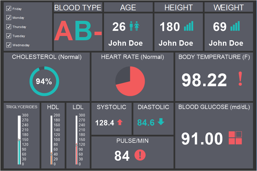
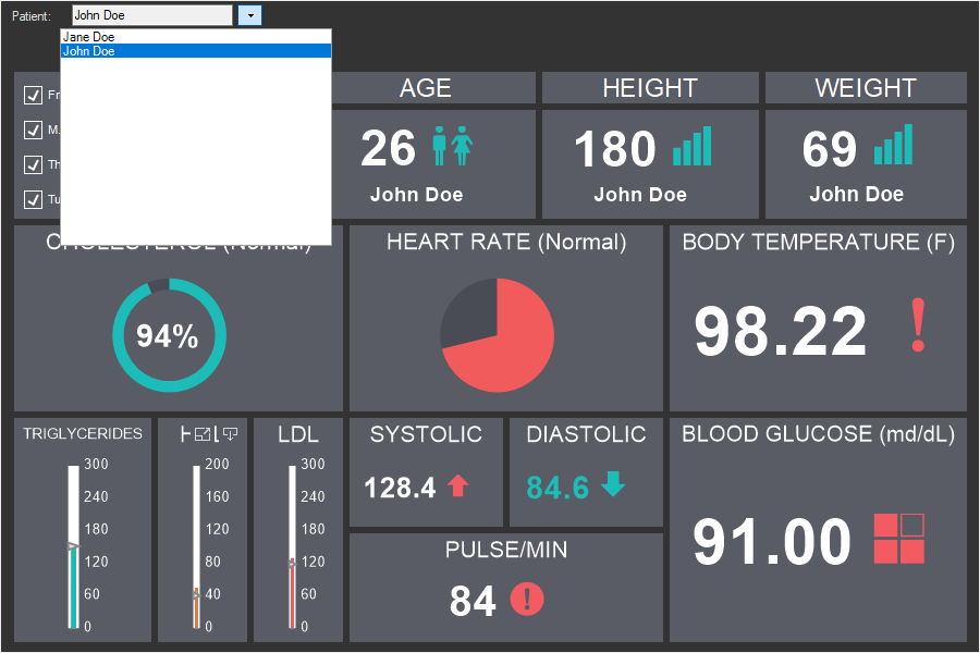
Image
Image is an element with which you can display various graphical objects (photo, logo, picture, etc.) on the dashboard. The Image element supports the following types of graphics - BMP, PNG, JPEG, TIFF, GIF, PNG, ICO, EMF, WMF, SVG.

This chapter will cover the following:
Information |
Interaction can be applied to the current element.
|
The image can be placed anywhere on the dashboard. Setting up the source for the image element is carried out in its editor. To call the editor, you should:
![]() Double-click on the Image element;
Double-click on the Image element;
![]() Select the Image item, and select the Design command in the context menu;
Select the Image item, and select the Design command in the context menu;
![]() Select the Image item, and, on the property panel, click the Browse button of the Image, Hyperlink properties of the image.
Select the Image item, and, on the property panel, click the Browse button of the Image, Hyperlink properties of the image.
To resize an image element you should:
![]() Select it in the dashboard;
Select it in the dashboard;
![]() Increase or decrease the size of the element vertically, horizontally or diagonally.
Increase or decrease the size of the element vertically, horizontally or diagonally.
In the editor you can indicate the source of the image for the current element. Within one element, you can display only one graphic object (picture, logo, photo, an image by hyperlink).

![]() In the Image field you can upload an image from the local storage.
In the Image field you can upload an image from the local storage.
![]() In the Icon field, you can select an icon for the Image element and the color of this icon.
In the Icon field, you can select an icon for the Image element and the color of this icon.
![]() In the Hyperlink field, the link to the graphic object is indicated. This can be either a URL or a link to a report resource (resource://logo). In addition, you can specify a link to the datacolumn://DataSource.DataColumn data column which contains an image in the base64 encoding or variable - variable://variablename.
In the Hyperlink field, the link to the graphic object is indicated. This can be either a URL or a link to a report resource (resource://logo). In addition, you can specify a link to the datacolumn://DataSource.DataColumn data column which contains an image in the base64 encoding or variable - variable://variablename.
Information |
Since only one graphic object can be displayed in one element, the image can have only one source. The order in which the object is shown in the image element is as follows:
Thus, if a graphic object is loaded directly in the Image element, the image receiving hyperlink or the selected icon will not work.
|
Any graphic object added to the element is stretched to the entire area of the element, with the exception of the specified margins and padding. The setting of the graphic object in the element is carried out using buttons on the ribbon panel or using properties on the property panel. All these properties are located in the Image additional group:
![]() The Aspect Ratio property. When stretching an image, its proportions may be broken. To stretch the Image element while maintaining the proportions of the graphic object, you should set the Aspect Ratio property to true.
The Aspect Ratio property. When stretching an image, its proportions may be broken. To stretch the Image element while maintaining the proportions of the graphic object, you should set the Aspect Ratio property to true.
![]() The Horizontal Alignment property is relevant if the Aspect Ratio property is set to true. Horizontal alignment of the graphic object within the Image element. You can also specify the horizontal alignment using the buttons on the Ribbon panel.
The Horizontal Alignment property is relevant if the Aspect Ratio property is set to true. Horizontal alignment of the graphic object within the Image element. You can also specify the horizontal alignment using the buttons on the Ribbon panel.
![]() The Vertical Alignment property is relevant if the Aspect Ratio property is set to true. Vertical alignment of the graphic object within the Image element. You can also specify the vertical alignment using the buttons on the Ribbon panel.
The Vertical Alignment property is relevant if the Aspect Ratio property is set to true. Vertical alignment of the graphic object within the Image element. You can also specify the vertical alignment using the buttons on the Ribbon panel.
The list shows the name and description of the properties of the element which you may find in the properties panel of the report designer.
Name |
Description |
Aspect Ratio |
Provides the option of the aspect ratio of the image in the current element. If the property is set to True, then the aspect ratio of the image in the current element will be saved. If this property is set to False, then the aspect ratio will not be taken into account and the image will not stretch proportionally. |
Cross-Filtering |
It allows you to enable or disable the cross-filtering mode for the current element. |
Group |
It allows you to add the current element to a definite group of elements. |
Horizontal alignment |
Changes the horizontal alignment of the image in the current element. |
Vertical alignment |
Changes the vertical alignment of the image in the current element. |
Back Color |
Changes the background color of the element. By default, this property is set to From Style, i.e. the color of the element will be obtained from the settings of the current element style. |
Border |
A group of properties that allows you to customize the borders of the element - color, sides, size, and style. |
Corner Radius |
It allows you to define the rounding radius for the corners of an element on the dashboard. You can round each corner of the element separately: Top - Left, Top - Right, Bottom - Right, Bottom - Left. The property can be set to a value between 0 and 30, where 0 is no rounding angle and 30 is the maximum value of the rounding radius. |
Shadow |
A group of properties that allows configuring the shadow of an element:
|
Style |
Selects a style for the current element. The default it is set to Auto, i.e. the style of this element is inherited from the style of the dashboard. |
Enabled |
Enables or disables the current item on the dashboard. If the property is set to True, the current item is enabled and will be displayed when previewing the dashboard in the viewer. If this property is set to False, this element is disabled and will not be displayed when previewing the dashboard in the viewer. |
Interaction |
Sets interaction of the current element. |
Margin |
A group of properties that allows you to define indents (left, top, right, bottom) of the value area from the border of this element. |
Padding |
A group of properties that allows you to define indents (left, top, right, bottom) of the columns from the range of values. |
Title |
A group of properties that allows you to customize the title of the Table element:
|
Name |
Changes the name of the current element. |
Alias |
Changes the alias of the current item. |
Restrictions |
Configures the permissions to use the current item in the dashboard:
|
Locked |
Locks or unlocks resizing and movement of the current element. If the property is set to True, the current element cannot be moved or resized. If this property is set to False, then this element can be moved and resized. |
Linked |
Binds the current location to the dashboard or another element. If the property is set to True, then the current item is bound to the current location. If this property is set to False, then this element is not tied to the current location. |