Gauge
Gauge is an element of the dashboard panel using which you can display the processed value from the data field.
This chapter will cover the following:
 Gauge Series;
Gauge Types;
Range of Values;
Colored Ranges;
Table of Properties.
You may adjust the Gauge element in its editor. To call the editor, you should:
Double-click the mouse left button on the item;
Select the Gauge element, and select the Design command in the context menu;
Select the Gauge element, and, on the property panel, click the Browse button of the Value or Series properties.
In the this editor adjusts the gauge.
In the Gauge editor you can:
Specify a data field with values for the gauge;
Specify the series of the gauge;
Specify a data field with target values for the gauge;
Select Type of the gauge;
Modify Expression of the selected element;
Select and adjust the range of the gauge;
Set the color palette of the gauge scale.
To create a gauge on the dashboard panel, you need a data field in the Value field. To do this:
Drag and drop the data column from the dictionary to the Value field, and for newly added items, drag it into the editor or the gauge area.
Create New Field. Set the expression for this element, the processing result of which will be the value for the gauge.
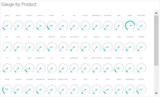
A gauge series is a separate graphic element for a specific segment of values selected by a specific condition. The condition in this case will be the values of the data field which is indicated in the Series field.
For example, a data field with product prices is specified in the Gauge field. Without specifying the series one graphic element will be displayed, the value of which will be the sum of the prices of all products.
If you specify a data field with a list of products in series then, for every product, a graphic element will be displayed, the value of which will be the price of this product.
If you specify a data field with a list of product categories in series, then a graphic element will be displayed for every category. The value of this graphic element will be the sum of the prices of products included into this category.
To specify the series of the gauge, you should do the following:
Double-click the mouse left button on the gauge;
In the element editor, drag and drop the data column from the dictionary to the Series field.
Create New Field in the Series field. Set the expression for this element, the processing of which will be series for the gauge.
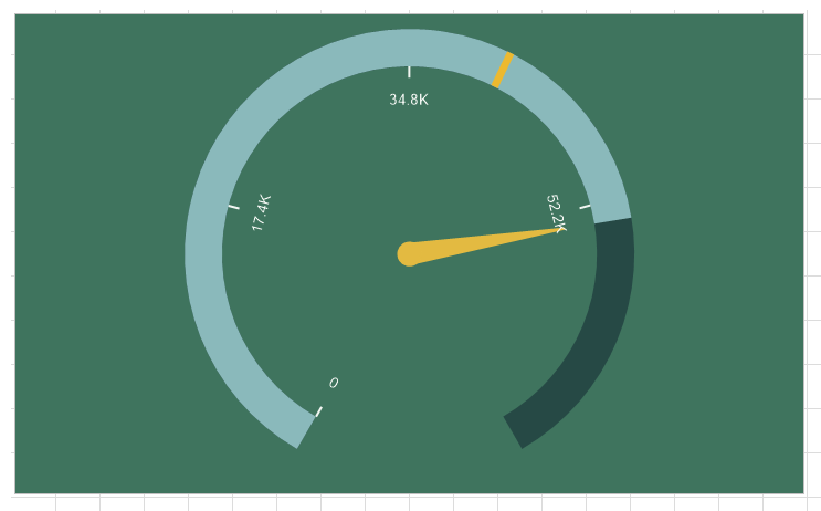
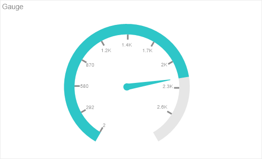
The gauge can be of the following types:
Full Circular;
Half-Circular;
Vertical Linear;
Horizontal Linear;
Bullet.
To change the type of a gauge, you should:
Double-click the mouse left button on the gauge;
Using the control buttons, select one of the types of a gauge.
Information |
Within the limits of one gauge element it is possible to use only one type of a gauge. Even in the case of multiple series, the type of the gauge will be the same for all values.
|
Regardless of the gauge type, its values and series, you can define a range of values. By default, the AutoRange mode is used. In this case, the initial and final value of the gauge scale is calculated automatically. However, if you need to specify a specific range of values, you should do the following:
Double-click the mouse left button on the gauge;
In the Mode field, left-click on the menu.
Select Custom in the drop-down list.
In the Minimum field you should set the initial value of the gauge scale;
In the Maximum field you should set the maximum value of the gauge scale;
Select the Auto value in the Mode field to enable the automatic mode for calculating the range of values of the gauge scale.
By default, the gauge scale is monochromatic. However, you can adjust the color for a specific range of the scale. To do this:
Double-click the mouse left button on the gauge;
Left-click in the Range Type field.
Select Color in the drop-down list.
Then you should:
Determine the type of values for the scale range - Percentage or Value;
Customize the list of ranges;
Customize every range by specifying the start - end values of the range and its color.
The list shows the name and description of the properties of the element which you may find in the properties panel of the report designer.
Name |
Description |
Cross-Filtering |
It allows you to enable or disable the cross-filtering mode for the current element. |
Data Transformation |
Customizes the data transformation of the current item. |
Group |
Adds the current item to a specific group of items. |
Labels |
The group of properties that allows you to set labels of values:
|
Target |
The group of properties, which allows you to customize the display of target value in an element:
|
Back Color |
Changes the background color of the element. By default, this property is set to From Style, i.e. the color of the element will be obtained from the settings of the current element style. |
Border |
A group of properties that allows you to customize the borders of the element - color, sides, size, and style. |
Corner Radius |
It allows you to define the rounding radius for the corners of an element on the dashboard. You can round each corner of the element separately: Top - Left, Top - Right, Bottom - Right, Bottom - Left. The property can be set to a value between 0 and 30, where 0 is no rounding angle and 30 is the maximum value of the rounding radius. |
Font |
A group of properties defines the font family, its style, and size for the values of the element. |
Fore Color |
Specifies the color of the values of the element. By default, this property is set to From Style, i.e. the color of the values will be obtained from the settings of the current element style. |
Shadow |
A group of properties that allows configuring the shadow of an element:
|
Style |
Selects a style for the current element. The default it is set to Auto, i.e. the style of this element is inherited from the style of the dashboard. |
Enabled |
Enables or disables the current item on the dashboard. If the property is set to True, the current item is enabled and will be displayed when previewing the dashboard in the viewer. If this property is set to False, this element is disabled and will not be displayed when previewing the dashboard in the viewer. |
Interaction |
Sets interaction of the current element. |
Margin |
A group of properties that allows you to define margin (left, top, right, bottom) of the value area from the border of this element. |
Padding |
A group of properties that allows you to define padding (left, top, right, bottom) of the graphic element area from the margin of the value area. |
Show Blanks |
Allows displaying or hiding the label "Show (blank)" in the dashboard element when there is no data available for that element. |
Title |
A group of properties that allows you to customize the title of the element:
|
Value Format |
It allows you to set the formatting of labels of scales for the current element. |
Name |
Changes the name of the current element. |
Alias |
Changes the alias of the current item. |
Restrictions |
Configures the permissions to use the current item in the dashboard:
|
Locked |
Locks or unlocks resizing and movement of the current element. If the property is set to True, the current element cannot be moved or resized. If this property is set to False, then this element can be moved and resized. |
Linked |
Binds the current location to the dashboard or another element. If the property is set to True, then the current item is bound to the current location. If this property is set to False, then this element is not tied to the current location. |