Tree View Box
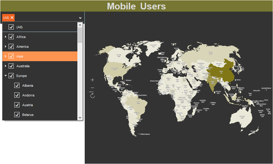
Tree View Box is a filtering element on the dashboard, which is used to create a hierarchy of values and filter data for analysis in the viewer by these values. It can be located anywhere on the dashboard panel. Depending on the size of the dashboard in the viewer, it can grow or shrink by width only.

This chapter will cover the following:
The Tree View Box can be subordinate to other filtering elements, or be the main filtering element for them. The Tree View Box can work in two selection modes:
![]() One. In the viewer, you can select only one value within one level of the hierarchy of values. Accordingly, data filtering for the elements of the dashboard will be performed only by one value.
One. In the viewer, you can select only one value within one level of the hierarchy of values. Accordingly, data filtering for the elements of the dashboard will be performed only by one value.
![]() Multi. In the viewer, you can select multiple values within the same level of the hierarchy of values. Accordingly, data filtering for the elements of the dashboard will be performed by all selected values.
Multi. In the viewer, you can select multiple values within the same level of the hierarchy of values. Accordingly, data filtering for the elements of the dashboard will be performed by all selected values.
You may setup the Tree View Box element in the editor. To call the editor, you should do the following in the report designer:
![]() Double-click the Tree View Box element;
Double-click the Tree View Box element;
![]() Select the Tree View Box element and select the Design command in the context menu.
Select the Tree View Box element and select the Design command in the context menu.
Information |
The search string for elements will be displayed automatically, if the number of values of the element will be 10.
|
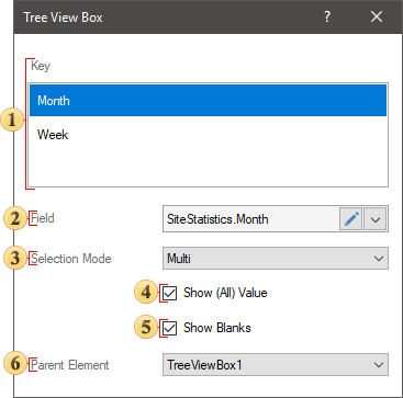
In the Tree View Box editor, you can add items with data, set up the value selection mode, select the main filter item.

![]() The Key field. The data item is specified, the values of which will form the hierarchy and be displayed in the Tree View Box item.
The Key field. The data item is specified, the values of which will form the hierarchy and be displayed in the Tree View Box item.
![]() The Field field. Displays the expression of the selected item data field.
The Field field. Displays the expression of the selected item data field.
![]() The Selection Mode parameter. Specifies the number of simultaneously selected values of the element. A Tree View Box is one element or many elements.
The Selection Mode parameter. Specifies the number of simultaneously selected values of the element. A Tree View Box is one element or many elements.
![]() The Show (All) Value option. Enables the option to select all values in the Tree View Box element. If this option is enabled, the Select (All) Value value will be present in the Tree View Box element.
The Show (All) Value option. Enables the option to select all values in the Tree View Box element. If this option is enabled, the Select (All) Value value will be present in the Tree View Box element.
![]() The Show Blanks parameter allows you to display or not to display blank values from a data source in the list of the values of the current element.
The Show Blanks parameter allows you to display or not to display blank values from a data source in the list of the values of the current element.
![]() The Parent Element parameter. It is used to define the main filtering element for the current element. The data of these filter elements will be interrelated, and depending on the selected value of the main element, the list of values of the current element will be filtered.
The Parent Element parameter. It is used to define the main filtering element for the current element. The data of these filter elements will be interrelated, and depending on the selected value of the main element, the list of values of the current element will be filtered.
Get acquainted with the step-by-step instruction in the Dashboards with Tree View Box chapter.
The list shows the name and description of the properties of the element which you may find in the properties panel of the report designer.
Name |
Description |
Data Transformation |
Customizes the data transformation of the current item. |
Group |
Adds the current item to a specific group of items. |
Back Color |
Changes the background color of the element. By default, this property is set to From Style, i.e. the color of the element will be obtained from the settings of the current element style. |
Border |
A group of properties that allows you to customize the borders of the element - color, sides, size, and style. |
Corner Radius |
It allows you to define the rounding radius for the corners of an element on the dashboard. You can round each corner of the element separately: Top - Left, Top - Right, Bottom - Right, Bottom - Left. The property can be set to a value between 0 and 30, where 0 is no rounding angle and 30 is the maximum value of the rounding radius. |
Font |
A group of properties defines the font family, its style, and size for the values of the element. |
Fore Color |
Specifies the color of the values of the element. By default, this property is set to From Style, i.e. the color of the values will be obtained from the settings of the current element style. |
Shadow |
A group of properties that allows configuring the shadow of an element:
|
Style |
Selects a style for the current element. The default it is set to Auto, i.e. the style of this element is inherited from the style of the dashboard. |
Enabled |
Enables or disables the current item on the dashboard. If the property is set to True, the current item is enabled and will be displayed when previewing the dashboard in the viewer. If this property is set to False, this element is disabled and will not be displayed when previewing the dashboard in the viewer. |
Fixed Height |
Allows setting the mode of fixed or change height. |
Margin |
A group of properties that allows you to define margin (left, top, right, bottom) of the value area from the border of this element. |
Padding |
A group of properties that allows you to define padding (left, top, right, bottom) of values from the range of values. |
Text Format |
Sets the formatting of values for the element. |
Name |
Changes the name of the current element. |
Alias |
Changes the alias of the current item. |
Restrictions |
Configures the permissions to use the current item in the dashboard:
|
Locked |
Locks or unlocks resizing and replacement of the current element. If the property is set to True, the current element cannot be moved or resized. If this property is set to False, then this element can be moved and resized. |
Linked |
Binds the current location to the dashboard or another element. If the property is set to True, then the current item is bound to the current location. If this property is set to False, then this element is not tied to the current location. |