Cards
Cards is a data analytics element, which allows you to display grouped values of data fields as a card.
In this chapter the following questions will be considered:
 The order of displaying values in cards;
The order of displaying cards in an element;
The color of cards background;
You can display on cards:
Values from data fields and a graphic analysis applied to them;
Manually specified value;
Images from data fields.
Values display of the Cards element is customized in its editor and using properties. To call the editor, you should:
Double click on the Cards element;
Select the Cards element, and choose the Design command in the context menu.
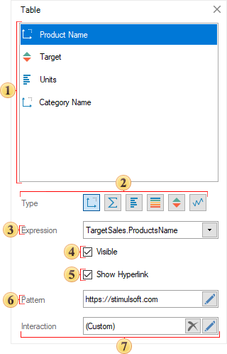
Element Editor
In the editor of the Cards element, you can add fields with data, the order of their display in each card, deletion and enable of different types of graphic data analysis.
 The list of data fields of the Cards element.
 The Expression field of a selected data field.
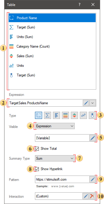
 Value type of the selected data filed:
The Dimension is the type at which the value of the data field will be displayed in its initial state.
The Measure indicator is the type in which various functions can be applied to the values of the data field.
The Data Bars is the type in which various functions can be applied to the values of a data field, and a Data Bars will be added for each value of this field.
The Color Scale is the type in which various functions can be applied to the values of a data field, and a color scale will be added for each value of this field.
The Indicator is the type in which various functions can be applied to the values of a data field, and an indicator will be added for each value of this field.
The Sparklines is the type in which a value of a data field will be presented as a graphic. By the way, in this case, the sparkline has several views – graphic, area, data bars, win/lose. In addition, you can define the mode of starting points for sparkline, graphic or area.
The Bubble is the type in which various functions can be applied to the values of a data field, and each value will be presented as a bubble.
 The Visible parameter allows you to enable or disable the display of a selected column in a element of a dashboard. Also, enable or disable of a column can depended on the result of a logic expression. If the result of expression calculation will be the true value, a column will be enabled. If the result of expression calculation will be the false value, the column will be disabled.
In cases, if such types of graphic analysis as Color Scale, Sparkline, Bubble are used for data fields, other parameters, which allow you to define additional settings of these types will be displayed in the editor.
When adding the first data field to the Cards element, for each value from a data column will be formed its own card. Next, if another data column will be added from the same source, its values will be added to existing cards as well as these data is compared in the source.

If a data column will be added from another data source, its values will be added to existing cards if there is a connection between data sources. Otherwise, if there is no connection between data sources, for values from the second column data column will be formed their own cards.
The order of displaying values in the cards
Each value from a data column, by default, it is displayed in a new row. The order of displaying values in rows of a card is defined by the location of fields in the Cards element editor. This way, the higher a data column, the higher a value from it in the card.
If you need to display a value from the following data column in the same row as the previous one, you should use the Wrap Line property and set to the False value. After that, the values from the data column which is located in the element editor below will be displayed in the card of the same row.
The order of displaying cards in the element
The order of displaying cards in the element is defined by the following element properties: Column Count and Orientation. By default, the Column Count property is set to 0 value, i.e. the number of columns in the element to display cards is calculated automatically. However, you can change it, having specified the necessary number of columns as a value of this property.
The direction of cards columns filling depends on a value of the Orientation property and by default is defined as Horizontal, i.e. cards are displayed from left to right line by line.
However, the Orientation property can be defined as the Vertical, i.e. firstly cards will be filled with from top to bottom, after in the next right column.
Cards Back Color
By default, cards back color in the element and the element back color are defined from the Back Color property. The value for this property can be received from the element style or defined from the Back Color property. However, each card can have its own shade. It depends on the value of the Color Each property. If the Color Each property is set to the True value, each card will have a unique shade.
Color sets for creating shades depend on a value of the Series Colors property and can be received from a style of the element or defined from preset color collections in the list of values of this property.
Table of Properties
The table contains name and description of the Cards element properties and its fields.
Name |
Description |
Cross-Filtering |
It allows you to enable or disable the Cross-Filtering mode for the current item. |
Group |
Adds the current item to a specific group of items. |
Cards |
The group of properties, which allows you to set cards in the element: Each card.
|
Column Count |
It allows you to define the number of columns in the element. By default, the property is set to 0, i.e. the number of columns for cards in element is counted automatically. |
Data Transformation |
Customizes the data transformation of the current item. |
Orientation |
It allows you to define the direction of filling the columns of the element with cards. If the property is set to the Horizontal value, the columns are first filled from left to right within the width of the element, and a transition to a new line is performed. If the property is set to the Vertical, the columns are first filled from top to bottom within the height of the element, and then a transition is made to a new column on the right. |
Back Color |
It allows you to specify a background color for cards in an element. By default, the color from the style is used. Also, it’s worth taking into account that if the Color for each mode is enabled, the background color of the cards is defined by the value of the Series Colors property. |
Border |
A group of properties that allows you to customize the borders of the cards - color, sides, size, and style. |
Corner Radius |
It allows you to define the rounding radius for the corners of an element on the dashboard. You can round each corner of the element separately: Top - Left, Top - Right, Bottom - Right, Bottom - Left. The property can be set to a value between 0 and 30, where 0 is no rounding angle and 30 is the maximum value of the rounding radius. |
Series Colors |
It allows you to define a collection of colors to generate unique background hues for cards in an element. This property is relevant if the Color each mode is enabled. |
Shadow |
The group of properties that allows you to customize the element's shadow:
|
Style |
It allows you to select a style for the current element. By default, the value is Auto, i.e. the style of this element is inherited from the style of a dashboard. |
Enabled |
It allows you to enable or disable the current item in a dashboard. If the property is set to the True, the current element is enabled and will be displayed when viewing a dashboard in the viewer. If this property is set the False, this element is disabled and will not be displayed when viewing the dashboard in the viewer. |
Interaction |
Customizes the interaction element of the cards. |
Margin |
The group of properties that allows you to define the indents (left, top, right, bottom) of the value area from the border of this element. |
Padding |
The group of properties that allows you to define indents (left, top, right, bottom) of values from the border of the value area. |
Show Blanks |
Allows displaying or hiding the label "Show (blank)" in the dashboard element when there is no data available for that element. |
Title |
The Back Color property allows you to change the background color of the current element's header. By default, this property is set to From Style, i.e. the background color will be obtained from the settings of the current element style.
|
Name |
It allows you to change name of the current element. |
Alias |
It allows you to change alias of the current element. |
Restrictions |
It allows you to set the permissions to use the current element in a dashboard:
|
Locked |
It allows you to prevent or allow resizing and moving the current element. If the property is set to True, the current element cannot be moved or resized. If this property is set to the False, this element is moved and resized. |
Linked |
It allows you to bind the current location to a dashboard or another element. If the property is set to the True, the current element is anchored to the current location. If this property is set to the False, this element is not anchored to the current location. |
Properties of the element data fields: |
|
Expression |
It allows you to specify an expression for the current data field. |
Label |
It allows you to change the label of a data field. |
Fore Color |
It allows you to specify fore color for the current data field. |
Height |
It allows you a row height for the value of the current data field. By default, the property is set to 0, i.e. the line height for the value is calculated automatically. |
Horizontal Alignment |
It allows you to specify the horizontal text alignment for the current data field. |
Vertical Alignment |
It allows you to specify vertical text alignment for the current data field. |
Wrap Line |
It allows you to define whether the next value in the current card will be displayed on the same line or will be moved to the next line. If the property is set to the True value, the next value will be displayed in a new line. If the property is set to the False value, the value from the next data field will be displayed on the same line as the value from the current data field. |
Font |
The group of properties that allows you to define font family, its style for values of the current data field. |
Text Format |
It allows you to specify text format for the values of the current data field. |
Word Wrap |
Allows enabling or disabling word wrap mode. |