Report with Chart in Data Band
Suppose a Chart component is placed on the page of the report, then, for a report, this component will be rendered as a page item. If the Chart component is placed in the DataBand, then, when rendering a report, this component will be rendered as part of the DataBand. Since the Chart component placed in the DataBand, is rendered as a part of the DataBand, and will be printed as many times as the DataBand will be output. An example of designing a report with a chart in the DataBand will be described below. In this example, the chart will graphically display the detailed data of the data source in the DataBand. Follow the steps below to render a report with the Chart in the DataBand:
| 1. | Run the designer; |
| 2. | Connect data: |
2.1. Create New Connection;
2.2. Create New Data Source;
3. Create a Relation between data sources. In this case, the Parent Data Source is the Categories data source, and the Child Data Source is the Products data source;
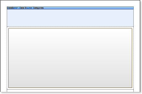
4. Put the DataBand on a report template page:
5. Edit DataBand:
5.1. Align the DataBand by height;
5.2. Change values of band properties. For example, set the Can Break property to true, if you wish the data band to be broken;
5.3. Change the DataBand background;
5.4. Enable Borders for the DataBand, if required;
5.5. Change the border color.
6. Define the data source for the DataBand using the Data Source property:
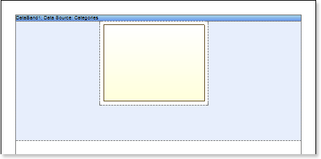
7. Put the Chart component in the DataBand as seen on a picture below:
8. Edit the Chart component:
8.1. Align it by width;
8.2. Change properties of the Chart component. For example, set the GrowToHeight property to true, if it is required the Chart component be grown by height;
8.3. Set Borders, if required, for the Chart component;
8.4. Change the border color.
8.5. Edit the chart area. For example, change the Area.Brush.Color property, if it is required to change the color of a chart area.
9. Change the type of a chart using the Chart Type property. For example, set it to Clustered Column:
10. Define the data source for the Chart component using the Data Source property
11. Define the relation between data sources, using the DataRelation property of the Chart component:
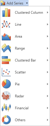
12. Add series. Invoke the Series Editor, for example, by double-clicking the Chart:
13. Setup chart series:
13.1. Get the data for Value and for the Argument of series. There are three ways to get data for the series: set the column data from the dictionary, or specify an expression, or manually specify values for the series as a list, through the ',' separator. For example, create a series and specify columns from the dictionary: define the Products.ProductName for the Argument and Products.UnitPrice for the Value;
13.2. Change the values of the series properties. For example, set the Show Zeros property to false, if it is necessary to hide zero values;
13.3. Enable or disable Series Labels;
13.4. Edit headers of rows: align, change the style, font, type of value, etc.;
13.5. Change the design of series, by setting values of the following properties: Border Color, Brush, Show Shadow.
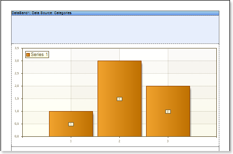
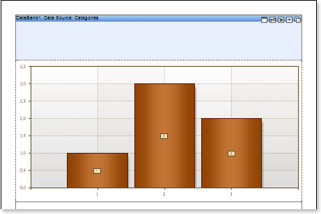
The picture below shows an example of a report template with the chart:
14. Edit Legend:
14.1. Enable or disable the visibility of Legends. You can do it by setting the value of the Legend.Visible property to true or false, respectively;
14.2. Align the legend horizontally and vertically;
14.3. Change the legends design, etc.
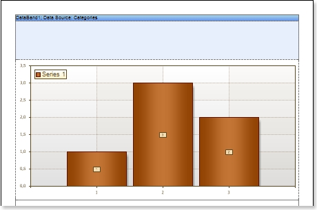
The picture below shows an example of a report template with the chart displaying the legend:
15. Change the style of the chart, completely change the appearance of the chart:
15.1. Change the Style property. Where the value of the property is a chart style;
15.2. Set the AllowApplyStyle to the true. If the AllowApplyStyle property is set to false, then the report generator, when rendering, will take into account the values of the appearance of the series.
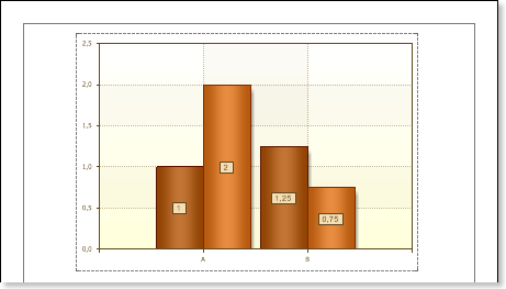
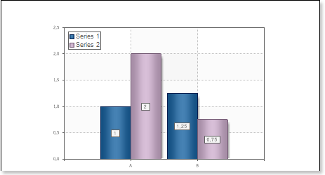
The picture below shows an example of a report template of the chart with a changed style:
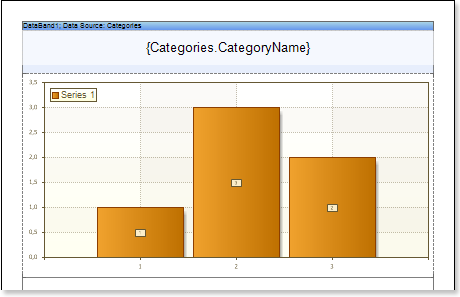
16. Put text components with an expression in the DataBand. Where the expression is a reference to the data field. For example, put a text component with the expression: {Categories.CategoryName};
17. Edit Text and TextBox component:
17.1. Drag and drop the text component in the DataBand;
17.2. Change parameters of the text font: size, type, color;
17.3. Align the text component by width and height;
17.4. Change the background of the text component;
17.5. Align text in the text component;
17.6. Change the value of properties of the text component. For example, set the Word Wrap property to true, if you need a text to be wrapped;
17.7. Enable Borders for the text component, if required.
17.8. Change the border color.
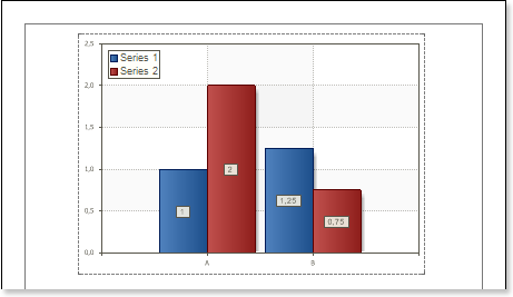
18. Click the Preview button or invoke the Viewer, clicking the Preview menu item. The picture below shows a sample of the report with the chart in the DataBand:


Adding styles
| 1. | Go back to the report template; |
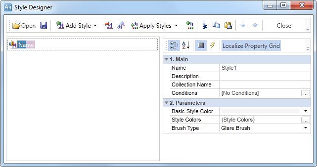
| 2. | Call the Style Designer; |
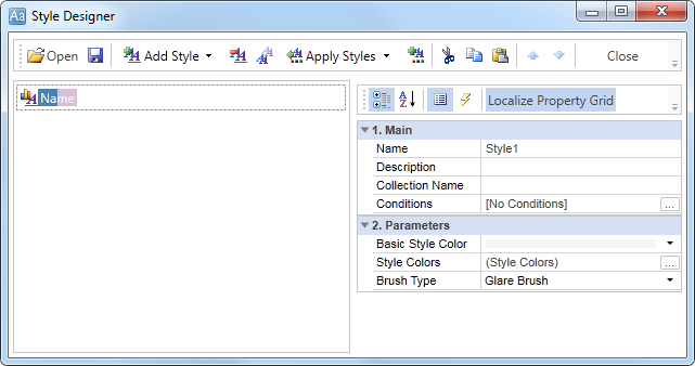
The picture below shows the Style Designer:
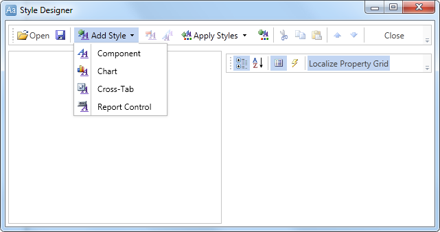
Click the Add Style button to start creating a style. Select Chart from the drop down list. Set the style using Basic Color Style, Brush Type and Style Colors group of properties.
Click Close. In the list of values of the Style property of the chart component a custom style will be displayed. In our case, the value is Style for Chart. Select this value;
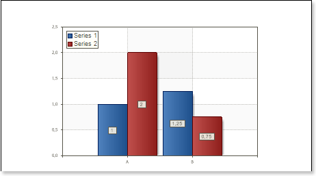
3. Click the Preview button or invoke the Viewer, clicking the Preview menu item. The picture below shows samples of reports with the chart with a style applied: